Color Theory 101
~A guest post by Scarboy
Hi everyone, Skarboy (painting Kommando) here. I’ll be here on BoLS from time to time to talk about (you guessed it) …painting! I’ll try to focus on some of the less common aspects that aren’t covered in the numerous how-to books out there already (like what color to paint your Ultramarines or Word Bearers). First up is a word or two about color theory and how you can apply a little of it to selecting a palette for your favorite army. If you’ve had formal art training of any kind, you may want to skip ahead a few sections.
Color Theory Summarized
Color theory, in the Emperor’s common Gothic, is studying how colors interact with one another, and how you can mix and match them to get the effects you want on your minis (or tanks, or whatever else). It’s got a long and involved history, and there are some interesting historical figures involved (Sir Isaac Newton, Leonardo da Vinci, and others). Mixing light is called additive color mixing and is described with additive color theory. Pigments or paints are described with subtractive color theory, because when they all mix together, you get black (instead of white, which is the result when using light) As this isn’t a history or a physics lesson, let’s get on with it.
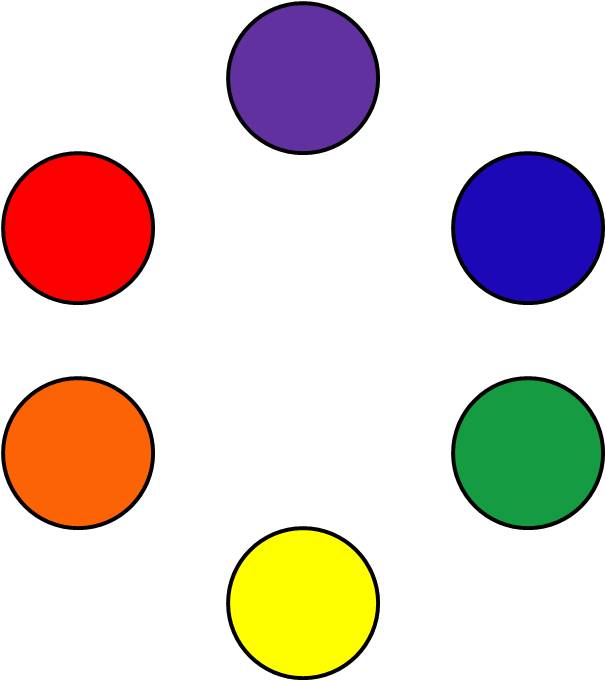
Let’s take a look at our color wheel:
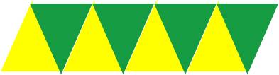
Planet-shattering, isn’t it? This is a very simple color wheel, listing only primary and secondary colors. Primary colors are red, blue, and yellow. They are called primary colors because every other color (including black) can be mixed up from them. Purple, orange, and green are called secondary colors because they are created by mixing two of the primaries together (red and yellow make orange, yellow and blue make green, etc.). Notice that the secondary colors are in between the two primary colors they are derived from: orange is in between yellow and red, green is between yellow and blue, etc.
Complimentary Colors, Harmony, and Discord
Where colors are on the color wheel are important. Colors that are opposite each other on the color wheel are called complimentary colors. Viewed side-by-side, complimentary colors produce an effect called discord. Let’s take a look at purple and yellow:
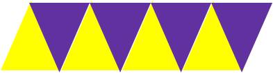
Doesn’t look quite right, does it? Take another glance at the color wheel and notice yellow and purple are directly opposite one another.
Colors that are near each other on the color wheel are called harmonic because, when placed side-by-side, they produce something called, well, harmony. Take a look at how much better yellow looks with green than it does with purple above:
In general, primary colors go well with each other. Secondary colors less so, but there are ways to help (more on this later). Black and white tend to fit in pretty well with any color (including each other, take a look at the Black Templars and their color scheme) because they are neutral colors – more on that later.
What about brown? Brown doesn’t make an appearance on the color wheel. Strictly speaking, it’s a very subdued shade of orange, but I’m getting ahead of myself. You’re better of getting a brown off the shelf; it’s a tough color to build from “scratch.”
Black is placed in the middle of the color wheel because (in theory) you make black by mixing all three primary colors together. Practically the results are a little different (you usually end up with a gray or a brown), but you can try it if you like. Again, you’re better off buying your black off the shelf, as it’s almost impossible to get correct mixing it on your own.
Value vs. Intensity (Saturation)
It’s also important to speak about two properties of colors that are often confused. Value refers to how light or dark a color is. The less value a color has, the lighter it will be. The darker it is, the more value it will have. Generally speaking, to make a color lighter you’d add white, or another light color. For example, it’s usually better to add orange or red-orange to your browns to lighten them up. To get a lighter red, you definitely want to add orange or yellow (it will look pink if you add straight white). This is important when you go to highlight your minis, whatever technique you use (drybrushing, layering or blending). Here are some good rules to follow when trying to get a lighter color:
-Blue: mix with a lighter shade of blue or white
-Green: mix with a lighter green, yellow, or white
-Yellow: mix with white – pretty much your only option!
-Orange: mix with yellow (tends to look pink when you use white)
-Red: mix with orange or yellow
-Purple: generally OK to mix with white; sometimes you need to add blue or red
Add gradually – it’s easy, especially with white and black, to overpower your original color. If you’re mixing a shade for highlighting, you may have to start over if you add too much of the lighter color. Don’t worry; if you don’t have the hang of it, it doesn’t take much practice.
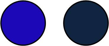
Intensity (or Saturation) refers to a colors brightness, or how “vivid” a color is. Below, the blue on the left is more intense than the one on the right, while they both have approximately the same value.
It’s easy to make a color less intense – all you do is add some of the complimentary color. For example, for purple, you add yellow. For blue, add some orange. Again, add the complimentary color very slowly, because you can quickly end up with brown or gray.
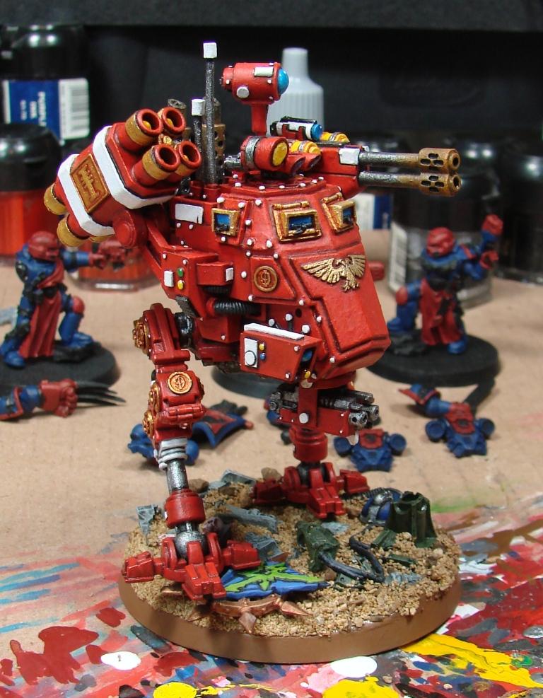
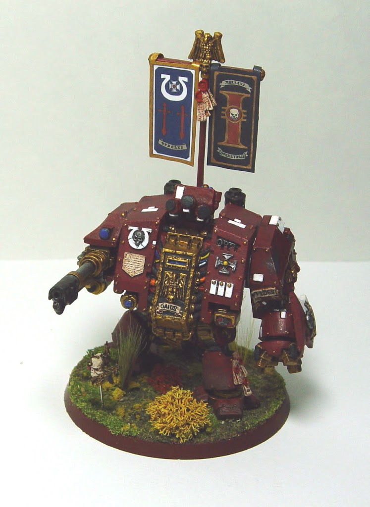
Which is the more intense red? The Dreadnought or the sentinel? Which is a darker value?
Going the other way (making a color more intense) is much more difficult, but there are a few options. First, you can mix the paint with ink. Inks are much more fluid and usually more intense than most acrylic paints. You do have to be careful when mixing them as they will substantially change the consistency of your paints (making them more fluid and less opaque). I would recommend glazing instead. Glazing is done after the base color is applied, and involves painting a layer of undiluted or almost undiluted ink over the top of the base color. Different brands of ink have different properties, and glazing can sometimes produce a very glossy effect. If that is the result you are after, no problem. If not, you can coat with some dull-coat lacquer, or dry brush a layer of a slightly lighter color to take some the shine away. I’ll talk more about lacquering, when you should, and when you shouldn’t in a later article.
This Deathwing Captain’s power sword was glazed with citadel blue ink and blended with many layers of drybrushing. It was a difficult technique and I am glad I figured out layering afterward. Vallejo also makes inks, and they don’t have the “glossy sheen” problems the old citadel inks did – even when glazing.
Opacity and Coverage
Now would be a good time to talk about opacity, intensity, and coverage. Opacity is a measure of how much light a material reflects. In terms of paints, it’s how “solid” the color looks after a single coat. Due to the physical properties of paint (see gentleben’s excellent “What the hell is paint?” article), more intense (i.e. “vivid”) colors tend to be less opaque- this is why it’s so damn hard to paint things bright yellow. Fear not – there is an answer. I’ll get more into undercoating in a later post, but it’s possible to get really good results by using a less intense, more solid color first, and then painting on top with the more vibrant, less opaque color. I’ve found citadel’s foundation paints to be especially useful in this situation; they are nice and opaque, and the brighter Vallejo colors I like so much go on over them very well.
Warm colors, Cool colors, and Neutral colors
There isn’t a real textbook definition for warm and cool colors. Orange, red, yellow, and some of the red and yellow-browns are considered to be warm colors. Blues, greens, and purples are considered to be cool colors. Whites, grays, and some of the darker browns are considered to be neutral, simply because they don’t fit into either of the other categories.
Selecting Your Palette
When I talk about a color scheme for a particular figure, I generally refer to it as the palette for the figure. There aren’t any absolutes when selecting a color scheme; there are a lot out there in the fluff for 40K, WFB, Epic, and on and on and on. I prefer to select mostly harmonious colors, and mostly cool or warm colors.
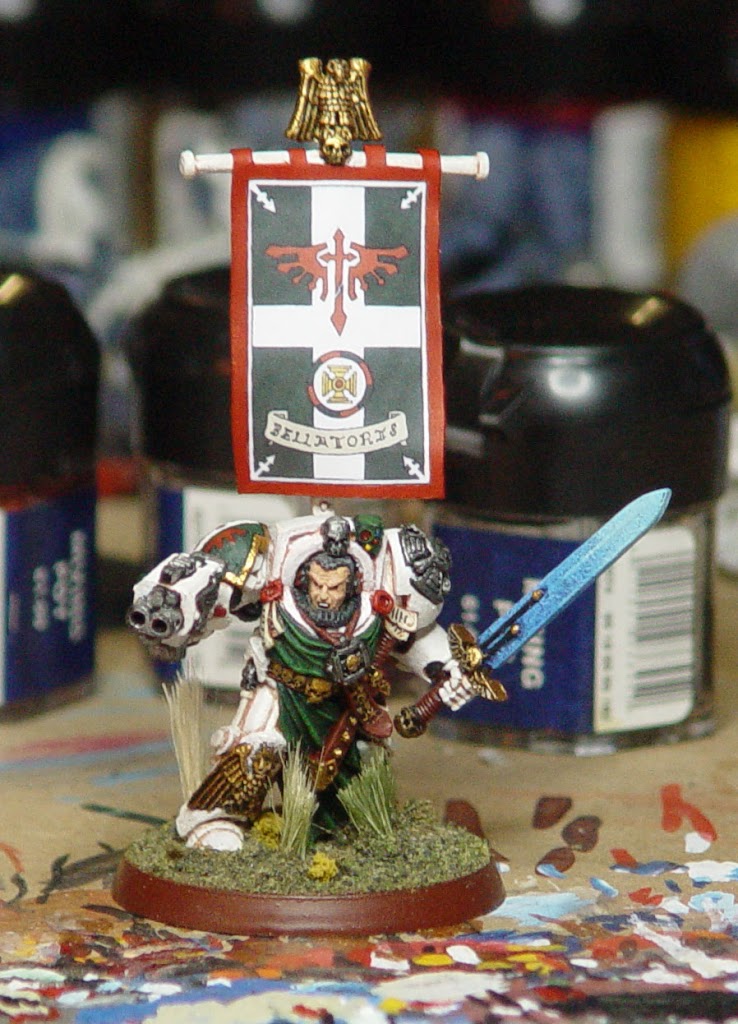
If you feel like putting complimentary colors next to each other, try cranking down the intensity of one (or both) of the colors. Although the green on this Dark Angels Assault Sergeant is fairly intense, the red is not (in fact, it’s almost brown). The result is, it doesn’t produce a whole lot of discord and generally looks okay, even right on top of the green (a complimentary color). The bright red, orange and yellow on his power sword balance out the green and the neutral tan color of the parchment, and since the cross-piece of the sword separates them, the sword colors don’t generate much discord.
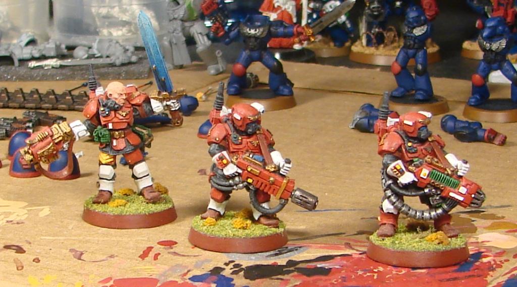
These inquisition storm troopers are done almost exclusively in three colors: red-brown, black, and white. I like to use a three-color palette; it’s just personal preference. I’d advise three to four main colors until you get a better feel for it. Notice none of the three are exactly the same – I never really nailed it down, but I kind of like each one being subtly different.
If you’re painting Space Marines, the folks at Bolter and Chainsword have an excellent color-testing tool for your Marine color schemes. Again, I’ll speak more about color testing later, but in the meantime take a look: http://www.bolterandchainsword.com/index.php?autocom=pages&do=show&id=1 Also on the same page are links to a terminator painter and a sisters of battle painter. Thanks for the work, guys!
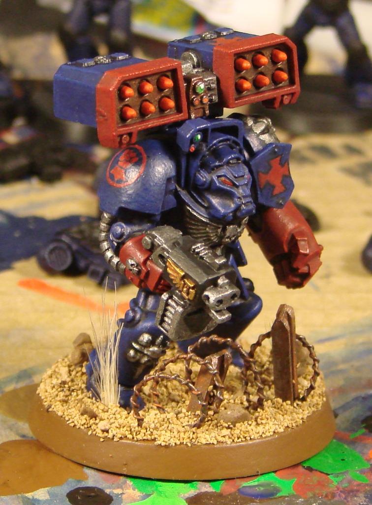
Notice this Crimson Fist terminator is done in mostly cool colors – in fact, he’s almost entirely blue. I went with warmer, more intense colors for the details on him to provide some contrast and make him a little more visually interesting.
It’s really up to individual preference, but remember a few basic tenets and you’ll be okay:
-Colors should be mostly harmonious – too much discord will just be a distraction.
-Colors should mostly be warm or cool (neutral colors look good next to both types).
-Try to stick to a few (three to four) main colors – it’s a good balance between being visually interesting and being too overwhelming.
~Well, that’s all for now. Post away with questions and responses for Skarboy who submitted this piece to get some more info into our painting section. This is the the type of info that seems second nature to the old timers, but is hard to track down for the new up and coming painters who just entered the hobby.