HOBBY: Back in Black

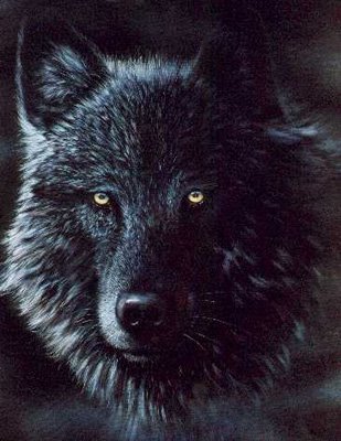
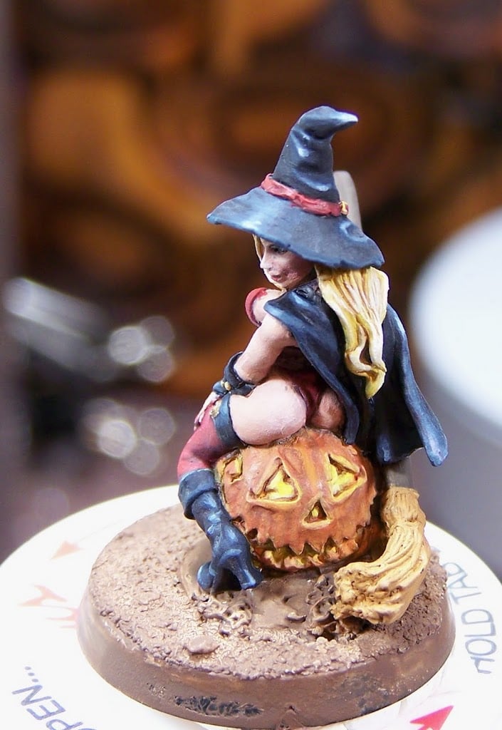
Most of us who paint on an intermediate level understand the idea behind shadow, base color, and highlight. GW’s paints are designed to capitalize on this idea as are the figure paints of other paint companies. This subject alone can spawn pages of discussion on color theory and paint mixing. On a basic level the idea is about properly rendering color in three dimensions through using rough proportions of 25% of the painted area being a shadow tone, 50% base color, and 25% highlight. I admit those proportions are terribly scientific and not representative of a painting style. However, those proportions are helpful when thinking about painting black. Black’s shadow and base color is black, which means once you have applied a solid layer of black all you will be doing is bringing up the highlights. This can be quickly observed on any model painted by GW’s Heavy Metal painters, and is obvious on chaos warriors or marines in black power armor.
The next concept in painting black is that black isn’t really black, at least not on cloth. Black is achieved in cloth through mixing dyes. This can be most easily observed in men’s dress socks. The color of black on the sock may be brown, blue, red, green, violet, and rarely grey. This knowledge can help us paint our highlights naturally. Armed with these two concepts, we turn to color selection.
Many painters, including myself at one point, will highlight black through the additive process. This means that we start with black and build our highlights by adding white to the mix. This is an acceptable way to highlight black, but I began to notice on my figures that these grayscale highlights looked flat and lacked life. This is when I discovered the paint color “Payne’s Grey”.
This wonderful near black color can be mixed using black, blue, and a dark brown. Alternatively you can get this pre-mixed. GW’s version is Necron Abyss, which is not as near black as I would like, but could easily be made closer by adding Chaos Black to it. Reaper Miniatures makes a color called Blue Liner that I feel is spot on, and it is what I use.
I start by applying my first highlight of pure Blue Liner where I want the highlights to start and paint towards the brightest point of the highlight. After this is done I will start adding an off-white color to the mix and repeat. It is important to note that I add these highlights where the paint is thinned about 50/50 with water, and I add very little white at a time because white can quickly lighten up the color, which can spoil some of your transitions.
It is important to note that using an off-white color is preferred. I suggest this because pure white can bring up the color too fast, and make your work look chalky. If you’re using GW colors I would suggest for your off-white using Bleached Bone, Dheneb Stone, or Astranomicon Grey mixed with some Skull White. I use a set of three off-white colors from Reaper. They are Linen White, Leather White, and Ghost White. Using any of these off-white colors will produce some really great effects when used with Payne’s Gray.
How do you highlight black? Have you used these colors before? Tell us how these concepts work for you.


