Hobby: The evolution of a painter! Jawaballs and his tanks.
11 Minute Read
Jul 30 2010
Advertisement
Hey Folks, Jawaballs here!
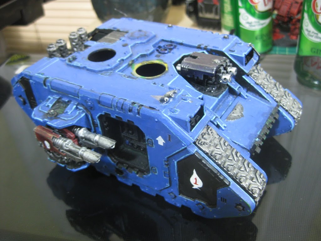
I thought I would share with you a pictoral history of my tanks and how they evolved since I started with 40k. I began in the fall of 2006 and started with Ultramarines of course since they were the ones on the box and the ones in the GW step by step tutorial. Here is a picture of my very first Space Marine tank, a Land Raider.
Notice the standard GW Ultramarine blue on black technique highlighted with Ice blue. Oh, and check out the exquisite hand painted white spade with the red one! I just watched The Big Red One and was playing around. I know, not all that creative. (By the way I’m laughing at myself about the spade. It sucks.)
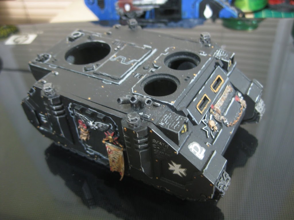
This tank nearly sunk me on painting 40k. I tried, and only marginally succeeded. At that time I had switched over to Daemonhunters and was playing around with painting Grey Knights as I got move involved in the hobby. (Of course!) But even as a 40k noob I realized that there were gaping holes in the DH codex and I started looking at using allies. Back to my space marines! So I ran off to the hobby store and found the Black Templar codex and loved that they had a very similar style to the DH, and decided to attempt some of them to go with my GKs. Here is my first attempt at a BT tank:
I only did a few BT tanks, a Land Raider and a Vindicator to go with this Rhinoback. The others have since been given away or traded. I show this because here, with a limited color pallet, you can see my attention to extreme highlighting starting to form. I know, some of you hate my style, but some of you like it. So blah! My highlights were sloppy, but you can see where I learned what parts to emphasize over others. You see, Emphasis is one of the Principles of Design. And learning which elements of any piece of art to emphasize is key. In this case, look at the smoke stack in the forground. You can see certain parts of it have more extreme highlighting. You can see other lines of the tank that follow the same pattern, and in later tanks, the pattern repeats. This was the tank where I started to figure it out. Finally note the hand painting script. My creativity was budding!
I toiled around with Black Templars for a bit, getting my butt whooped on by Fritz over and over, until the Spring of 2007 and the release of the Blood Angels PDF. Finally, an army that had the assaulty elements that I loved in the Black Templars, that did not have silly restrictions as to what tanks I could use. I loved the Whirlwind at the time, don’t ask me why… I guess I was a noob still and thought they were cool. Remember a time when we bought and painted models based on how cool they looked rather than how effective they were?
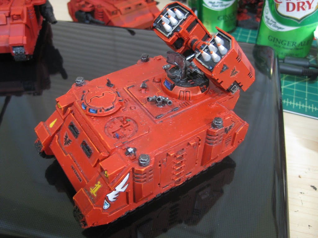
The Whirlwind was the next tank I painted, and the one that made me realize that I can do this well.
In this piece you see my attention to emphasis, and my highlighting got better. Even more edging. But also, you see that I actually finished this tank. I started thinking about color theory and accents, and threw in some blue on the view ports to accent the orange highlights. Most importantly, and this is the part that opened things up for me in my painting, was the blood drop and angel wing. I did a search and found something similar to this and wanted to try it. I feel that it came out pretty good for my first try! Granted, this tank leaves a lot to be desired. There is no blending, and it is still pretty sloppy. But still, when I showed up at the club with this for the first time, people started to pay attention to me and ask questions.
From here, things went pretty fast. Blood Angels were now my army. I started painting my first real army in August of 2007. It consisted of almost all jump pack marines, with a Whirlwind of course. It did not take me long to figure out that the WW sucked and my boys were getting torn up. I had to get my guys some mobile cover! So I started pulling off the jump packs and I bought some rhinos. Here is the first:
Behold, shading! Squad markings, readable words, not too terrible highlighting, and my first real hand painting all landed. This was already a quantum leap ahead from the Whirlwind. I began experimenting with washes and inks. Also, I free handed the large black icon on the top of the tank. I also started experimenting with something called scumbling, which is an oil painting technique I use to do portraits. Essentially you dab your paint onto the brush, then dapple it onto the canvas, spreading out until it is gone. This blends the paint into the paint already on the canvas and creates transition in value as well as texture. I think with this tank it can be said that Jawaballs arrived. This was also the around the time I did my first tutorial video. But quickly following this, almost within days came the next two, a vindicator and another rhino:
At this time I had a little painting renaissance. Here you can see me really develop my scumbling technique where I used a cut down dry brush to dapple the paint onto the edges, blending into the meat of the armor plates. You can also see both the hand painted black icon appear, and a little bit of white angel wing action. I also hand painted the 5 on the blade. This lead me straight into a rhino which I started the next day.
Here I combined the two effects, the white wings with the icon. I looked around on line and borrowed a similar look from Ron at From the Warp. He did something like this on a Death Company Rhino. You can see me start messing with battle damage, and really start pushing the transition of value in my shading and blending. I also tried toning down the messy wash stuff.
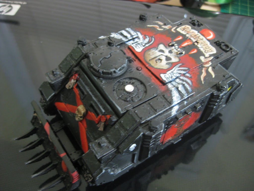
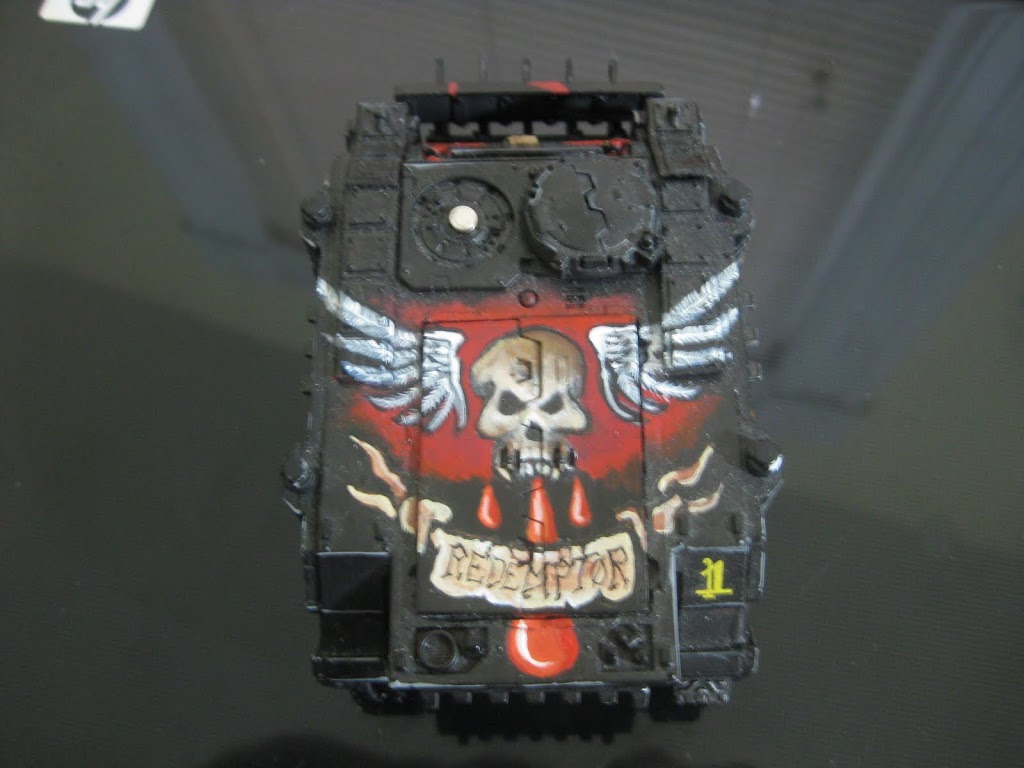
This tank led me into my next two Rhinos, another red, and a Death Company Rhino of my own.
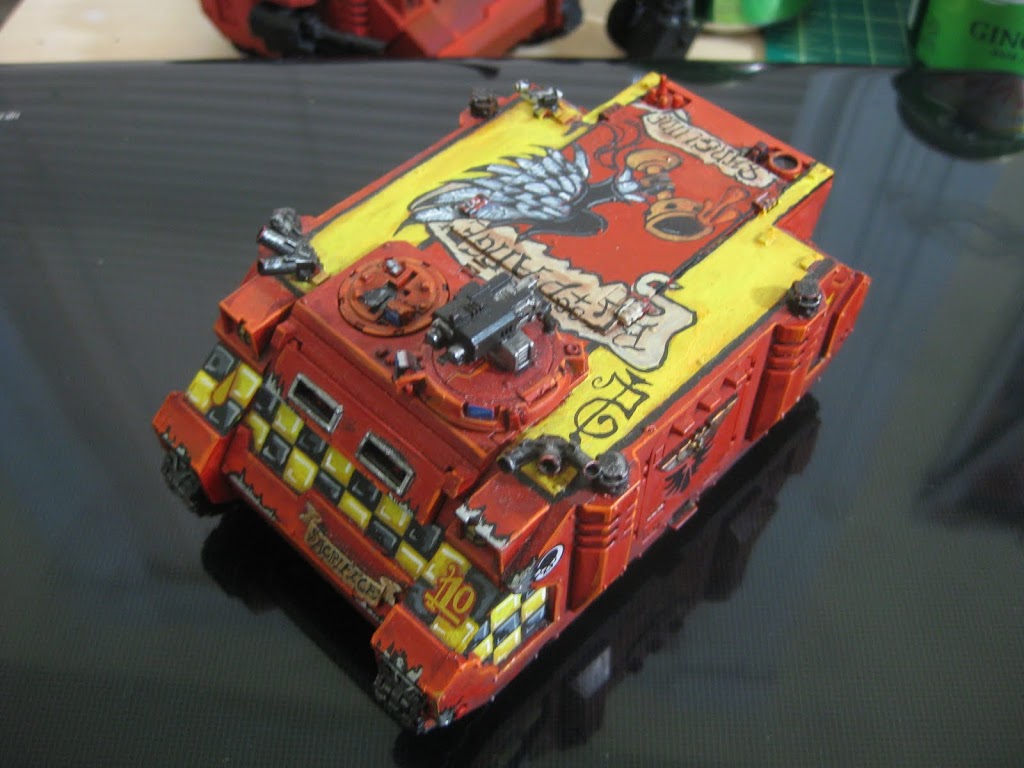
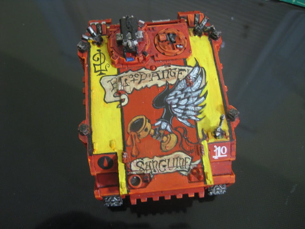
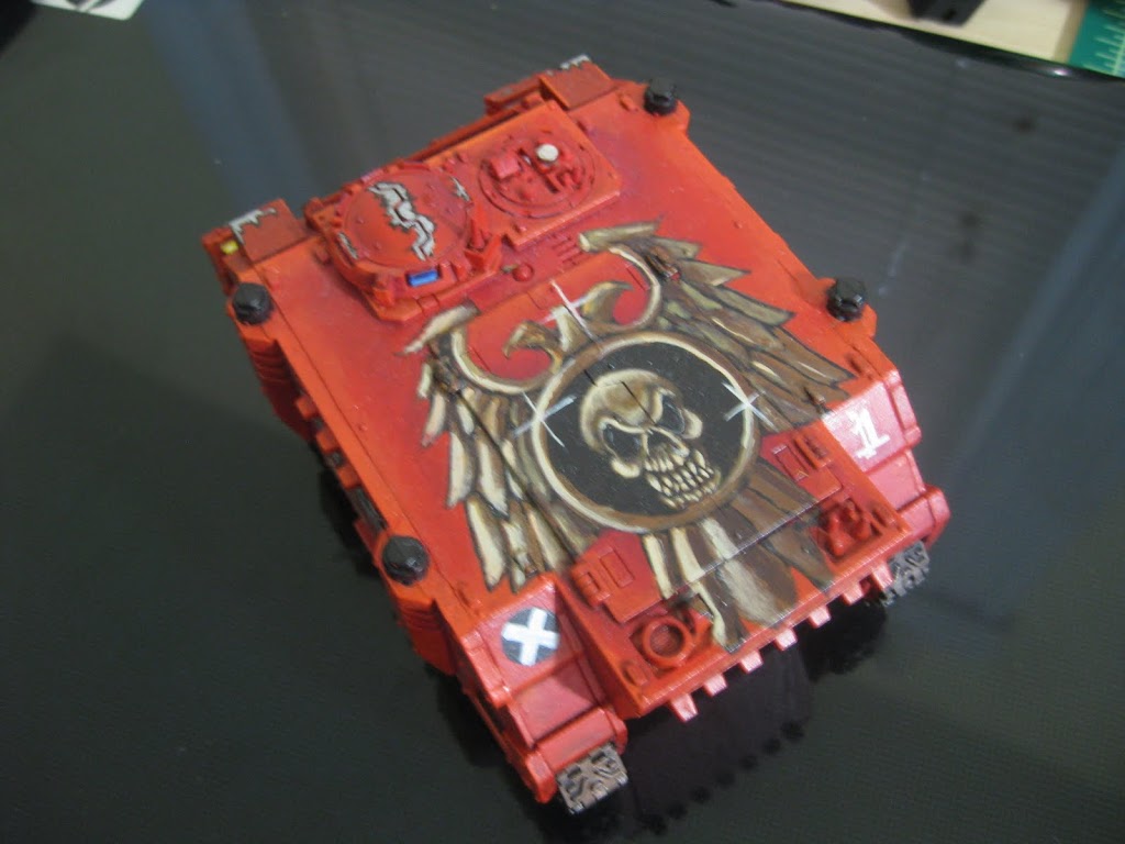
You can see a vast leap artistic expression over the course of eight tanks. In the skull I worked on layering browns to create depth, and on the red you can see extreme free hand work going on as I painted straight from a picture of the banner in the codex. By now, I was winning best painted and turning heads. But I had a huge problem. At this point, almost every tank in my army looked a little different. You can see that I got better with each one. The problem was that I had no unity! When I displayed my army, it looked like some of the tanks were painted by completely different people.That lead me towards the checker pattern. A good choice or no, I decided to add checkers to all of my tanks a bit later on, which is why you see checkers on the red rhino. I went back and threw them in. More on that in a bit.
From here I discovered the pleasure of the Baal Predator. And started messing around with those.
Advertisement
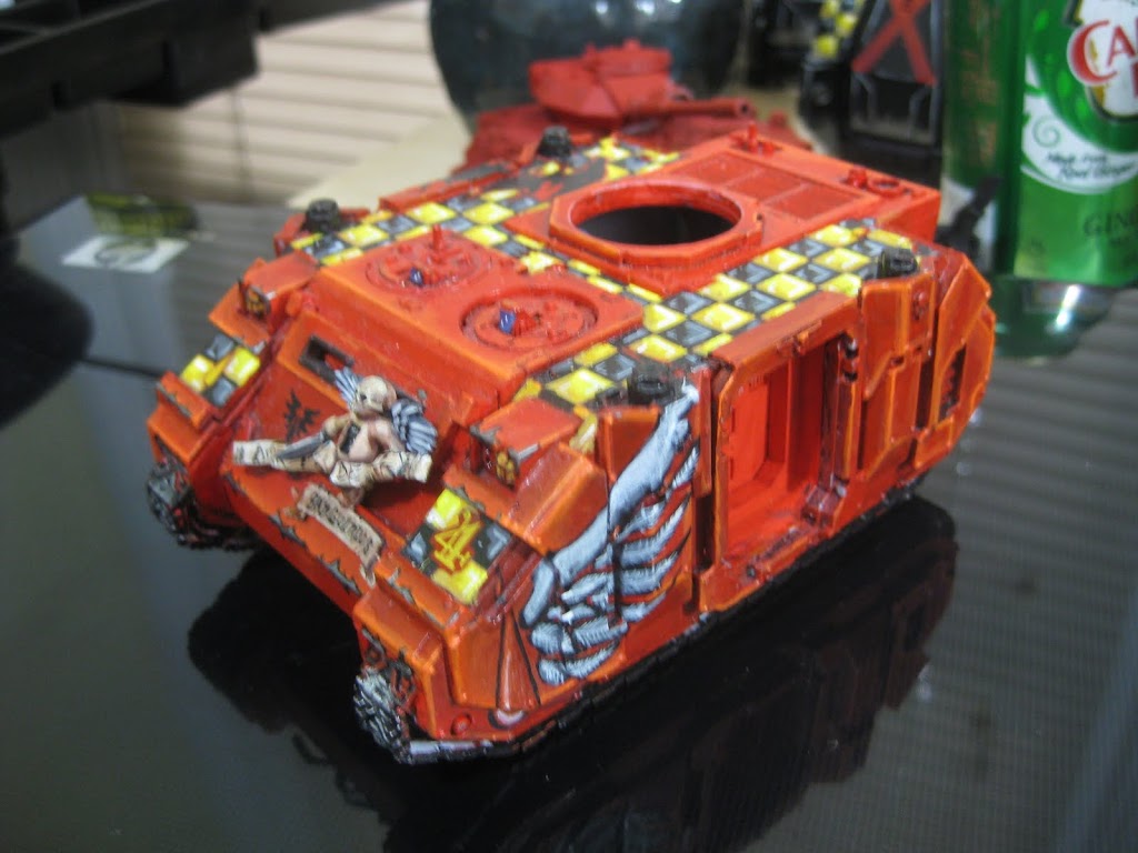
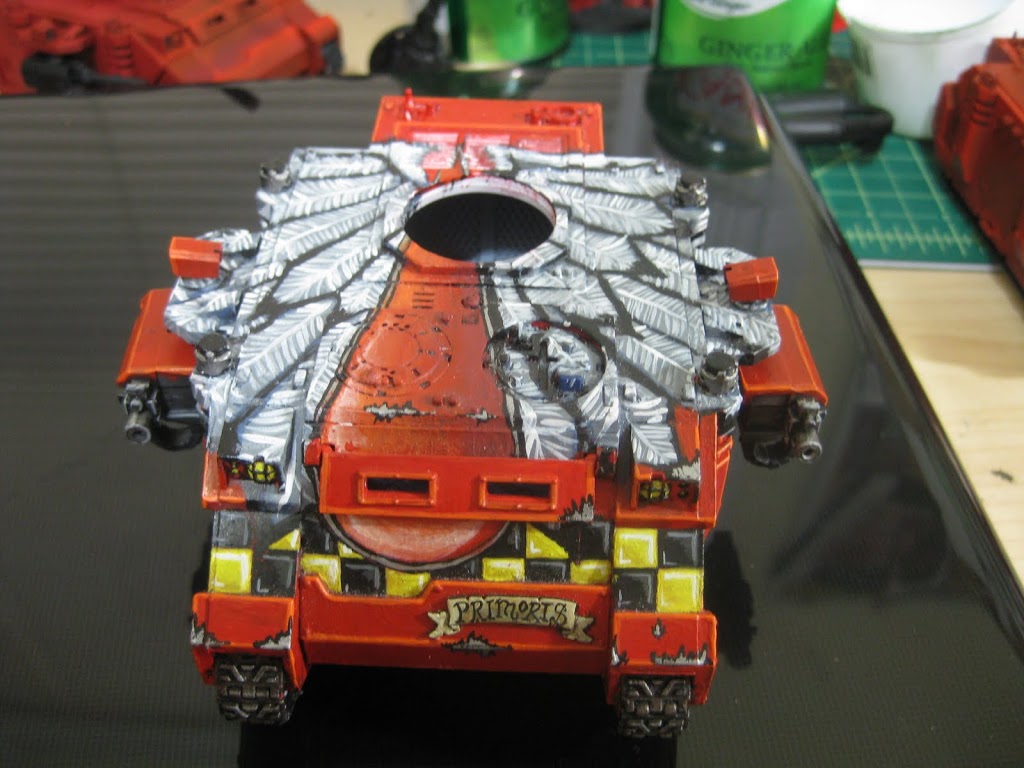
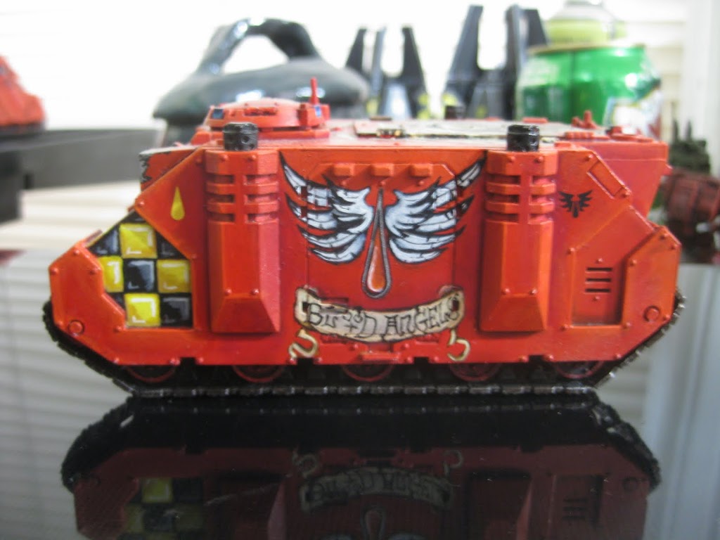
This old boy has seen a lot of action. It is now serving as a Razorback in my transition army, but you can see some elements here that really brought my painting game forward. The cherub on the front was my first kit bashing experiment. I found that in a fantasy box set. The tank itself was a celebration of my blending, scumbling and highlighting effects. The checkers came later of course. I am most proud of the angel wing on the side. I felt it was a very subtle, yet beautiful addition to the tank, which at the time was the best I had done.
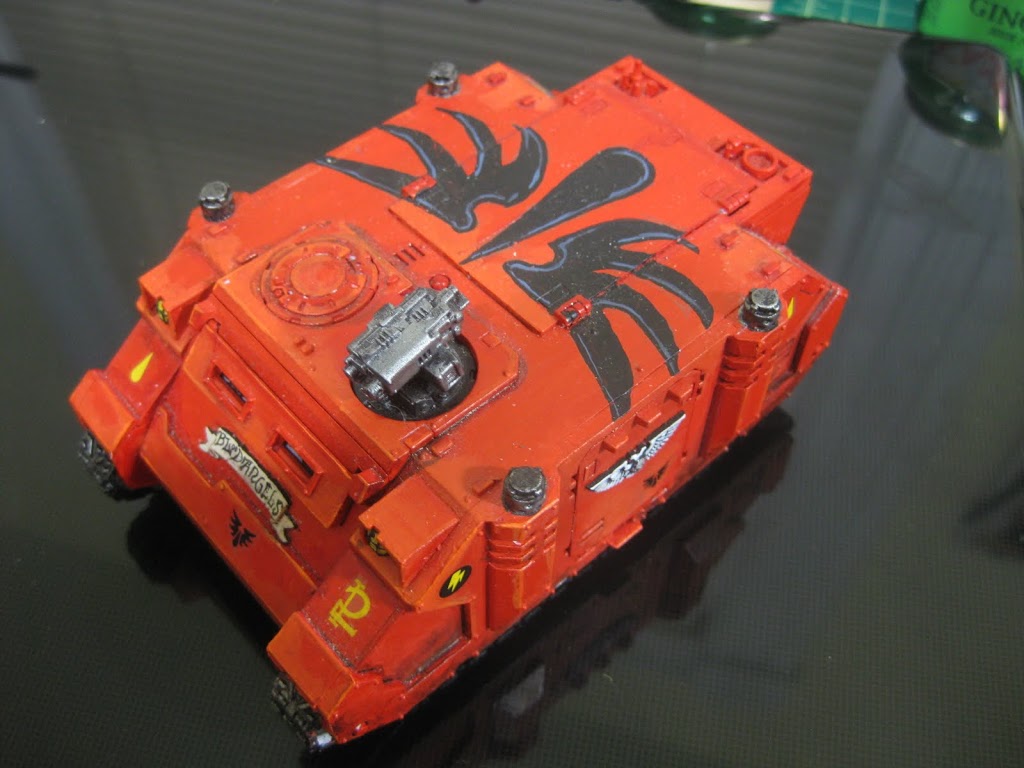
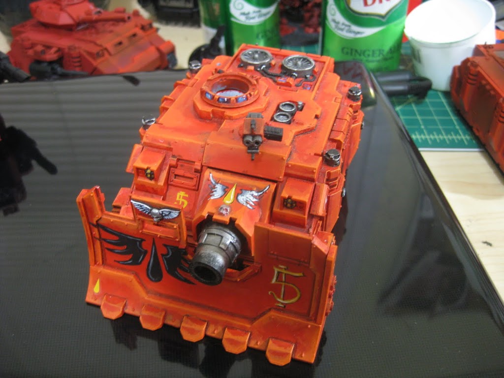
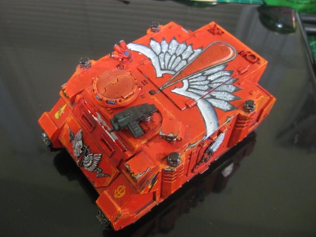
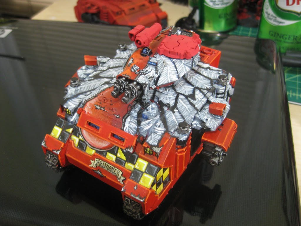
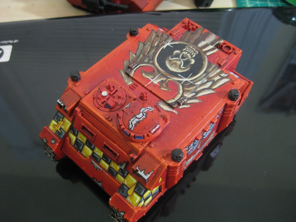
Then came my favorite tank to date. This one is either a love or hate. I entered it into a painting contest on Miniwargaming and did not win, but won Best Painted Tank at Bolscon last year. Of every thing I have painted, nothing has gotten such mixed responses!
This was the first tank I added checkers too. But obviously they are the least of the issues with this thing! People either love or hate the wings. The concept is a huge Blood Angels icon. You can see the blood drop coming down the middle slightly off centered. I painted over and under the turret so if you remove it, the painting is still complete.
I used the same stylized wings that appeared on a previous rhino, and deliberately ignored realism for style. One of the biggest points of contention was the off centered blood drop! Why did I not put it down the middle? Without a doubt, every one that has ever seen this model has pointed out that I messed up. Well, I didn’t. Er… no, the off centered blood drop was intentional. First of all, symmetry is boring. Ever since I was in high school, I always tried to break away from what every one else did. Every thing I had done to this point was right in the middle of the available space, and symmetrical. All of the Rhinos were painted right smack in the middle. Even the one with the banner image on the back manages some sort of symmetrical balance. Well on this I wanted to throw a little asymmetry into the mix. I figured hey, the Blood Angels are the most renowned artists in the imperium. They would understand the concept and apply it to their work. So taking a nod from a documentary I watched on The Acropolis in Athens, I went to work. The Parthenon, part of the Acropolis hill is such a massive, geometrical, symmetrical structure that the architects, in a groundbreaking decision, made it slightly off balance. You see, if they made it perfect, it just did not look right. Parallel lines caused optical illusions of sagging structures. So they intentionally added misaligned curves and structure quirks.
Armed with the knowledge of the ancients, I painted my wings off centered, and to this date am still happy with my decision.
Here is where the checkers came into existence. I painted them onto this piece in an attempt to balance out and validate the off centered wings. Then I realized that I could not have so striking a geometric pattern on one tank, and decided to add it to every tank in my army to bring Unity back into place.
The next tank I painted was another rhino.
Advertisement
While this tank was part of my PDF Mech list, you can see a pretty big departure from my original painting style. I got away from the extreme highlighting and messy scumbling effetcs. I started playing with nonmetallic metal and more weathering. Mostly, I wanted to reign in my over expressive Baal Predator and start constricting my style. From this tank my new painting style was born, and this tank is the only one of my previous attempts that still has a place in my current army, thought it and it’s checkers will be retired once I get around to replacing it.
That rather long walkthrough brings me to where I am now with my painting. Now that I have more or less decided on a final army list, I can commit to what models I wish to paint and can start working on the rebirth of my army.
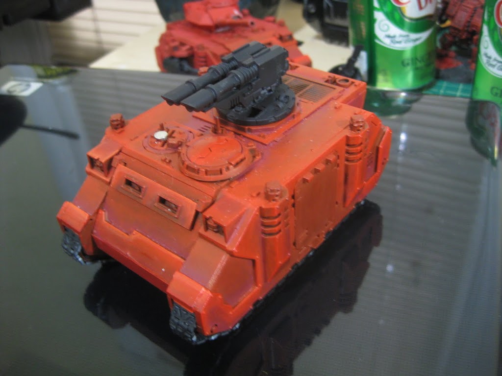
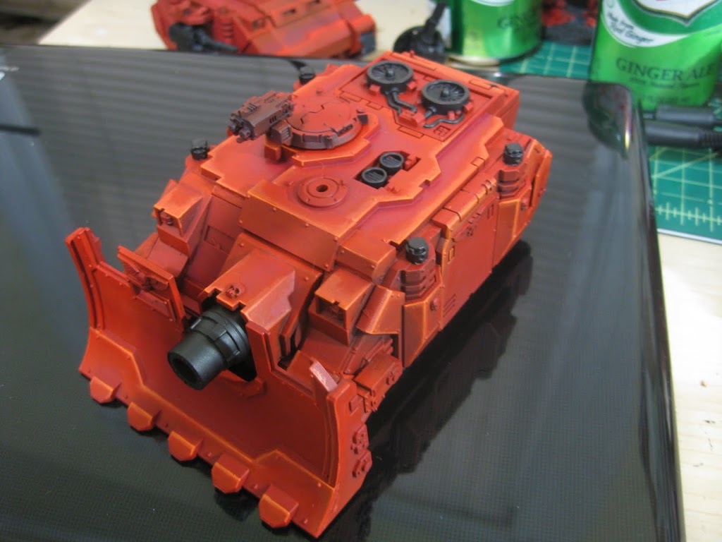
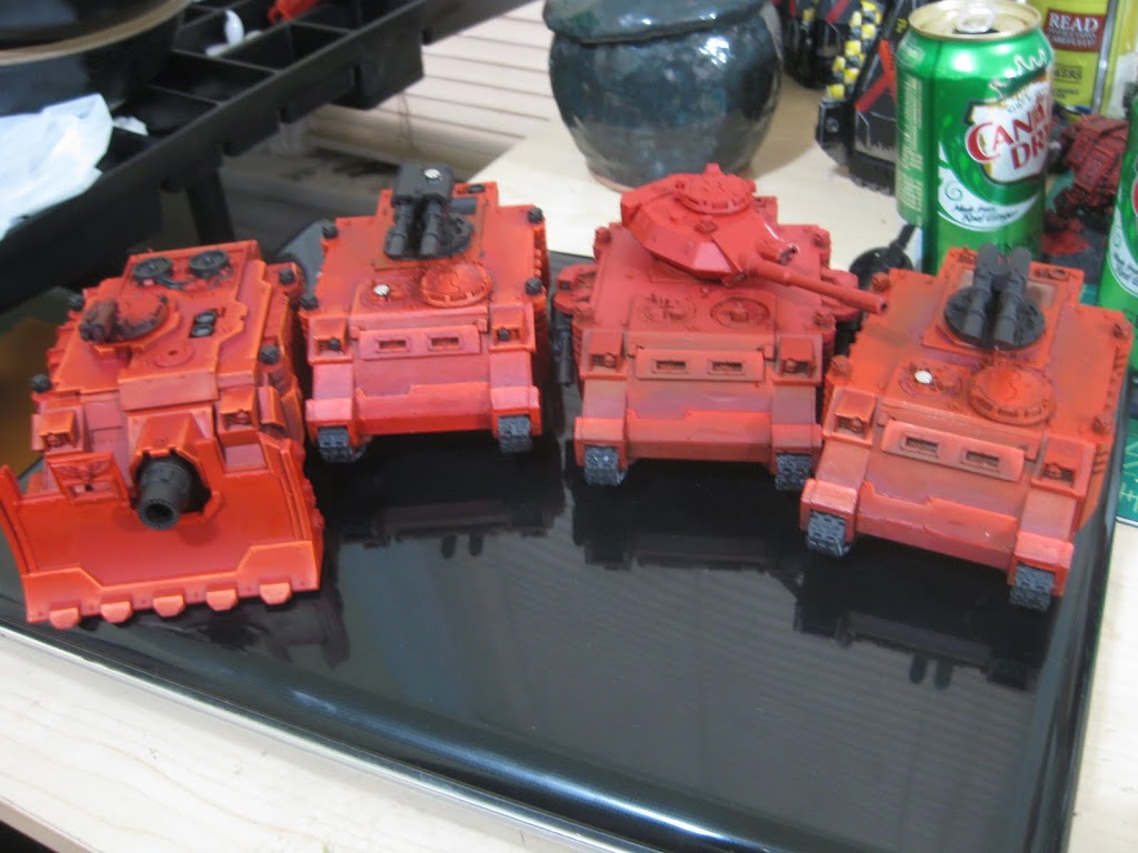
Firstly, I am going to completely underpaint, highlight and blend every tank in my army before doing any further personalization. It is of most importance to me now that my army be a unified force that looks like it was painted by the same guy.
Subscribe to our newsletter!
Get Tabletop, RPG & Pop Culture news delivered directly to your inbox.
By subscribing you agree to our Terms of Use and Privacy Policy.
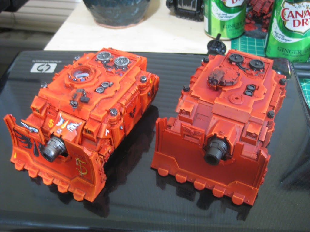
The Vindicator is the tank that is at the most finished state of this collection. But you can see the consistent blending and highlighting throughout the 4 tanks above. I will be doing a tutorial here on how I did these tanks later on, but the biggest change to my painting has been the use of The Army Painter’s Dragon Red colored spray prime. The stuff is beautiful! Previously I was doing the technique found in the White Dwarf Space Hulk edition where they used a mixture of Blood Red and Dark Flesh to do the undercoat. I will show you the difference between a tank I painted with that layering technique, which took over an hour, and a tank I sprayed with Dragon Red, which took about 30 seconds. Essentially, they were the same, with the spray being a little richer red while the White Dwarf technique was more brown.
Well that wraps it up. My fingers hurt! I will leave you with a picture comparing the two vindicators.
Compare for yourself which makes a better Blood Angels tank! I’m a little torn, but I have to say I like the darker, more brooding look of the recent tank.
What have your experiences been? When measuring self improvement, all that really matters is how well you think you have improved from your first work to what you are doing now. How often do you sit and compare and contrast? It is fun and you should give it a shot. Line up all of your tanks and see what you have done recently vs what did at the beginning.
You can follow the progress of my new Blood Angels army over at my blog where I will be demonstrating much more of the use of The Army Painter Dragon Red. Also you can follow my new Tau army as I build and paint a suitable table top army that I can still be proud of.
More to come!
Jawaballs
If you made it this far thanks! I can’t seem to comment on discus. Not sure why, but I apologize if I do not respond to any of your questions. I wanted to let you all know that I don’t have the power to delete comments. At least I don’t think I do, I wouldn’t know because I have never tried. I was accused of deleting unfavorable reader comments on an old post on BOLS. That is just silly. This is not my blog, and I am in fact only a guest writer. I’m just Jawaballs. I cannot moderate content. If your comments on BOLS were deleted, maybe you should consider what it was that you said? Remember, “It is better to be agreeable, than to be right.” The second Starbucks sermon of Steven.
Author: Guest Columnist
Advertisement

