LIGHT EM’ UP! Tips for Photographing Minis Like a Pro
Here are 5 easy tips to improve your lighting studio set up to showcase your miniatures in the best possible light.
Greetings fellow wargamers! Caleb with White Metal Games here. Over the years we’ve improved our lighting setup quite a bit here in the studio. Here are a few tricks we’ve picked up over the years.
1. Adequate Lighting
Unless you are going for a Noir style look, you are probably going to want more than one lamp. Fortunately lamps are cheap.
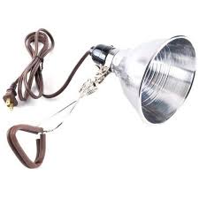
You can pick up a clip light such as this from a DIY store like Lowes or Home Deport, even Walmart, for about $5-6 bucks each. We recommend about 3 to be on the safe side.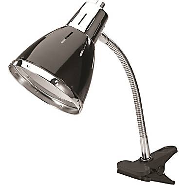
Can’t get to the hardware store? Not to worry, because it’s Back to School Time! You can find a lamp like these practically anywhere. They’re a tad more expensive because, well, because they look a bit more aesthetically pleasing and they’re intended for college kids with parents flitting the bill. So in that vein, ask your mom to pick you up one (or three) or these for about $10-20 bucks each.
2. Kill the Shadows
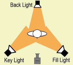
Now that you’re got your snazzy new lights, arrange them around your subject like so. This is the basics of three point lighting.
The idea is to eradicate shadows by filing in every angle of your subject, flooding those gaps with light. Sort of like how we use washes to fill out the details on a mini.
3. Quality Lighting
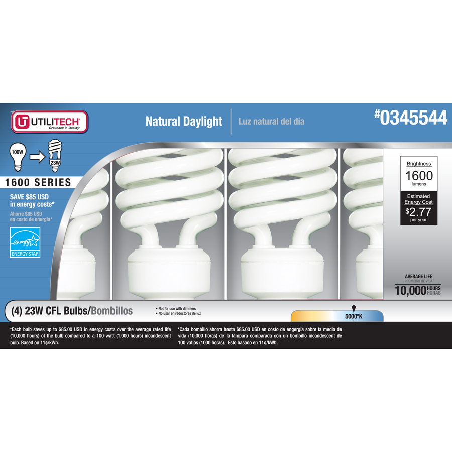 Things have changed since the day Thomas Edison first brought us the light bulb. Move over Edison, daylight is king! While your at the store, pick up a pack of Daylight balanced bulbs. $12 bucks will get you a four pack, which is more than enough lighting.
Not only are these bulbs brighter than traditional bulbs, they use less energy, so they save you money. Normally heat is a bi-product of using a traditional light bulbs. In general terms, the original light bulb was poorly designed from an energy use standpoint. These newer bulbs don’t get nearly as hot to the touch, so it’s more comfortable to photograph your models, which means you can shoot an entire army and still not break a sweat. Trust me, at the studio, we learned this the hard way. And even better, these bulbs will last much longer than traditional bulbs, so I’ll save money that way too!!!
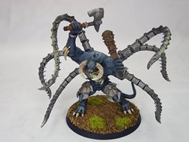
Case in point, see the two Daemon Princes below.
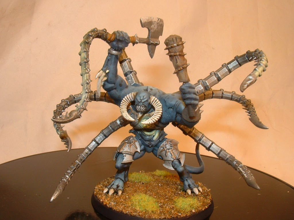 The first figure was photographed using regular 60 watt bulbs. The second, using the daylight balanced bulbs above. See how much cleaner and crisper the second image looks?
- Soft Lighting
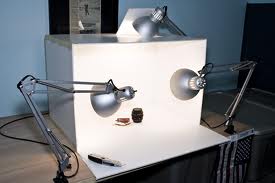
You’ll want to soften the light in some way, so it doesn’t strike the model directly. Softening is a term photographers use to describe the quality of the light striking their subject. Remember when you were in the highschool and the photographer had those white umbrellas with the flashes pointed into them? Same principle. The light didn’t hit you directly and as a result the indirect light was softer as it drifted over the subject. See in the below picture how none of the lights are pointed at the subject directly? The light is being bounced around the inside of the light box, creating a ‘soft’ overall light.
This will also help to prevent any damage to the figure over long periods of exposure to bright light. After all, you don’t want to spend weeks painting a figure and then have it fade when you leave it in the photo booth for too long!
Another way to do this is to take a thin white material, like tracing paper, white muslin (for you drama majors out there, cheese cloth (for you bakers out there), or even you’re mama’s nice white linens. The material should be thin enough that light can beam through it. Remember, if the light doesn’t reach your subject, then it doesn’t matter how soft the light is, the subject will still be too dark.
4. Simple or gradient background
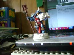
I see a lot of photos like this one out there:
And while this is okay for a quick upload to a site like Facebook or the like, it’s not really adequate when you want to showcase a model. There’s so much going on in the background I can’t focus on the model at all. You’re going to want something more like this:
 Gradient backgrounds are quite simply a fade from light to dark, usually colored in some way. Blue is common, mostly because it suggests a skyline. We’re used to seeing blue, we see it everyday outside (well, most of us do). Without getting into too much detail, finding a tutorial for how to print a gradient background isn’t all that hard. Just google it. Don’t have access to a printer? Then any basic blank white sheet of paper will do. Just try to position the sheet so we can’t see the edges. Ideally position the figure on the bend of the page. The idea is to create a seamless background, so all we have to focus on is the figure.
5. White = Bright!!!
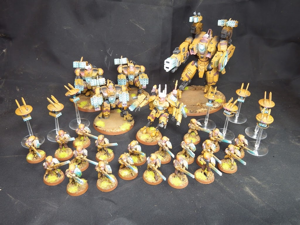 Ever notice that most photoboxes are white? Do you know why? It’s simple. White reflects light. So a nice bright white photobox will help to bounce the light around and brighten up the subject matter. Case in point, take a look at these Tau we recently did for a client.
See how overall the figures just looks darker? It’s not your eyes, it’s the background.
CONCLUSION:
By following these simple tips you’ll be able to improve the quality of your miniature photography in no time and then you’ll really be able to . . . .
PUT YOUR MINIS WHERE YOUR MOUTH IS!!!
So let’s see your best miniatures shots – go stick em in the Lounge here. ~Caleb

