Dark Age: Painting Mongo Part 2 – The Freehand

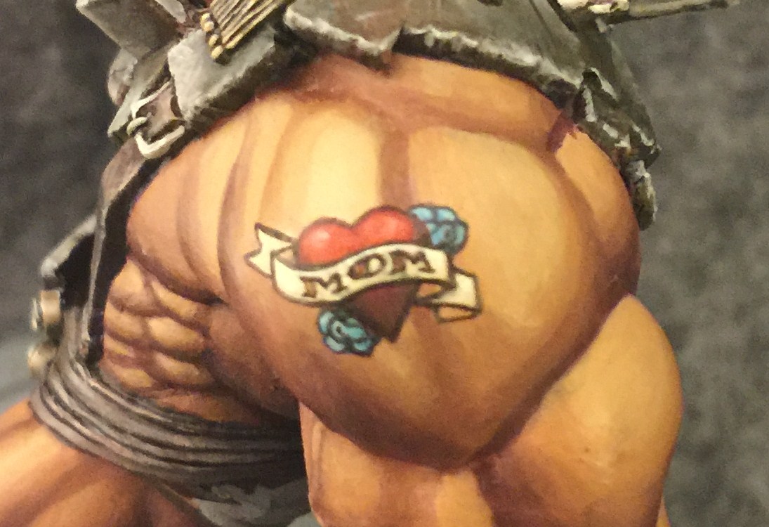
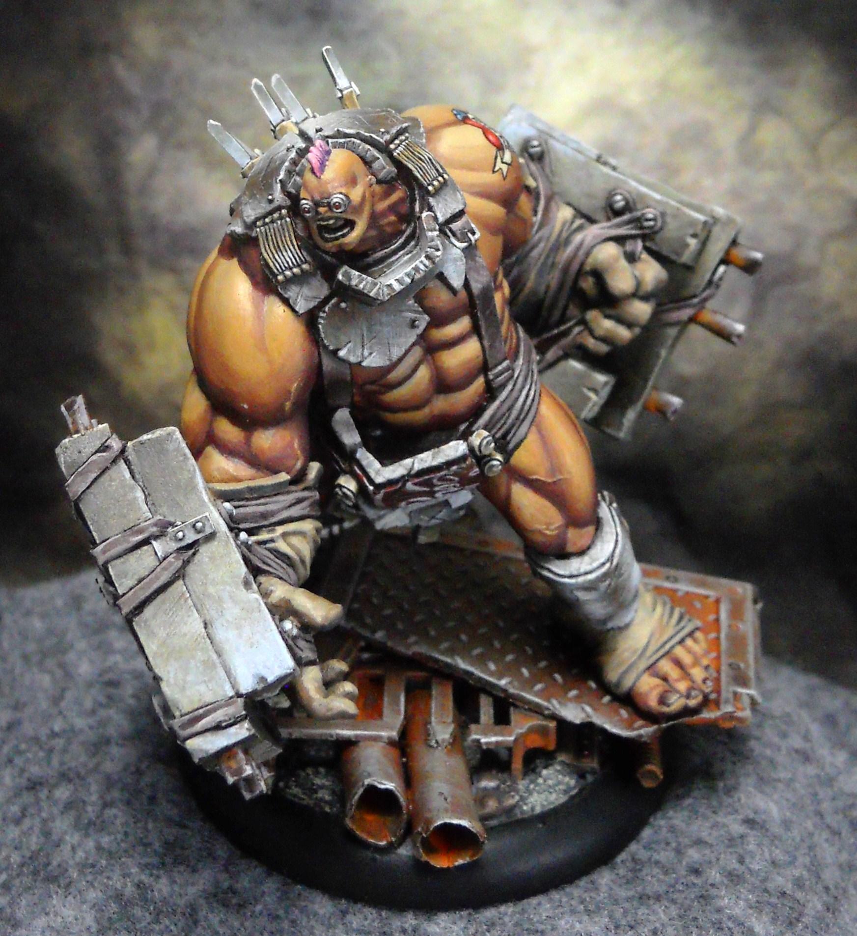
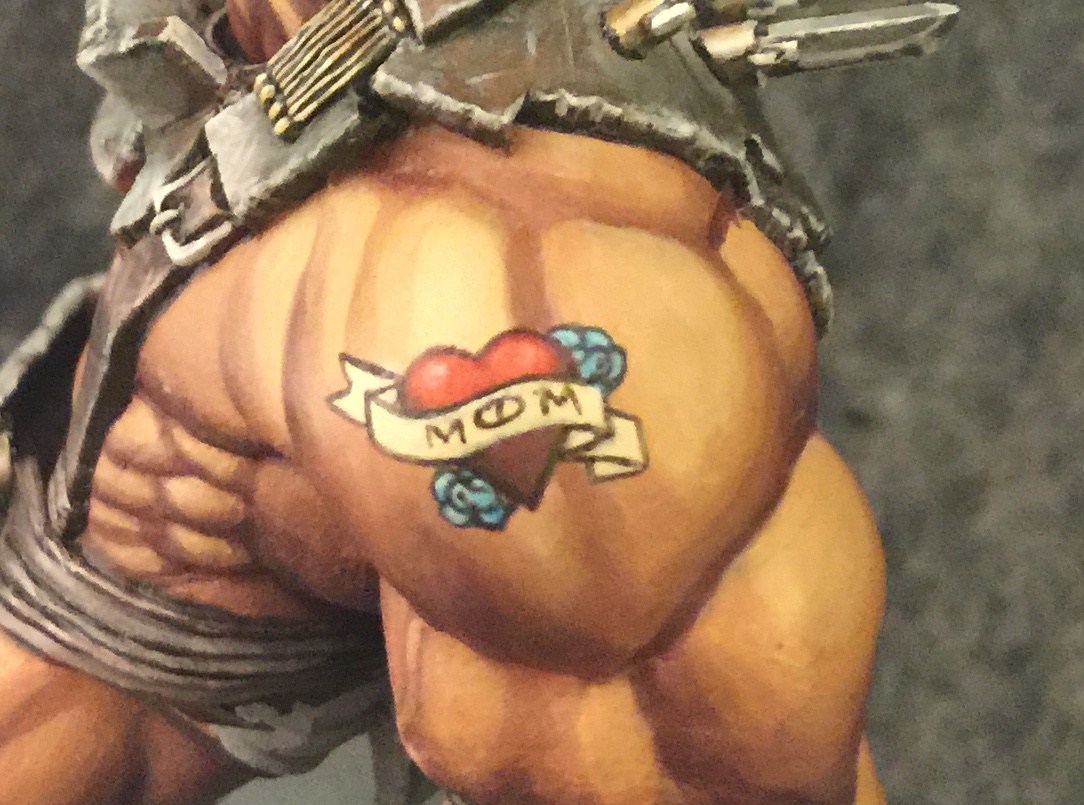
This time I’m going to do a step by step on Mongo’s tattoo and Belt Buckle.
If you missed the last article, this big beefy guy is the one getting the tattoo today. I wanted to do some freehand on all the exposed skin he guy has. At first my mind just wandered to the usual tribal stuff. It would have been pretty appropriate for Mongo here I think. But I wanted to do something a little more unique and unexpected that would also add a splash of color to the guy.
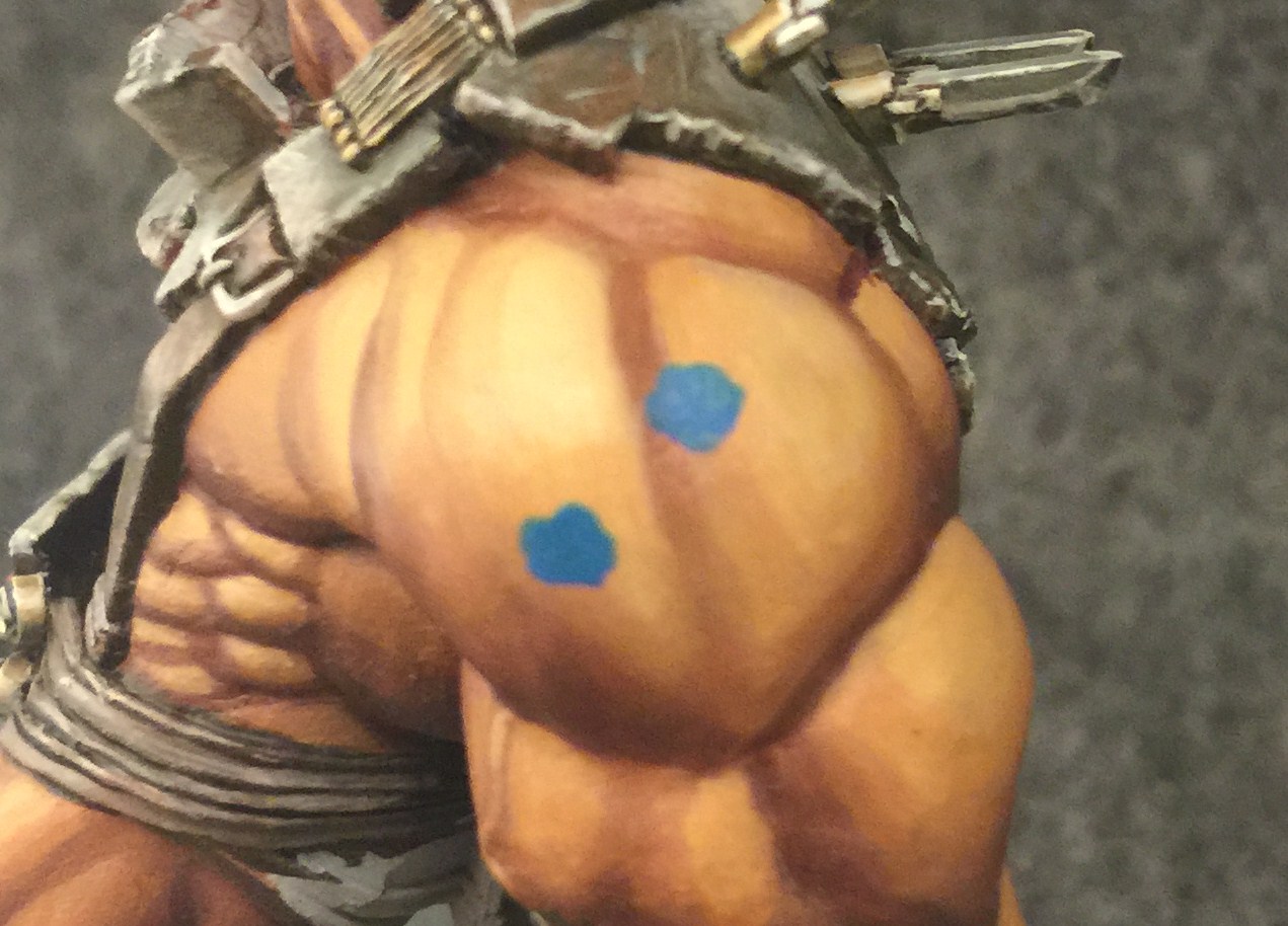
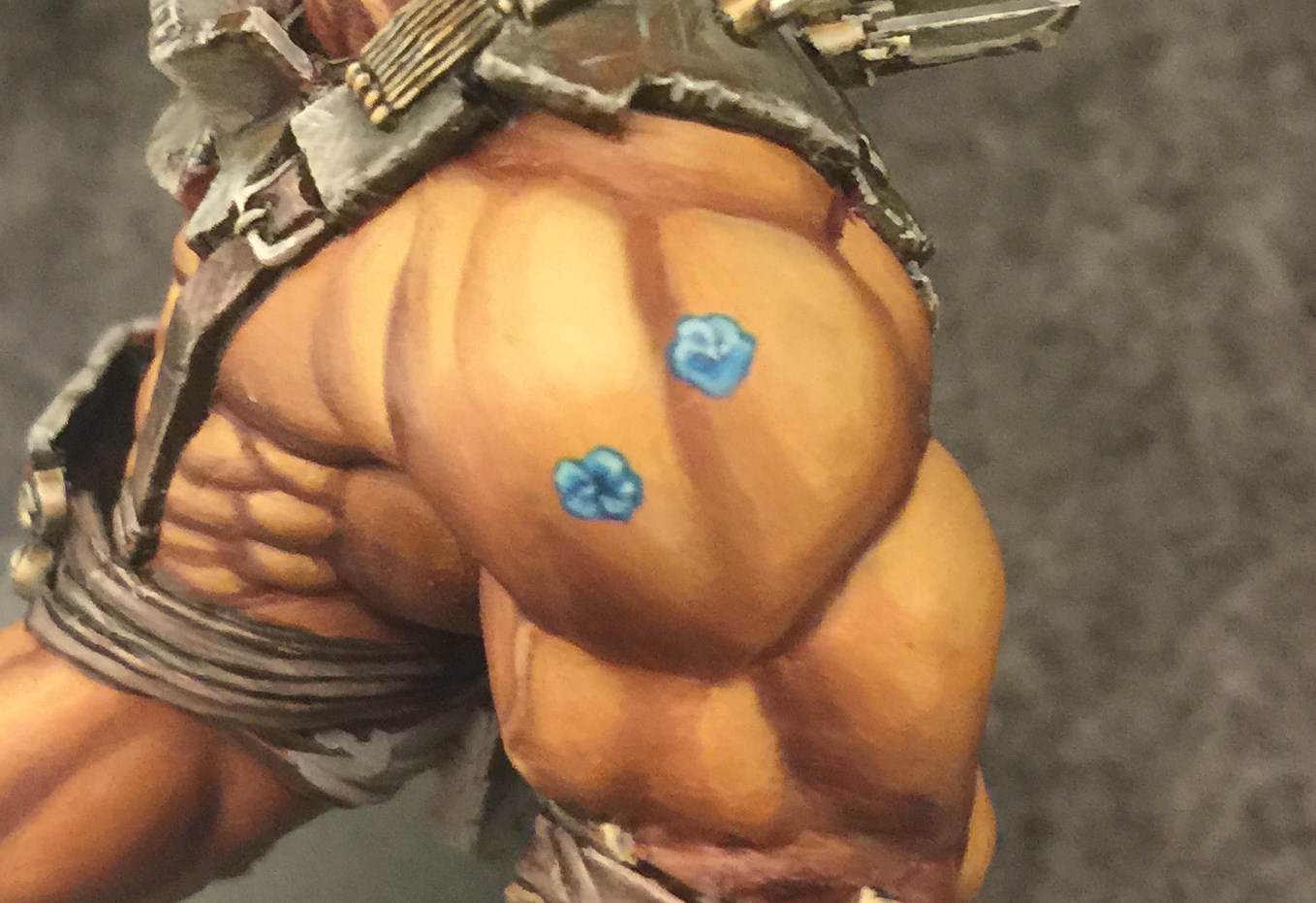
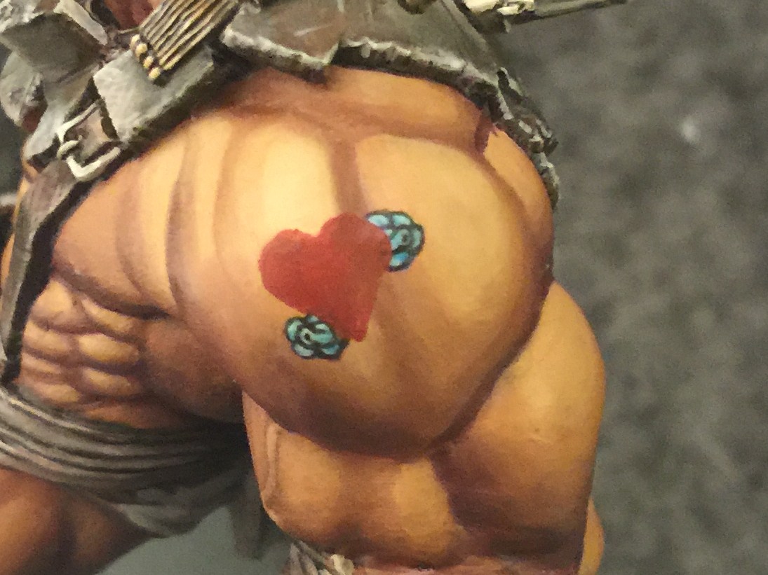
Unlike a real tattoo, this one is being done with paint. Paint is opaque so I can paint over whatever isn’t part of my final concept. And that’s important because freehanding is all about painting on top of old layers. Since the flowers are behind everything else, I’ll start with them. I begin with a basecoat of Cygnar Blue. Whenever you paint shapes like these, don’t just “draw” on an outline. These were each done by painting five different little blobs. It’s often easier to make shapes this way that by “drawing” them. They’re not perfect now but I’ll be outlining them later and that will give me the opportunity to change their shape up just a bit.
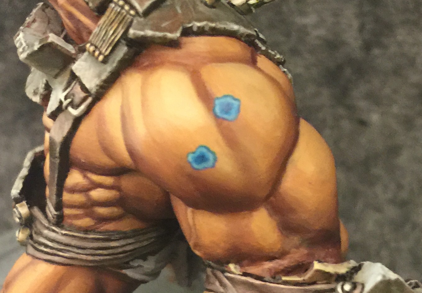
I add some highlights around the edge with Underbelly Blue, blending into the Cygnar Blue as it goes into the center.
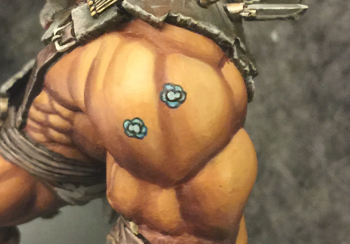
I start defining the petals with more frostbite, then shade them with Cygnar Blue mixed with a little Exile Blue. In this shot you can see the two flowers in different stages of painting. In the bottom flower this step has been completed while in the top the highlighting has just begun.
Next I add the central bulbs, and outline them and the petals with black. Unfortunately I’m not able to paint on the lines as thin as I would have liked, and I manage to cover up a lot of the earlier work. Oh well. I can always add it back.
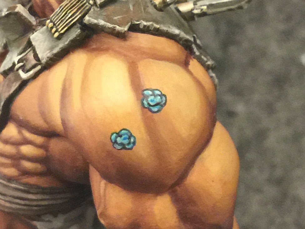
I try to put a little variation back into the little petals and begin defining the bulbs as well.
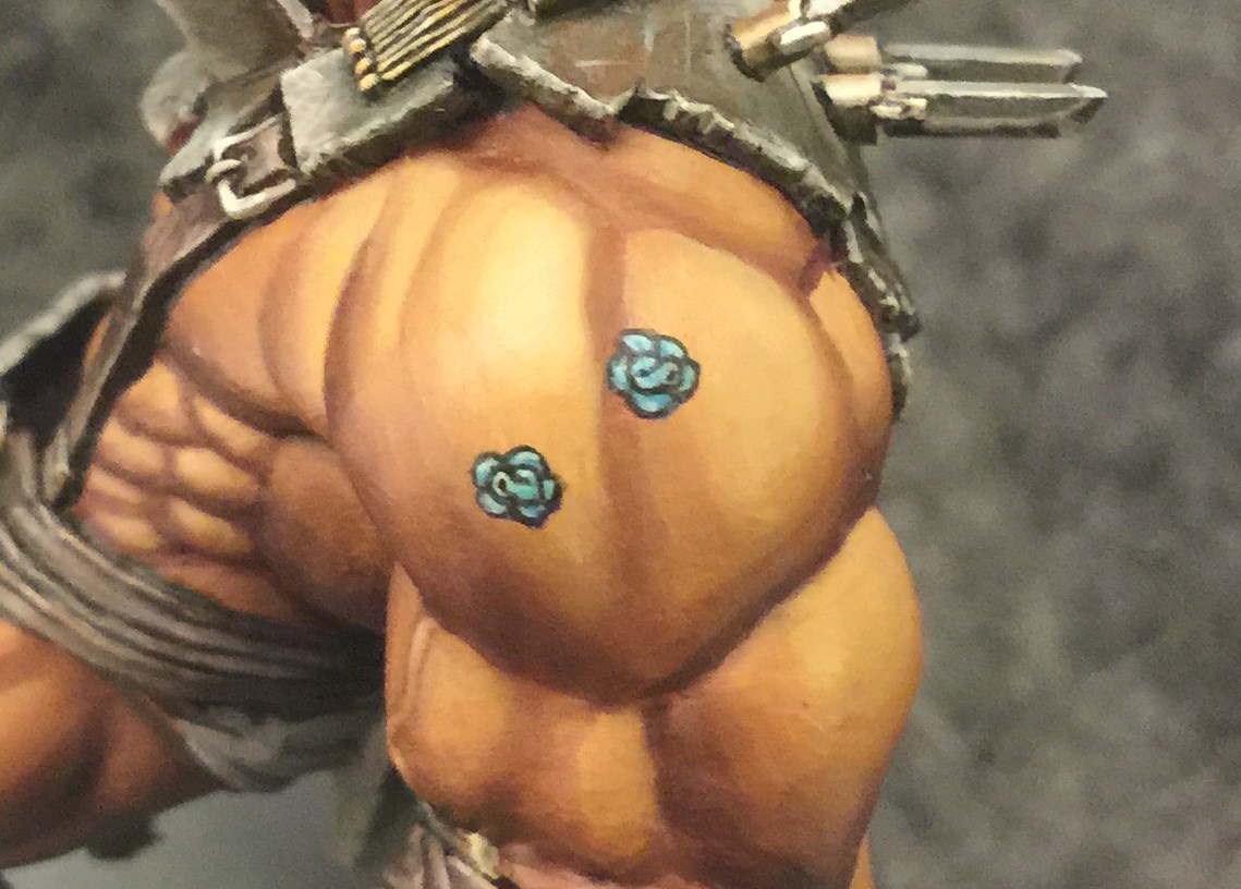
Well they’re not perfect roses, but man they are really freaking tiny and this is about as good as I can get them. But hey, only about half of them will show through once the rest of it is done.
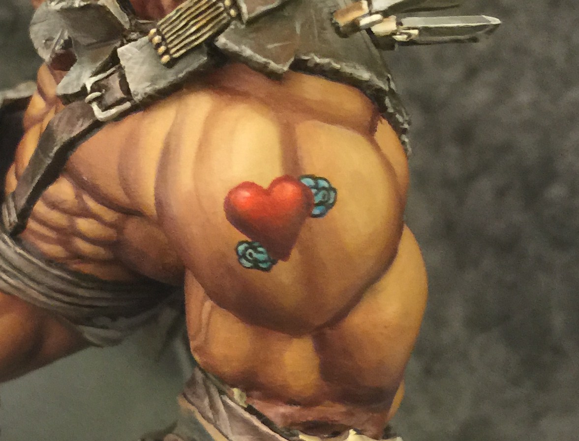
Like the flowers, this heart started as smaller shapes. I began by drawing two circles, expanding them bit by bit until it looked like they were the right size. A line was painted from where the two circles met down to the base of the triangle. then I added the other two lines connecting the first line to the two circles. It might sound overly complicated but steps like these help in creating uniformly sized shapes. Sanguine Red Base was used for this step.
The Sanguine Base of the Heart is highlighted first with Khador Red Base with Ryn Flesh blended in for the lightest areas. Exile Blue is blended in to shade it.
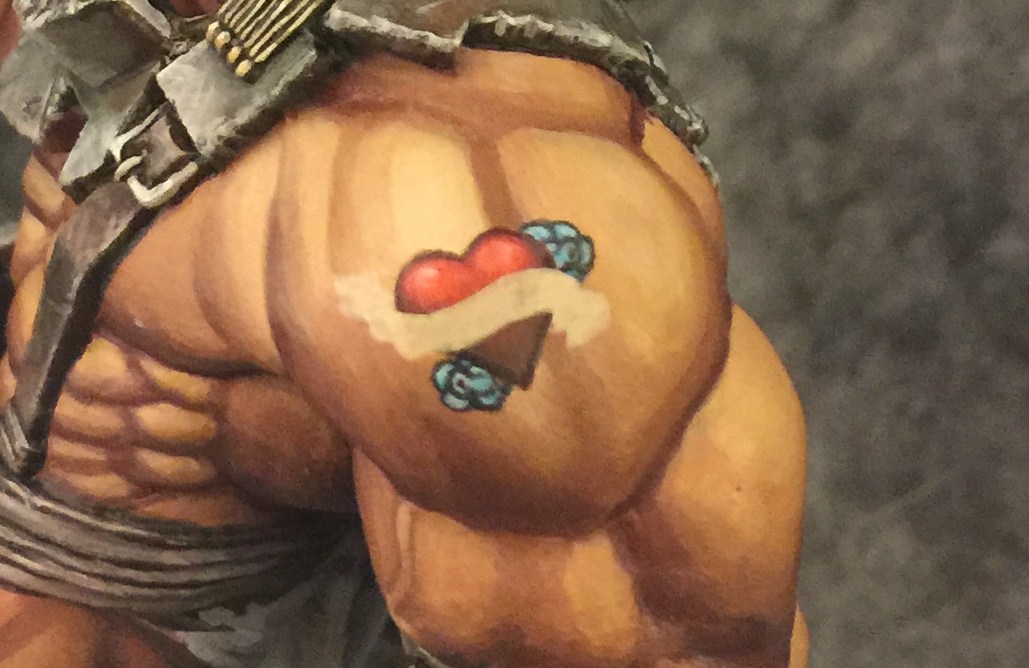
The scroll starts out with a basecoat of Hamerfall Khaki. This was one of the trickier parts of the whole process because I had to visualize how it would look when the outlines were added. Like every other step I created the shape slowly adding more Khaki bit by bit until it looked like the scroll I wanted.
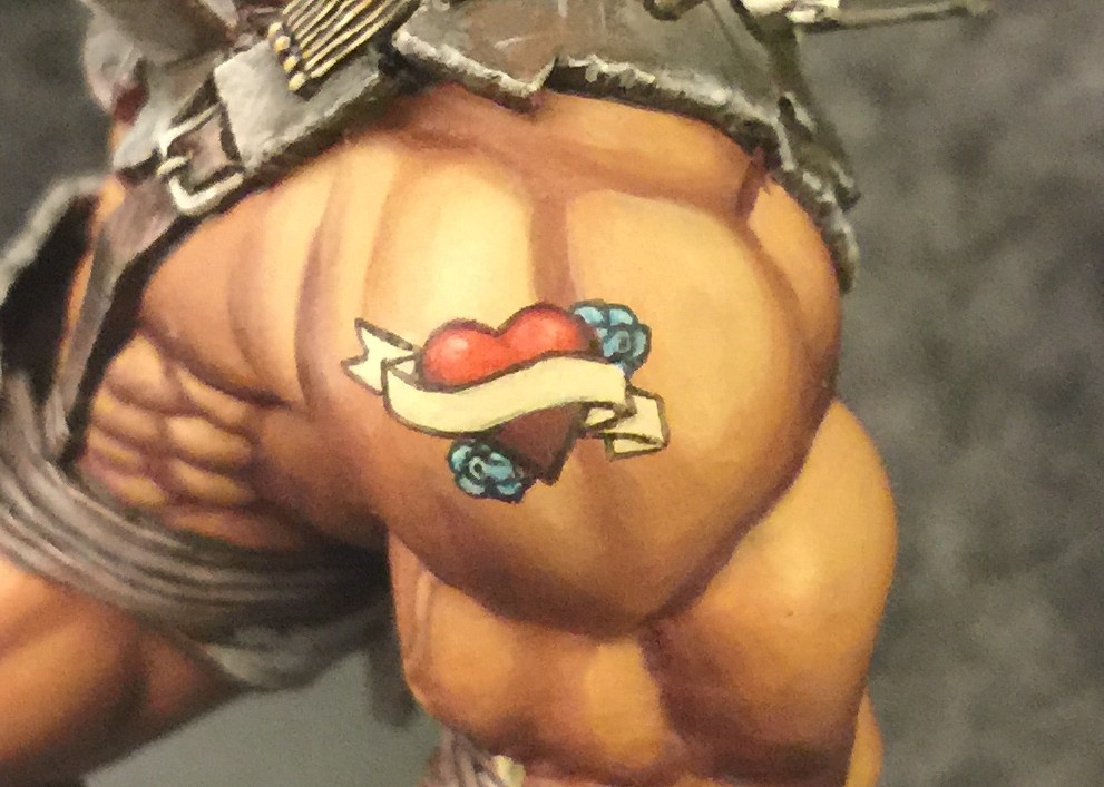
I added a little Menoth White Base over the Khaki before I did the outline to make it more opaque. And of course the shape from the previous step didn’t end up being perfect. Once I started with the outline I realized everything wasn’t quite how I wanted. No big. I just added to the shape until it looked right.
Finally it’s time to add the letters. Now for all I’ve been saying about how you have to build up your shapes with smaller shapes it’s obviously not going to be quite as simple here. But I still didn’t just write out the word. I started with the “O” in the middle to make sure it was centered, then added the lines to either side of it spelling out: ” l O l.”. I knew ahead of time I was going to go for old-style tattoo letters so I left space for the bars attached to the letters. Next I added more lines: “l l O l l”. Then a point perfectly in the center of each of them: “l . l O l . l.” Then connect the dots for “MOM”. All this trouble just to make the spacing and scale uniform. Of course some people are better with handwriting than others. It may not be necessary for everyone to follow all these steps, but I can barely manage anything but chicken scratch on a good day. And it’s still not perfect.
What followed next was a lot of back and forth. Subtracting from the black with the Menoth White Base, then adding back to the letters until I’d developed some lettering I liked. It’s still not perfect, but of course, its quite small and you can only do so much before you overwork it and the paint gets too thick and leaves you with a big ugly lump. Which brings me to something I can’t believe it took me this long to mention: keep our paints thin. I used some Matisse Drying Retarder along the way here to make sure I didn’t get any lumps along the way. Something like this to delay drying and prevent clumping is indispensable.
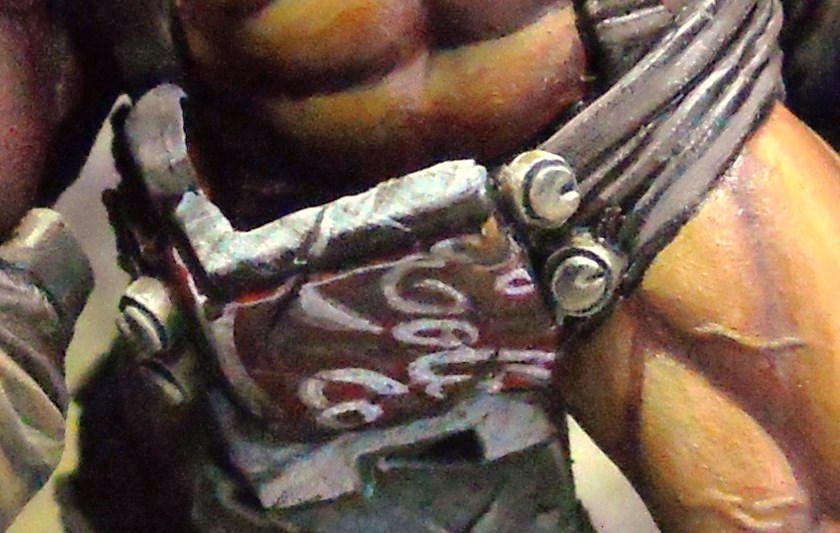
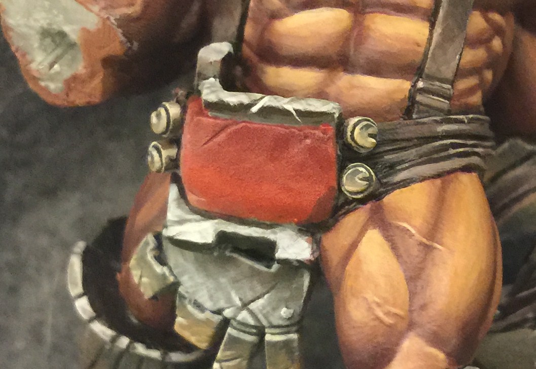
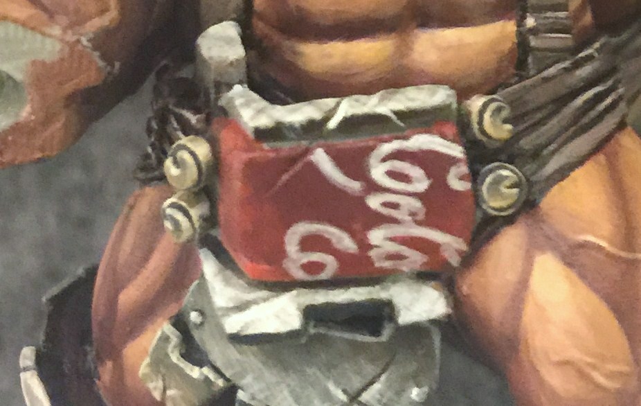
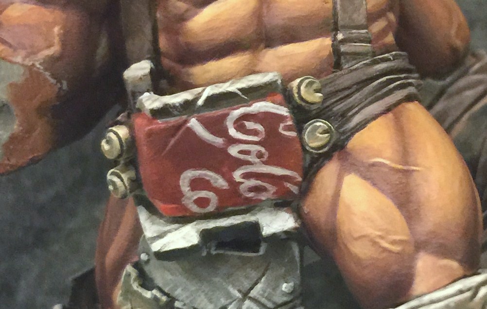
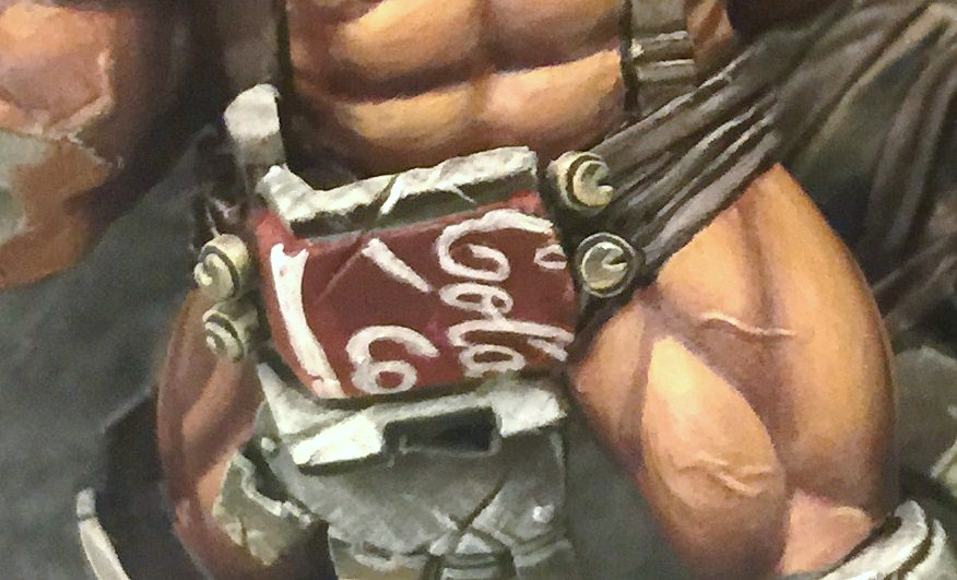
The tattoo is not the only area on Mongo with freehand. His belt had a rather large flat area that looked like it could use something interesting painted on it. Since Mongo’s armor kind of looks like it was made out of junk, I though maybe he would use a scavenged sign to make a nice handsome belt buckle for himself. For those who aren’t familiar with the setting of Dark Age, it is indeed a Post Apocalyptic/Sci-Fi game. It does happen to be set on another planet, but it’s a planet settled by humans from our earth. So while my first thoughts were to do a fallout shelter sign or a biohazard sign, I ended up going with something a little more mundane. Since what I had in mind is such a recognizable logo, I knew I’d have to crop it or something or people eye’s would be too drawn to it. If you can’t quite tell what it is at first glance that’s half the point. As far as narratives go, I guess what happened is at some point, Mongo ended up tearing off a strip from the front of an ancient vending machine he found rusting in a corner, and now it helps him keep his britches up.
It starts off simply enough with a basecoat of Sanguine Base blended into some Khador Red Base.
And speaking of highly recognizable logos, if you get them even a little wrong, it’s really obvious. This was the fourth attempt before I got it close enough to not want to paint over it. The trickiest part was capturing the italicized appearance of the logo. My first few attempts the letters stood up too straight. I had to practice painting t on a piece of paper, and also use a stiffer synthetic bristled brush.
As with the tattoo, I go about cleaning it up and shaping it into something more familiar.
Then I do it some more. Oh and add highlights with some pure white.
Then, because it is a few centuries old, I add some weathering. I start with some very thin streaks of white and Umbral Umber for distressing. Then it’s a thin wash of Agrax Earth with some Umbral Umber stippled in here and there. Since I kind of went overboard with the weathering, I go back in and bump some of the white back up.
You can check out Mongo from a bunch of different angles at CMoN. Please vote for him. And while you’re there you can go vote on all the minis in the contest. Oh and check out Mongo’s Outcast buddies in their own gallery.
~Hope you enjoyed the article. Keep watching the site for more painting articles and more Dark Age content!

