SHOWCASE: Arena Rex – Painting Medusa
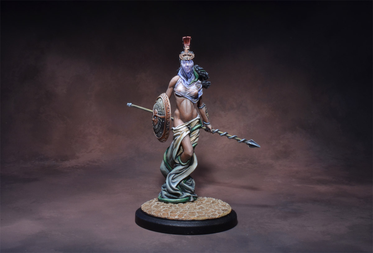

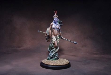
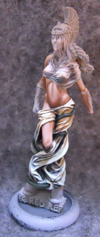
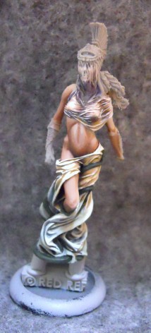
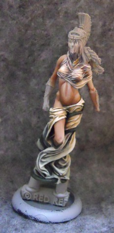
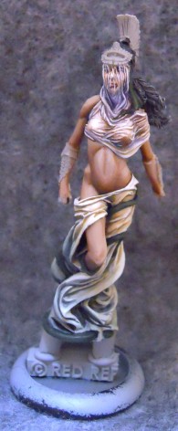
Today I’ve got step by step shots of one of my paint jobs for Arena Rex: Medusa.
It’s hard to believe I painted Medusa six months ago. I started on her right after I got back from Gencon last year. I spent some time at the coolminiornot booth talking to the head of Big Child Creatives (so embarrassed I’ve since forgotten his name) who works on all the Dark Age studio miniatures as well as many others. His advice to me after showing him my 2015 P3 Masters entry was to focus more on creating a central light source on your miniatures. Specifically this involves limiting highlights beyond a certain brightness to only a few central areas of the miniature to enhance the dramatic effect. Additionally I approached this project with a mind to strive for more color throughout. This may seem odd given Medusas largely white robes but as I’ll show there is a good deal of color that’s easy to overlook in shadows and highlights all over this model.
When I got home I was eager to try some of these theories out on my next Arena Rex project. The downside for you as a reader of this article is that the WiPs that I’m presenting aren’t going to follow quite so linear a progression as a good painting article should strive for. New techniques mean experimentation, and that means that I often returned to a previously “completed” step to tweak it based on the appearance of areas I’d since finished.
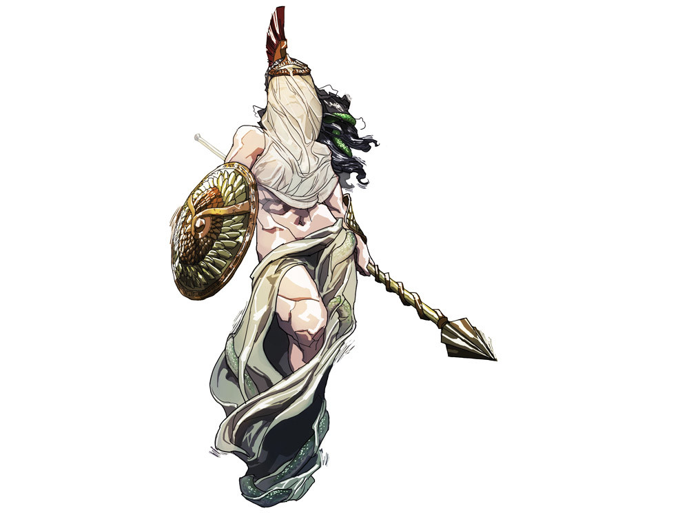
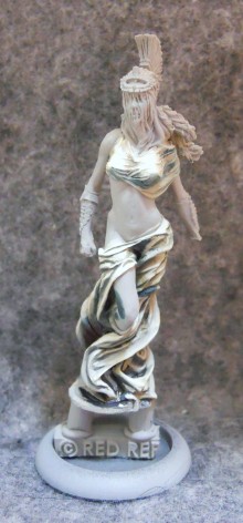
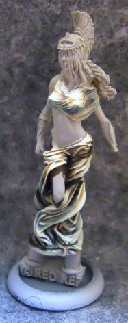
Here at step one I’m using predominately three colors. These are all P3 which has become my range of choice lately. We have Menoth White Highlight used as… well… the white highlights. This is shaded throughout with Iosan Green mixed with a bit of Umbral Umber to keep it from appearing too saturated. As per her concept art, Medusa is meant to be wearing white – not green – robes.
As you can see I was already trying to keep the brightest area around the upper central region of the miniature. Still, I felt it was a bit monotonous overall and wanted to mix it up somewhat.
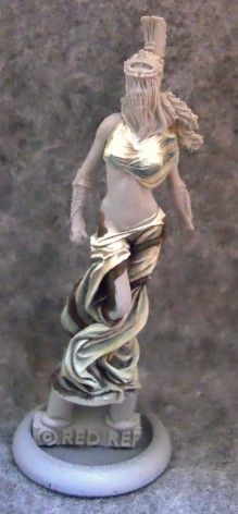
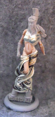
I decided to intensify the highlights towards the top of the robes and mix some warmer colors in around the same areas. I mixed some Rucksack Tan and just a bit of Bloodstone (both of which have a subtle orange tone) into the recesses of the fabric at the tops of her leg giving it a warmer orange appearance than the surrounding areas. I also add a bit more green to the fabric further down cooling its appearance a bit and darkening it.
Here I’ve worked in even more of these Orange tones.
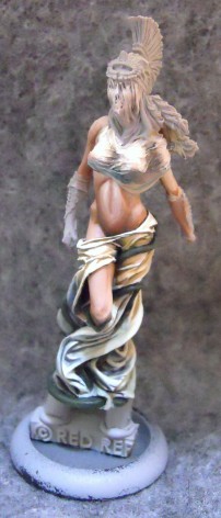
After adding still more Rucksack Tan I decide its time to move on to the skin. The basecoat is a pale mix of primarily Ryn Flesh with a bit of Beast Hide and Menoth White Highlight mixed in, since I find pure Ryn Flesh to be a bit to pink. I’ve already started adding some shading with a mix of Beast Hide, Khardic Flesh, and sometimes just a touch of Beaten Purple.
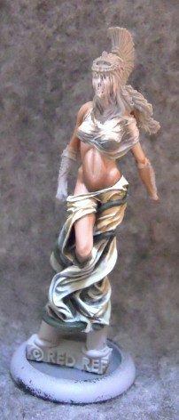
The next step is to blend all the highlights in together and bump up the contrast. I deepen the shadows almost to black in just a few places such as the recess where her abdomen retreats into her robe, and along the base of parts of her arm, and below her knee. At the top of her abdomen, and along the tops of her shoulders, I bring the highlights up almost to pure Menoth White Highlight.
I also went back to her chest for the first time in awhile. This was the first time I’d ever tried to do a sheer effect and I wasn’t quite sure how to handle it. I started with the same basic palette as the colors on the lower robes, mixing some Ryn Flesh in wherever her skin might show through.
I kept tweaking the values of the highlights and shadows but it just wasn’t giving me the effect I wanted.
Eventually I decided to try tweaking the tint as well as the value, giving the shadows in these areas a cooler feel with the additions of some blues and purples. This helped accentuate the contrast on the warm tinted areas od skin showing through.
That seemed to be doing the trick, so I went back to my earlier plan of increasing the contrast between the highlights and shading. This gave it kind of a wet look. Not what I had originally intended, but the effect was striking so I went with it.
There are tons of tiny wrinkles there and I wanted to make sure they were all properly accentuated.
Of course its all just practice for the face, which proved even more challenging. I’ll get into that more in part 2.
~Hope you enjoyed the Article! Come find me and the rest of the Arena Rex crew at Adepticon, get a demo, and pick up your own cohort to bring home the thrill of the Arena.

