Privateer: Designing Beast Master Xekaar

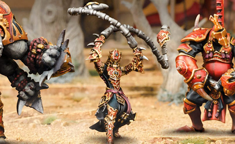
Get a behind the scenes look at the star of the Skorne Battle Box!
Mike Vaillancourt explains the development of Beast Master Xekaar – starting with the concept art. Let’s jump in!
* This is a male skorne Paingiver warlock that will debut the new Skorne battle box and will be cast in soft plastic.
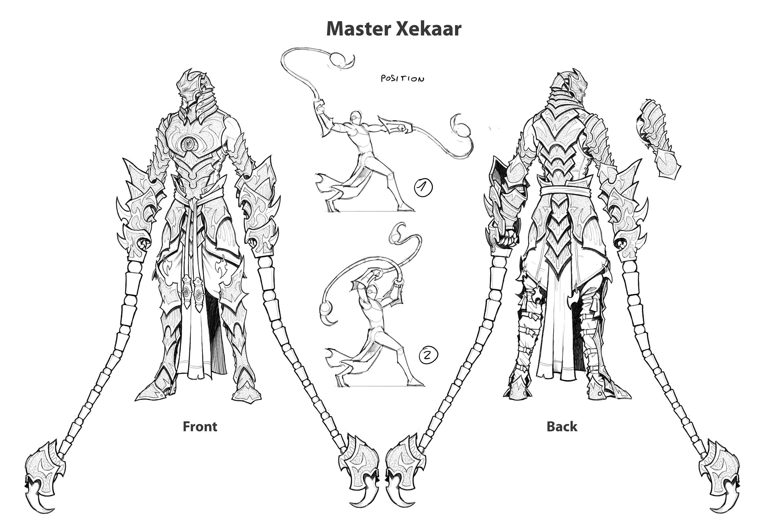
* Xekaar should have a subtle scorpion theme worked into his look.
* He wears armor stylized after the look of the Paingiver Bloodrunners and should look fast and sleek.
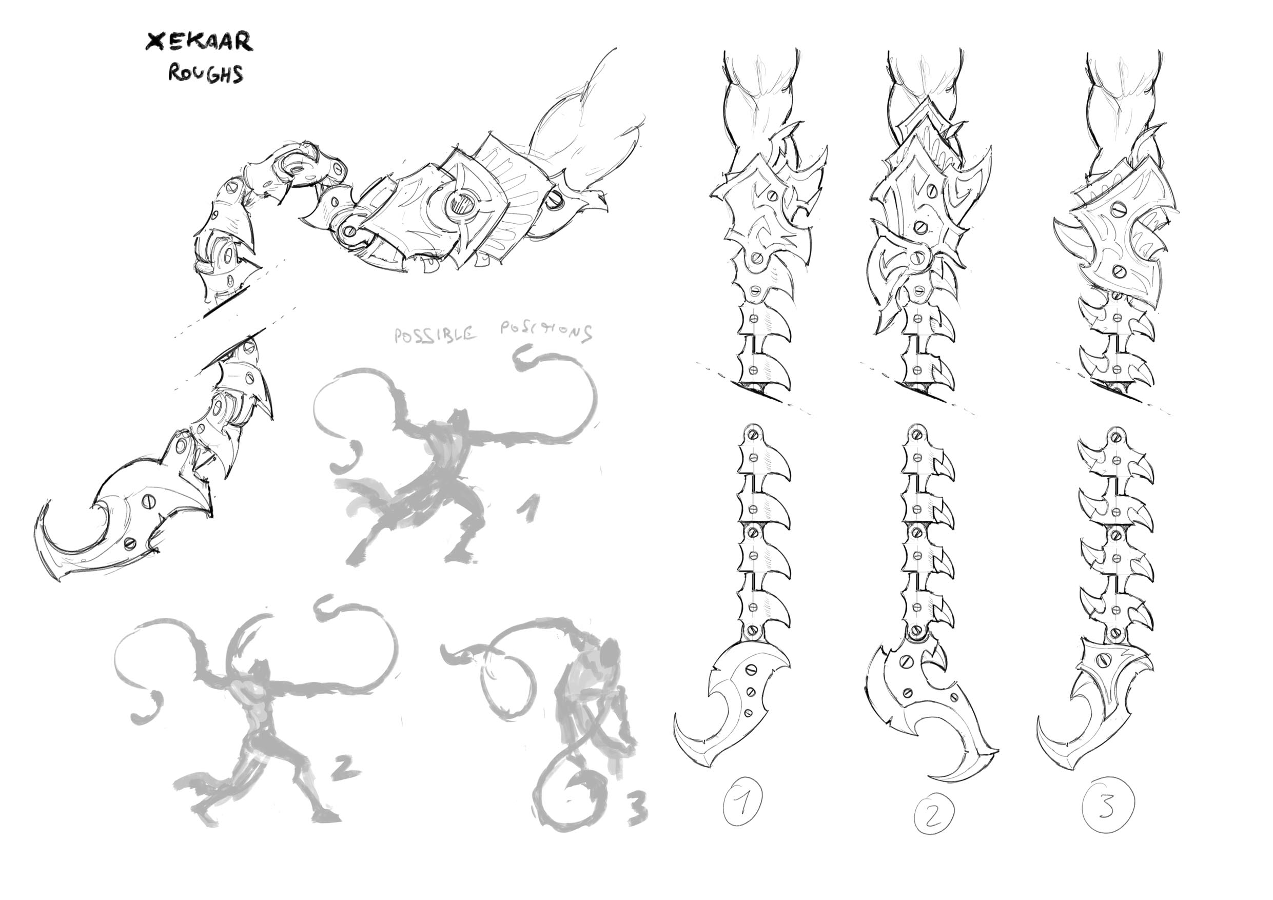
* Xekaar is armed with a pair of magical barbed whips. When posing Xekaar, we will want to see those whips in action.Based on all of that, Andrea Uderzo sent me the following sketches:
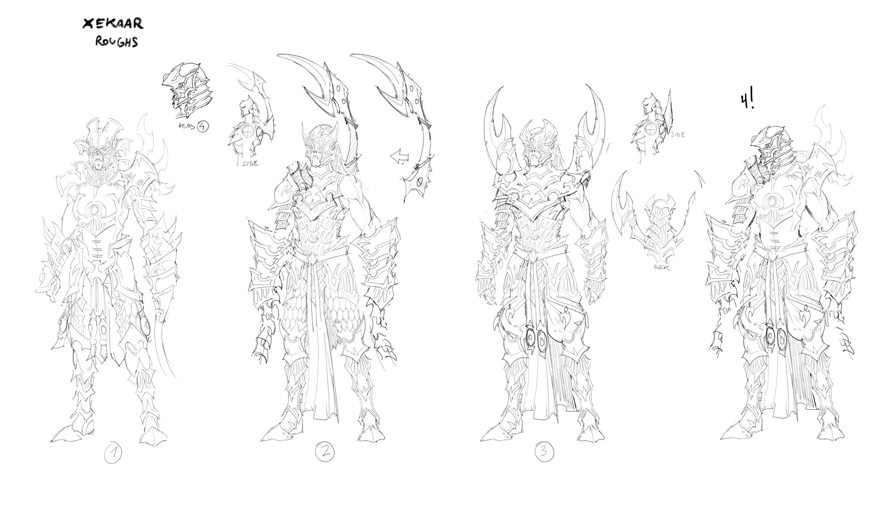
To begin, this is a soft plastic ’caster whose details are going to need to be trimmed down dramatically for production purposes. I didn’t like the stinger tail or the shoulder things on #2 and #3, as they’re a little goofy-looking.
Main body and head
I like the chest armor from #1, the legs from #3, the forearms of #2, and the head of #4 (but I’d like to see a ¾ of head 4). I created version 4! as an amalgamation of my favorite elements.
Whips
I was worried about this idea looking really bad in soft plastic. I prefer whip #2 with forearm #3. I like the large shapes of the forearms of #2, but I would consolidate the bottom two armor panels (closest to hands) into one larger piece of armor.
AdvertisementPose
For the upper torso I’d like to see something more along the lines of a dual whip-wielding lion tamer.
In this instance, Ed thought my mockup felt more brutish than fast and sleek, and he recommended removing the shoulder blades and having the exposed shoulder like #2. Based on those comments, I was able to provide feedback to Andrea and received the following:
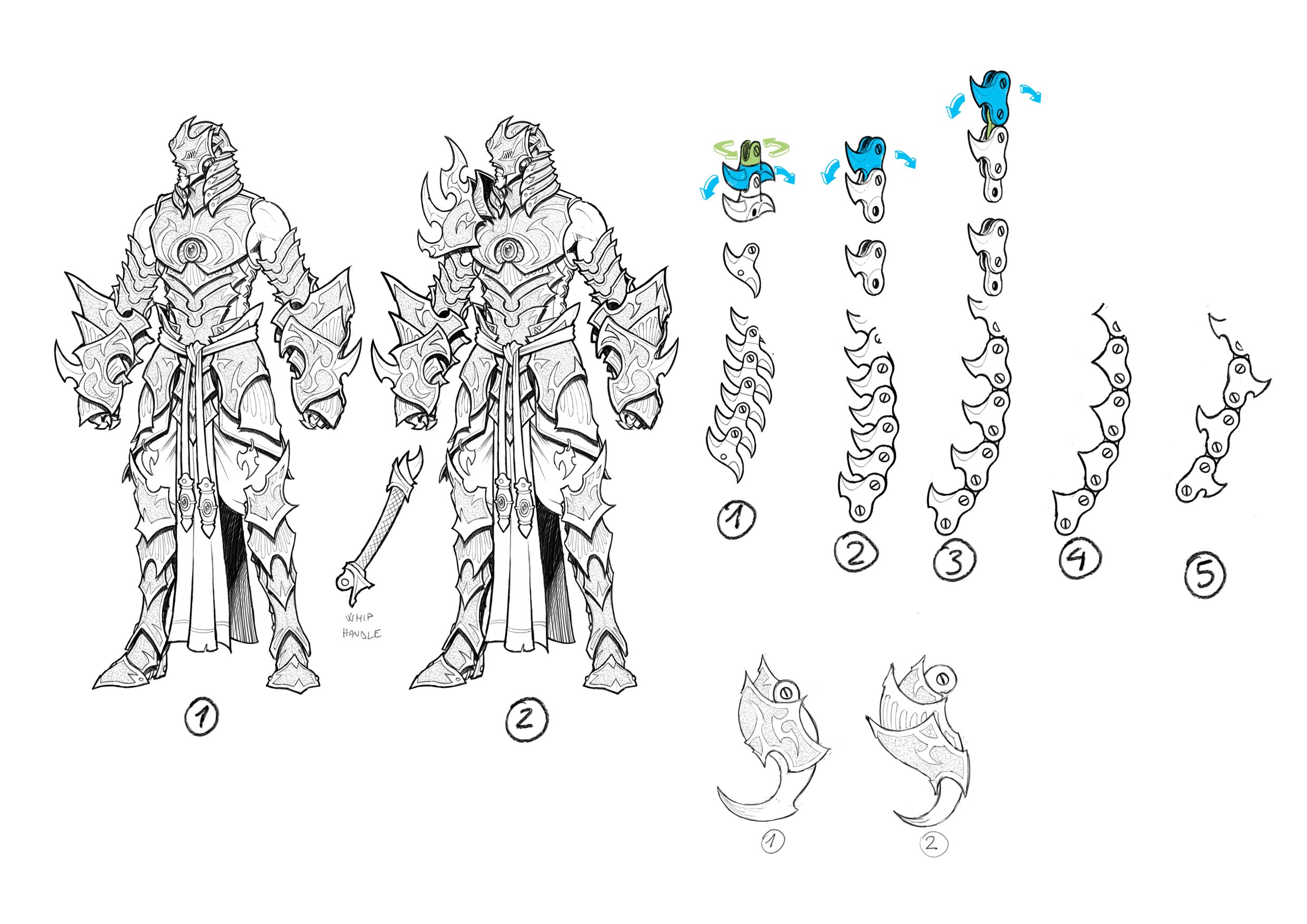
My immediate comments were that we needed to slim down his arms a bit, but I liked the shoulder armor. I liked whip tip #1, but I didn’t think the chains would work in soft plastic. My suggestion was to go for a more traditional whip core and have it painted like corrugated hose.
Contrary to my opinion, Matt Wilson didn’t think the asymmetrical shoulder pad worked, and felt that if we wanted asymmetry, we should give him one fully armored sleeve on one arm and reduce the other. His proportions needed adjustments, as he looked more human than he should be. For the chain, Matt also recommended going with a segmented chain constructed of knights’ lance like tubing and ball joints like dog tag chains.
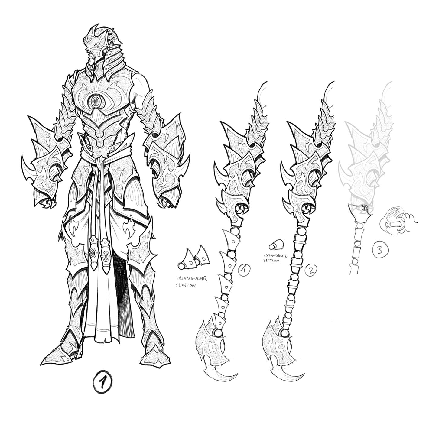
After receiving this sketch, I could see that Andrea’s overall design was looking pretty close to done. Addressing the question of the whip, I determined #2 would be the best to produce in soft plastic, but we needed to remove the single bead around each of the cylindrical links. When you’re designing for 30 mm, tiny little details like that will not reproduce well, especially in soft plastic.
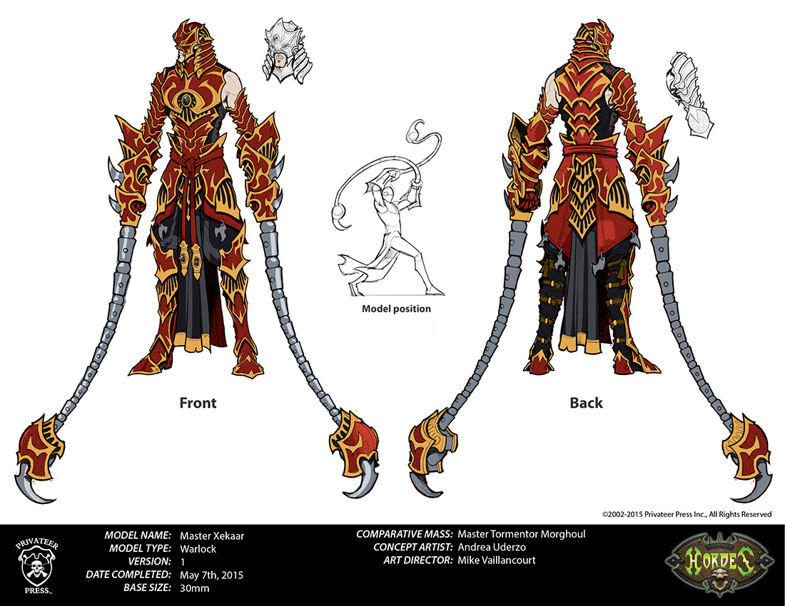
Once the group was in agreement, we proceeded to final and received the art you see above with two pose options. Pose two was the clear winner, and I think turned out fairly well. So, at this point, we proceeded on to a color pass and illustration.
When my rough color pass was complete, Matt DiPietro liked it, and we had our approved final for Xekaar.
I hope you enjoyed this tiny peek behind the curtain. Stay tuned for the next art Insider, as I’ll be discussing the development of our new Command book cover illustrations!


