Privateer: Designing Lord Kozlov

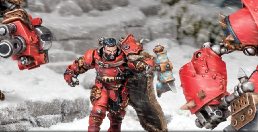
Designer Mike Vaillancourt talk about the process of designing the new Khadoran warcaster: Lord Kozlov.
To start off we had a visual description for him that read as follows:
This is a new warcaster that will be produced in plastic for the new Khador battle box. He is a former Iron Fang (see FoW: Khador, p. 92-93) who developed the warcaster ability.
The Iron Fang warcaster should wear stylized warcaster armor that draws visual cues from the armor of the Iron Fangs. Being warcaster armor, it should have a furnace, steam boiler, and smokestacks mounted on the back of it. It could be cool to have him wearing an Iron Fang-style helmet that conceals his appearance (we have not seen that much in Khador). He may also wear animal pelts like the Great Bears of the Gallowswood (see FoW: Khador, p. 133).
The Iron Fang Warcaster is armed with a mechanika great axe that should feature glowing grills, nodes, and possibly Khadoran runes. The weapons should be about as long as the warcaster is tall.
It would be great to see this model posed in mid motion, like he is moving quickly through the brush, about to swing his axe into an enemy.
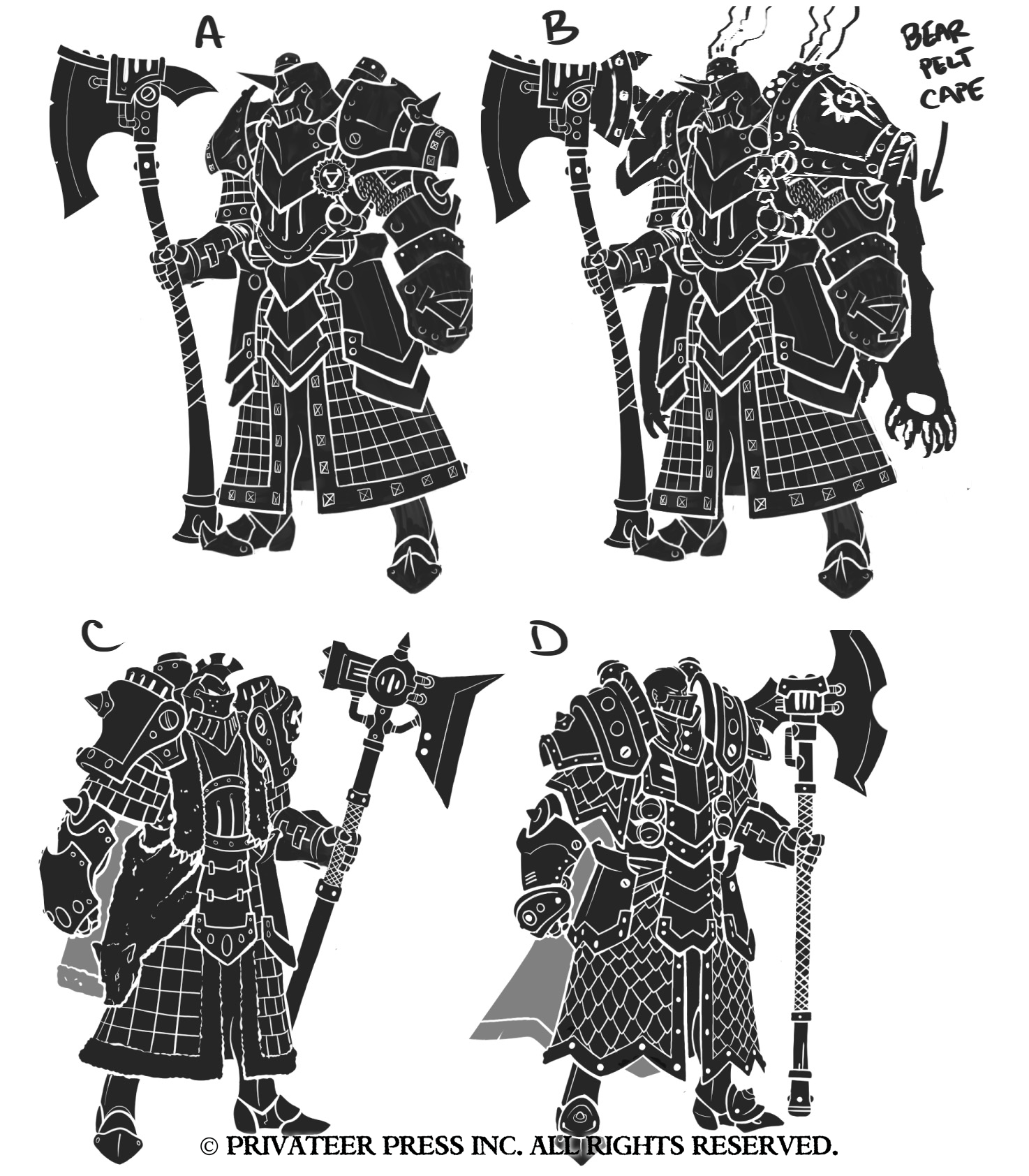
I sent the visual description and associated reference material to concept artist Nate Feyma, and he began working. Here’s the first round of sketches and silhouettes he sent to me.
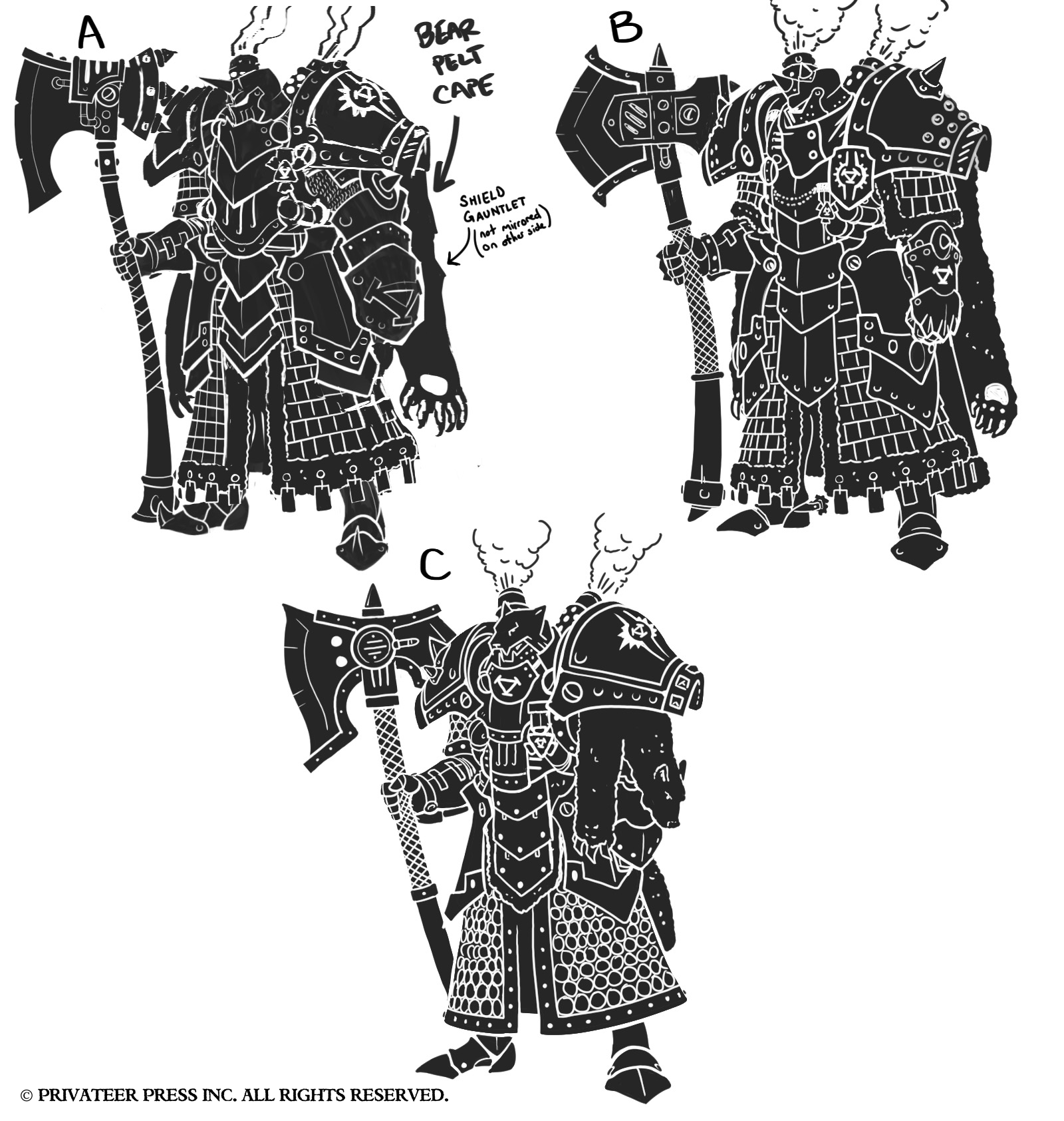
I thought “A” looked like it had the most potential, so I asked for a few more iterations based on that.
At this point, the consensus was that it looked too much like an Iron Fang character solo with smoke stacks than it did a warcaster. We decided to brainstorm an alternate direction, and Matt Wilson worked up a quick sketch that you can see in the upper left of this image.
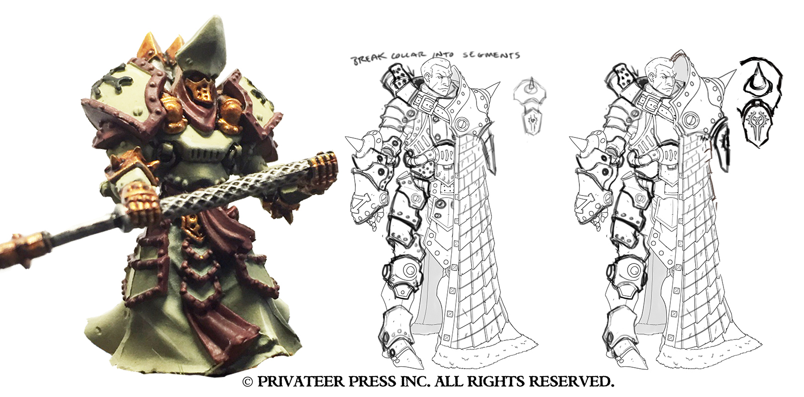
Nate took the sketch that I sent him and worked up some line art with and without rank insignias on breastplate. I also thought the face looked too much like an anime character, so I sketched up an alternate head (far right). Then we began the refinement process, as he still wasn’t feeling like a warcaster. Matt sketched over Nate’s work (middle) and I further refined it, accentuating volumes to give the character more mass and table presence (right).
Advertisement
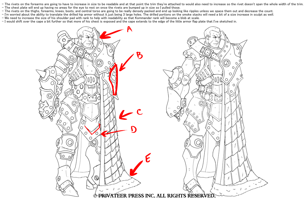
Now that we were moving in the right direction, studio director Ron Kruzie and I sat down and made a few notes with production director Mark Christensen to address any production-related issues.
I felt like this step was important to share so you get a bit more insight into the thought process behind all the changes made through development. I then began the refinement process for his head and face, and sketched up a few alternates.
Subscribe to our newsletter!Get Tabletop, RPG & Pop Culture news delivered directly to your inbox.By subscribing you agree to our Terms of Use and Privacy Policy.
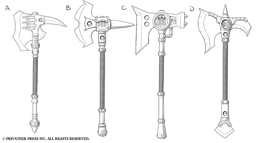
While you digest what it would have looked like to have Jon Snow as Lord Kozlov, let’s take a little break and check out the axe designs.
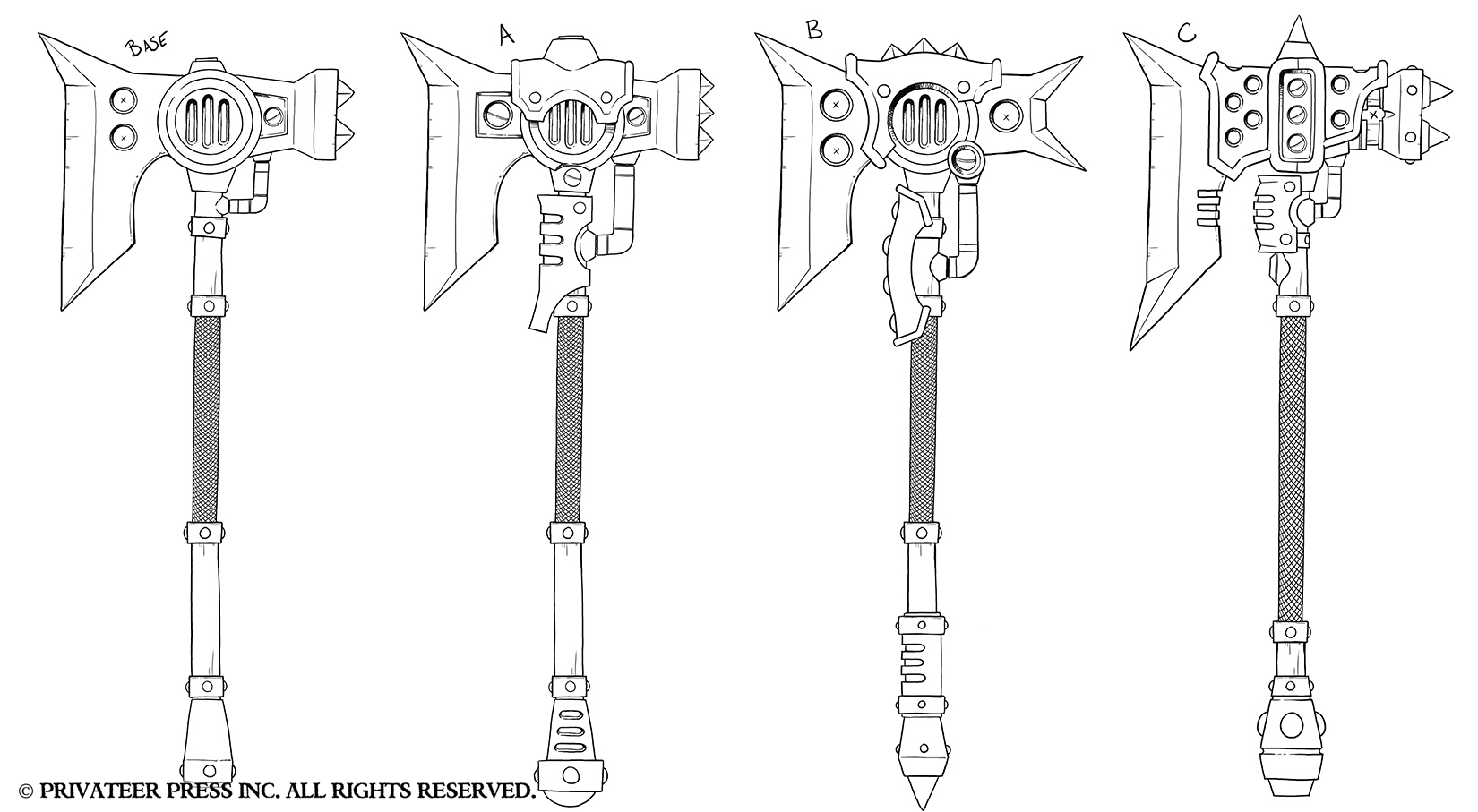
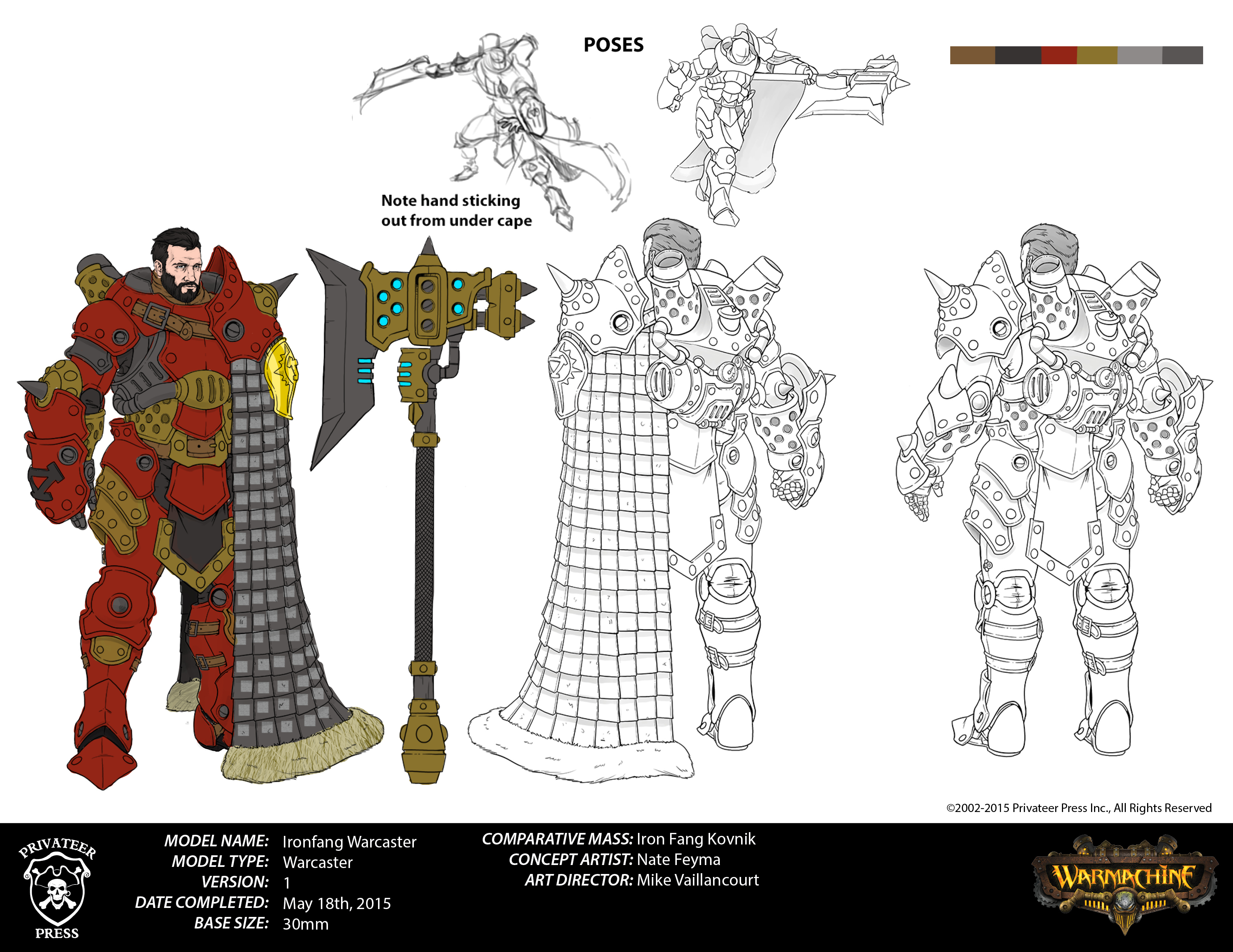
You’ll notice with the axe designs here that “C” was pretty close to what the final looked like. Although it was cool looking, it didn’t feel like it was there yet, so I requested further embellishments that would identify it as a warcaster’s mechanika weapon. Nate knocked it out of the park on his first passes, and “C” was the clear winner.
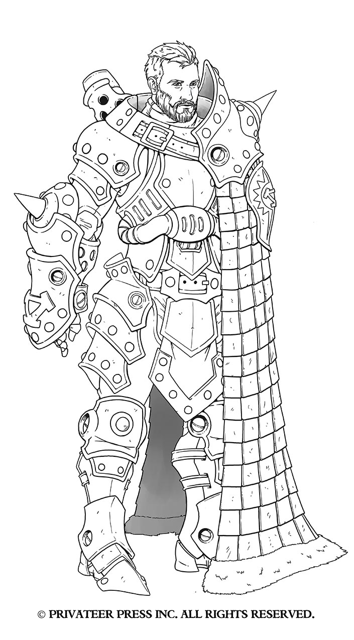
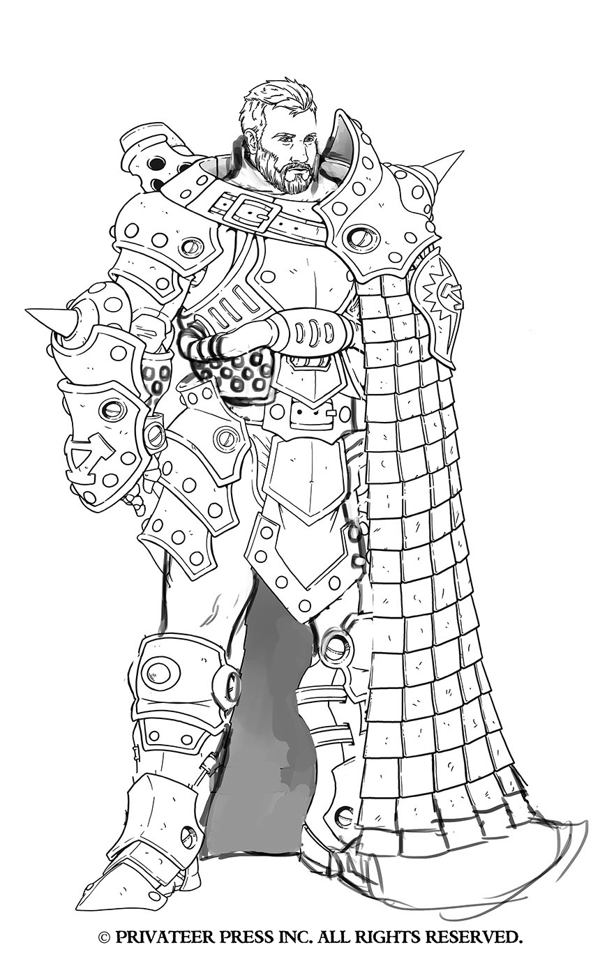
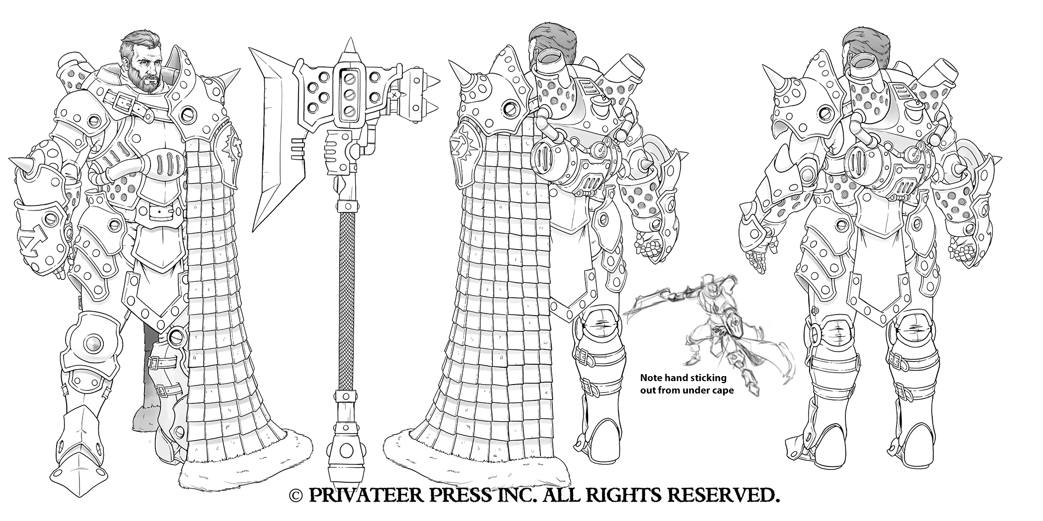
Now, back to our regularly scheduled program. During this phase a discussion was had about giving the character a full beard and shorter hair. I had a chat with Nate about not stylizing his head and face and sticking to true proportions, and Nate drew what became his final face.
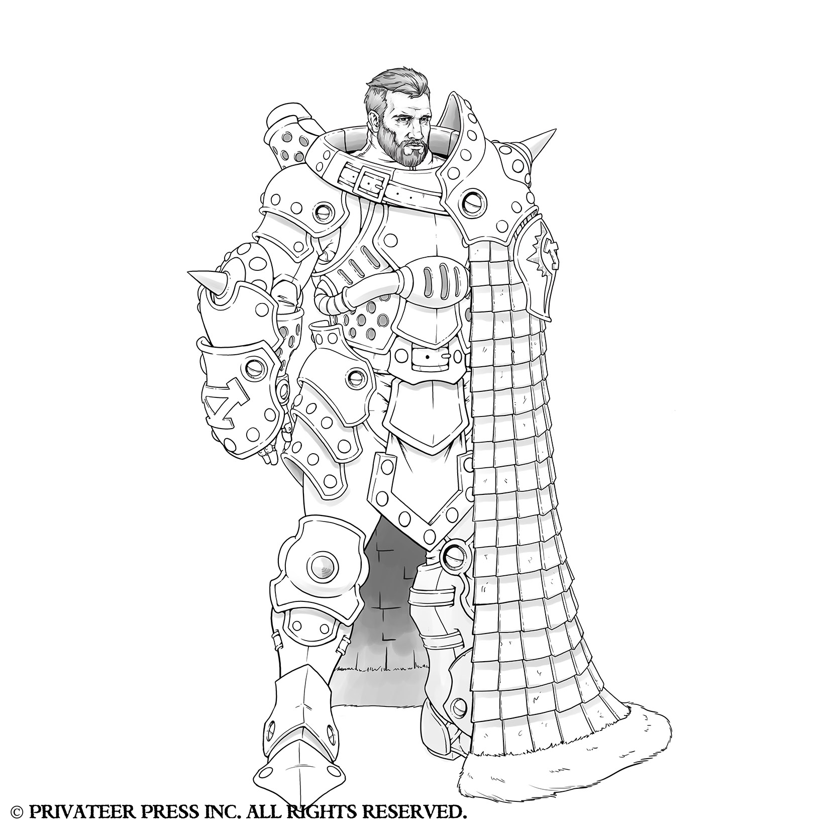
Still, looking at his whole outfit it wasn’t quite there; it was missing the presence of a warcaster. To rectify this, I stretched him side to side, widened his armor at the waist, made him taller, bulked out his armor, and rotated his right foot so it gave him a more grounded feeling even in a neutral pose.
Nate then cleaned up my quick sketch and we got something that was really close, but still needed some details to be reigned in.
Advertisement
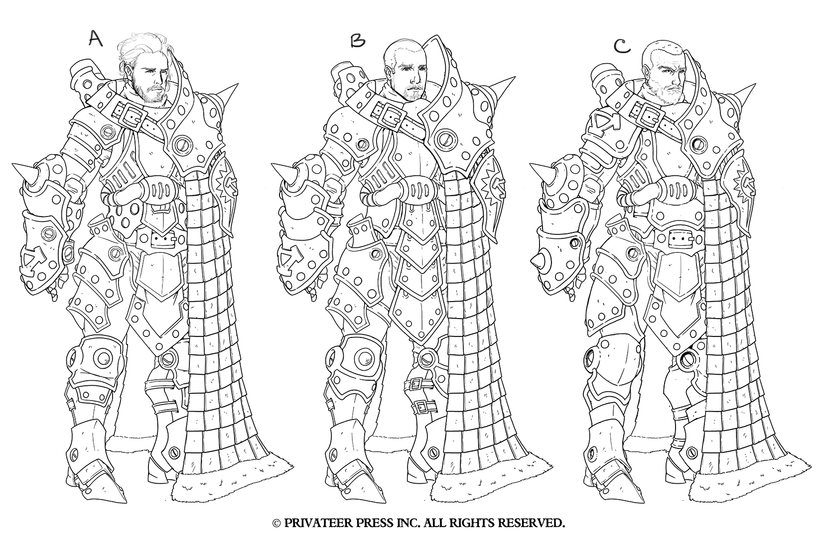
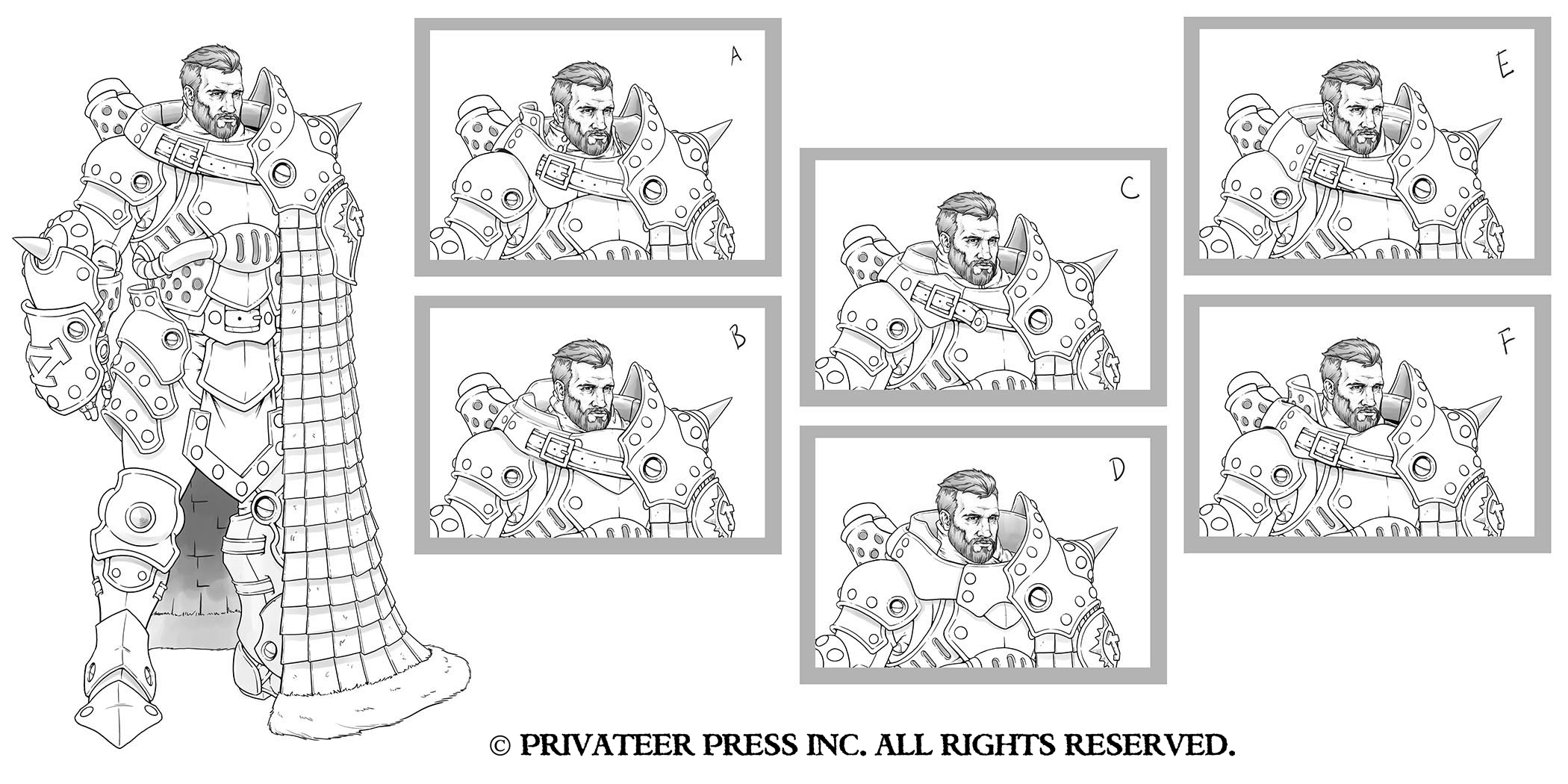
The one detail that felt off was his collar, so I requested a few iterations, and Nate sent us this.
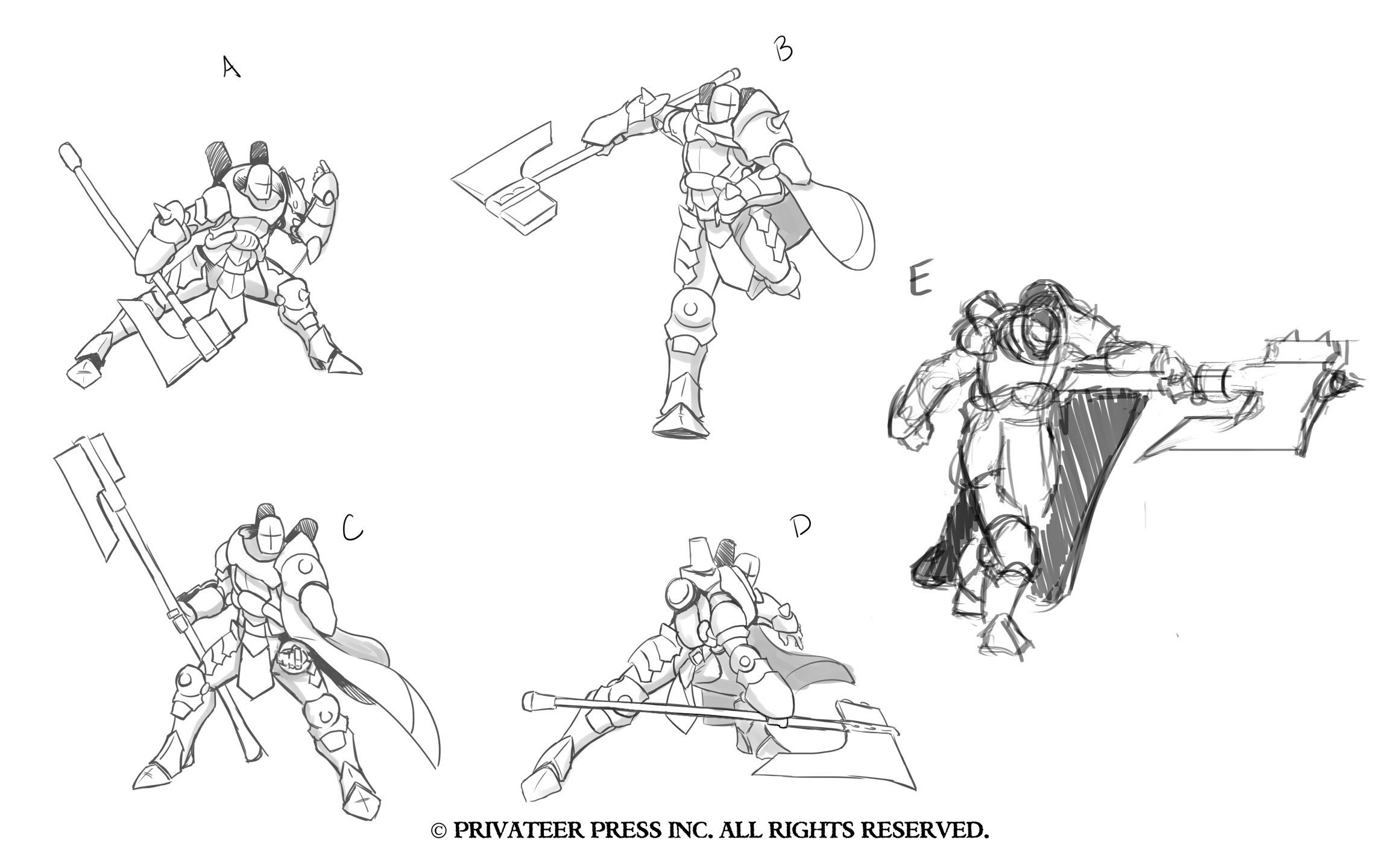
“C” was the consensus favorite. At this point, we move onto the pose. Nate’s options were good but weren’t quite hitting the mark, so I sketched up “E” as an option.
The group liked my sketch, and Matt sketched up another pose that you can see in this image.
Ultimately, “E” was the pose selected for the final sculpt. The only thing left to do was establish his color scheme, so I quickly colored him with some flat colors and we had a final.
I hope you’ve enjoyed reading about the concept creation process for Lord Kozlov. He was quite a bit of work, but I think the final product was absolutely worth it.
What do you think of this character design?

