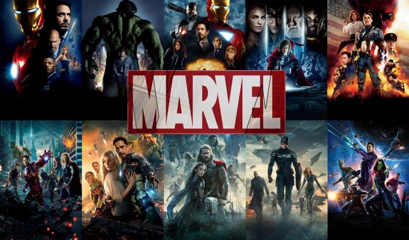
Geekery: The Look of Marvel Studios


The look, like the music, of Marvel movies can be a little blah – why is that?
In nearly every discussion I’ve had about DC the look of their movies – the scale, the color, how pretty they are – comes up. What I hear about Marvel is that they have great stories, but I haven’t heard/seen many make it a point to talk about how they really like the over all look of Marvel Studio’s movies.
Patrick (H) Willems gives a possible explanation as to why that is…
One of my main complaints about Civil War was the look of the airport fight scene. The color was blah, and it felt tiny given the kind of weight the fight was supposed to have story-wise. It was visually pretty boring. Glad to know I’m not entirely alone in that thought. It almost feels like they’re trying to remove the bright comic book color palette to make the movies feel more serious and credible. Navy instead of royal blue, rust instead of red.
It would be great to see Marvel take on more of that poppy color and contrast that DC uses – the look of their movies is one of DC’s saving graces for a number of us. But not Joel Schumacher’s Gotham poppy color. That’s just too far.
What’s your take?

