Privateer: Designing Lord Ghyrrshyld, the Forgiven

The undead joins the living with a brand new design…
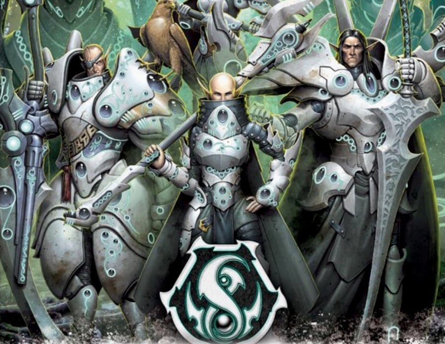
Goreshade has been restored by the goddess and has joined his house again. His new incarnation requires a new design – removing him from the undead Cryx and putting him back into the land of the living. Art director Mike Vaillancourt walks us through the process of bringin Goreshade to life with concept artist Johan Grenier…
In the first round of sketches (below), I first pulled up other Retribution warcasters’ concept art for a side-by-side comparison. Then I conducted a quick anatomy check. Johan’s sketch is on the right, and my adjusted sketch is on the left. The list of adjustments I made were as follows:
– Brought the shoulders closer together so he didn’t have an ultra wide torso
– Brought in the hips so they were more realistically spaced
– To match the shoulder and hip adjustments, brought in the size of the chest so it was a more vertically balanced instead of horizontally balanced barrel shape
– Increased the size of his head a smidge
– Made his face more Iosan and less undead by giving him a nose and eliminating the orc teethOverall, I didn’t think the first sketch was too far off, as Johan did a great job translating Goreshade directly from Cryx to Retribution armor and balancing the shapes. The one change I hadn’t noted that I wanted to see was changing his face to look thirty years older by adding in wrinkles and slightly more sunken features.
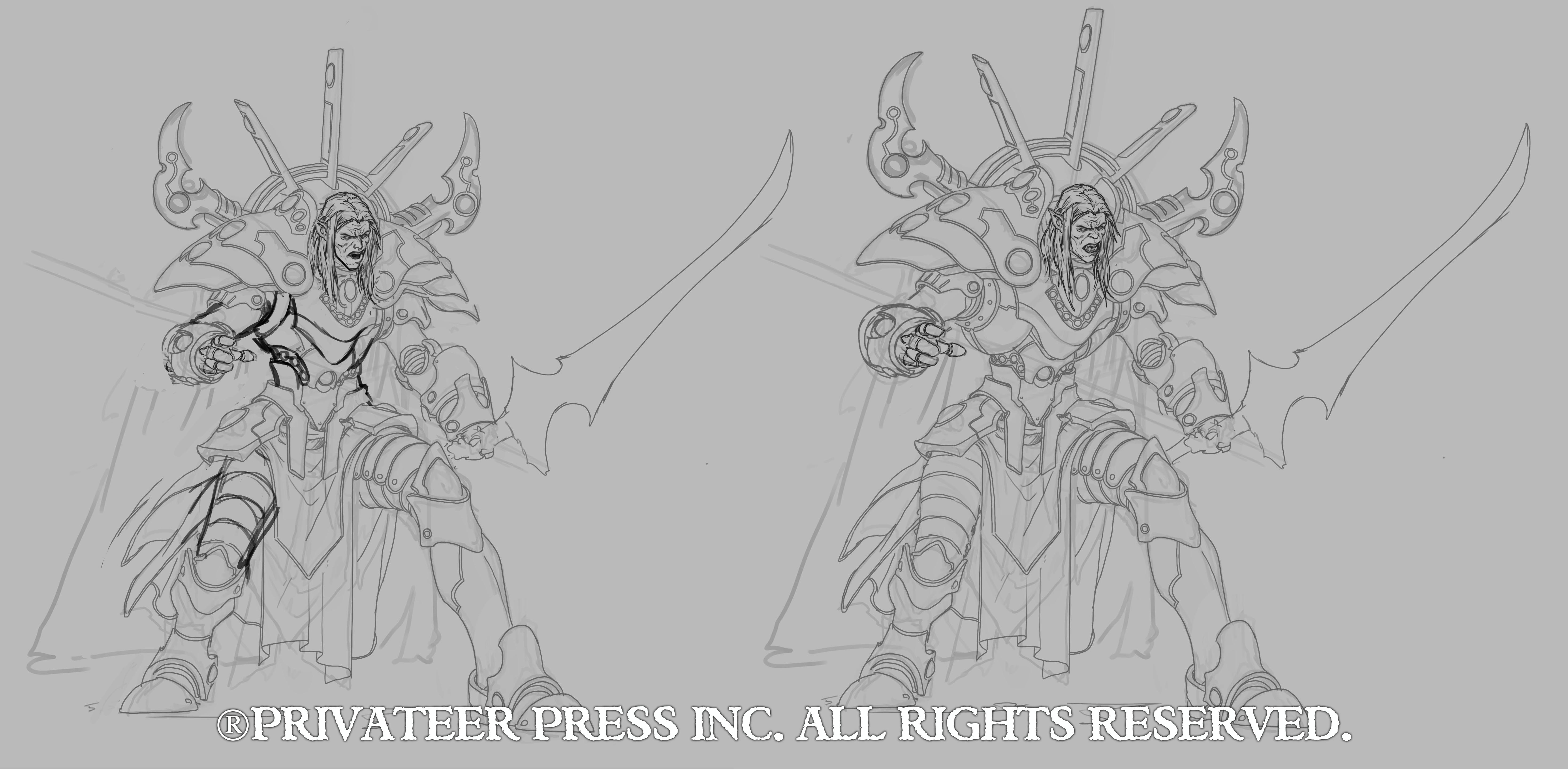
The group agreed with my feedback, and Matt Wilson added, “I feel like we want to see a bit more Gandalf in his attitude and look. Like, he’s older and wiser now. Maybe that’s mostly achieved in his pose by doing something more ‘heroic posed’ instead of aggressive action. And can we elaborate on the robes and skirting to get a bit of that wizardly feel?”
Combining Matt’s notes with mine, I sent off my sketch and notes. Johan got back to work and then sent me the following…
Advertisement
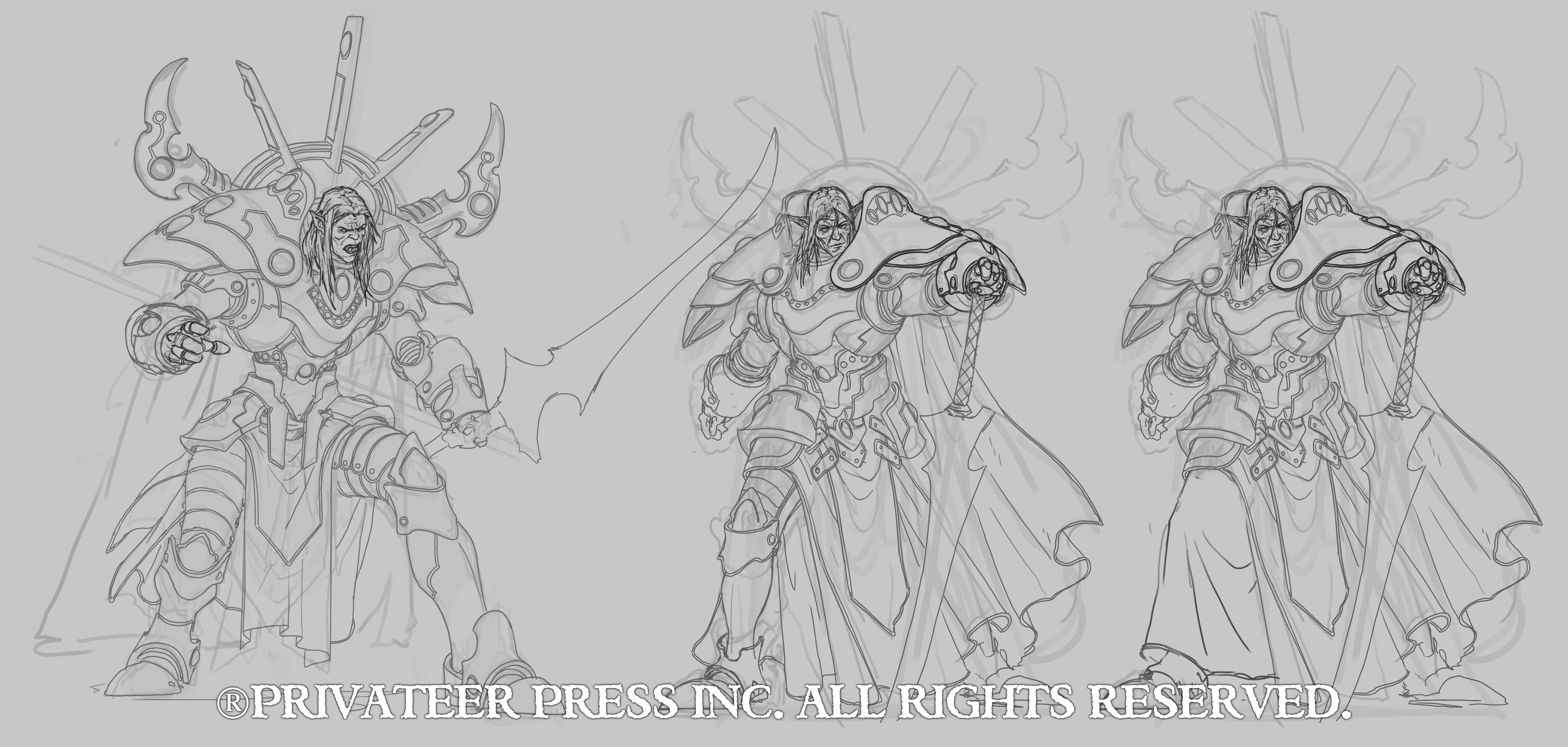
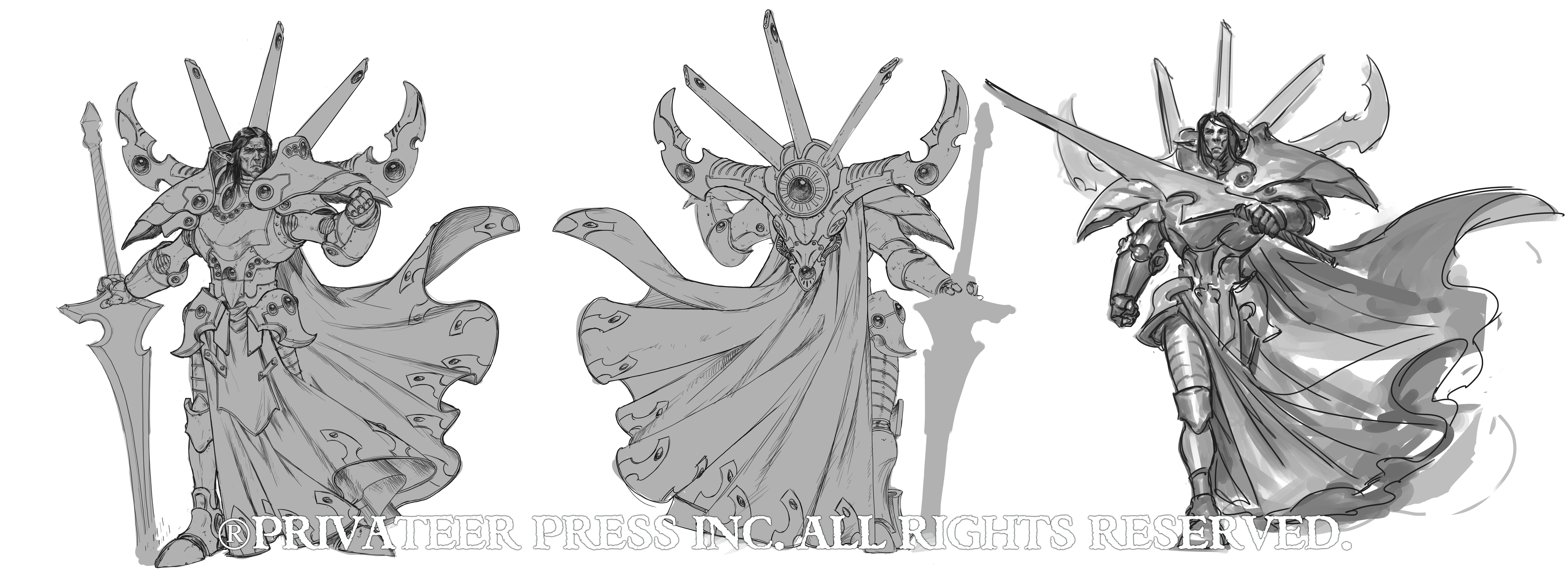
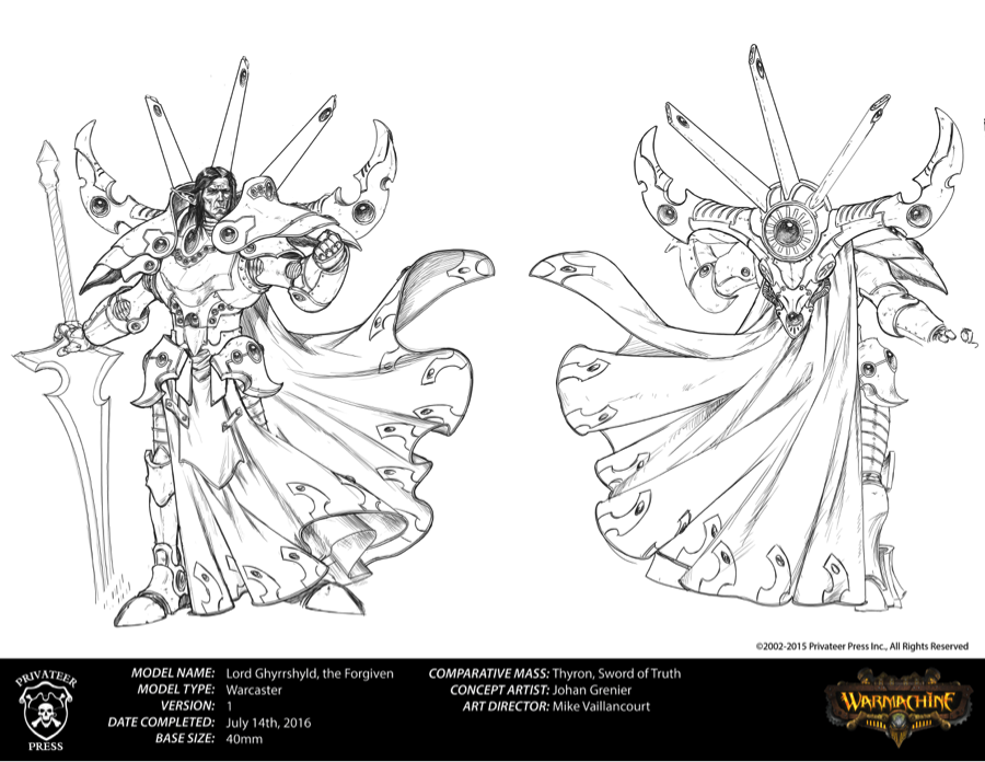
Goreshade looks a bit more Gandalf like here for certain. I like what Johan did with the face, the loincloth, and the cape in the middle version, but I like everything else about the armor on the left. I had ideas for a pose, but we could address that next. Will Shick liked the current pose with the weapon down, and that helped steer the direction toward a more vertical pose to help make him look more regal and so his sword tip wouldn’t be planted in the ground. Next, Goreshade has a spoiler, and once you see it, you can’t ignore it. So, we needed to remove the spoiler portion of the backpack at this point.
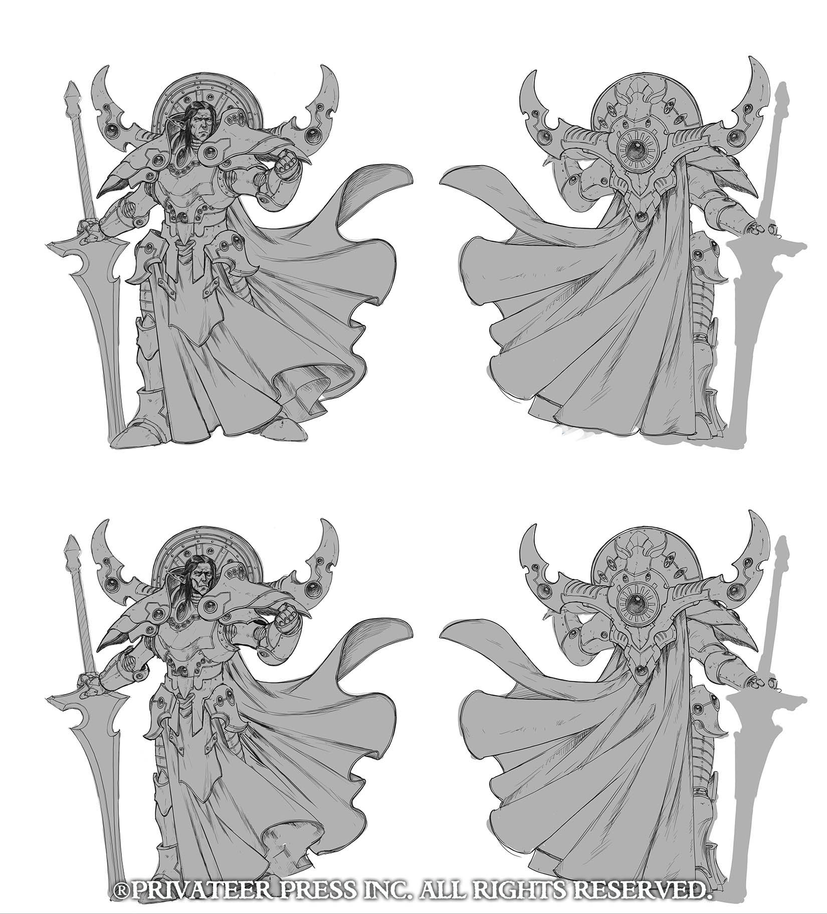
Johan did, indeed, remove the spoiler, and he sent me the adjustment above. The area I knew that needed to be changed was with his anatomy so I did the following:
– Pinched the waist, hips, legs, and arms
– Gave him sunken cheeks and eyes
– Adjusted his jaw lineAdvertisementAt this point, I was drawing blanks creatively with regards to the back piece, as I liked the angled pipes in the last incarnation (sans the spoiler connecting them). What wasn’t working for me with the disk were the visual similarities to Zaal. The group agreed with my assessment and requested the fins come back and the back piece be removed.
I then did a quick sketch (below) to give Johan direction.
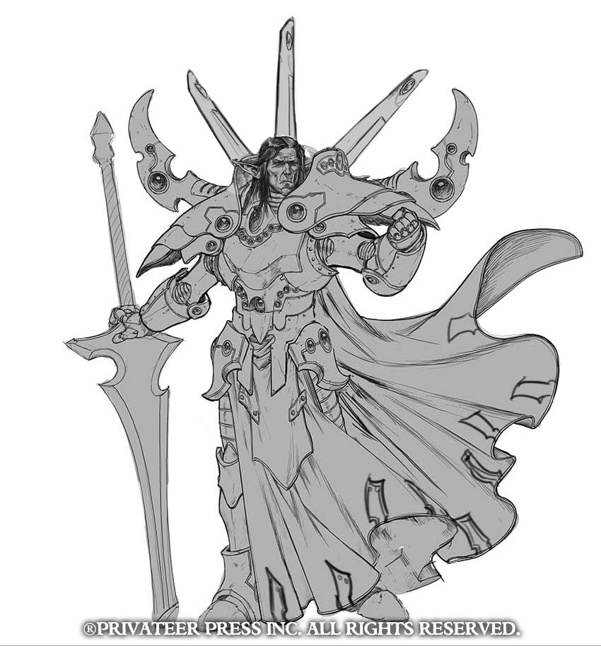
Matt Wilson requested removing the panel lines from the fins, and Johan sent me back this. At this stage, we were ready to proceed to pose. Johan did one sketch with him striding forward, but it was determined that the old Gandalf feel of him had been lost. The pose Johan drew his final line art in was ultimately chosen as the winner.
Subscribe to our newsletter!Get Tabletop, RPG & Pop Culture news delivered directly to your inbox.By subscribing you agree to our Terms of Use and Privacy Policy.
