Pimpcron: Simple Ways to Make Your Battlefield Awesome!


Pimpcron has some ideas to make your tabletop woke.
Hey people. The Pimpcron is in the house. In your house, right now. I know you weren’t expecting company so I will ignore how gross and disheveled your home is. Just a quick question, what do you plan on doing with all of this stuff on your counter? Looks like you live with a pet racoon.
Anyway, I get emails at my official Pimpcron Warhammer Podcast email ([email protected]) all the time asking questions like “How does photosynthesis work?” and “Does this look infected?” but sometimes I get emails about Warhammer. One common question I get from devoted followers is “How can I make my tabletop look cooler?” That’s when I jump into action and write an article describing things. Well, here it goes.
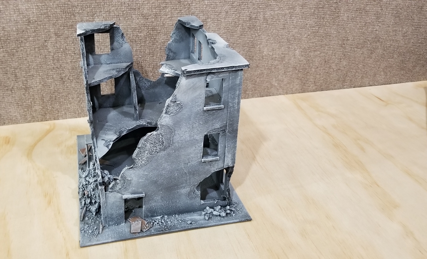
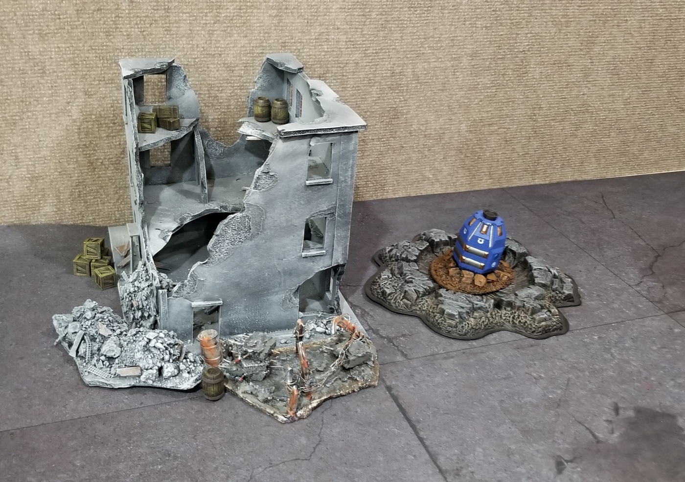
Doable, but blah.
It Has To Make Sense
The number one thing you can do if you want your board to look cool is to wear sunglasses, high top sneakers, and a denim jacket while you play the game. Trust me, people will be impressed. The number two thing you should do is give your board a theme narratively. No matter what terrain you’re using, set it up in a way that makes sense and tells a story. All too often people play this game without wearing cool clothing and accessories, and even more often, they just randomly throw terrain down.
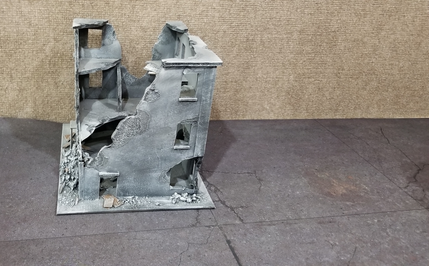
Much better already, but still lacking.
A bunch of nonsensical scattered terrain does not a cool tabletop make. You have to ask questions before setting up the board. Does anyone live here, and if so, where? How do they make a living? Who or what is native to this landscape? All of this will help you decide where to put the buildings, trees, ruins, etc. Have you ever seen a real landscape where the buildings were all haphazardly thrown a bout with no thought given to roads, symmetry or anything else? Of course not, so why should your miniatures expect any less?
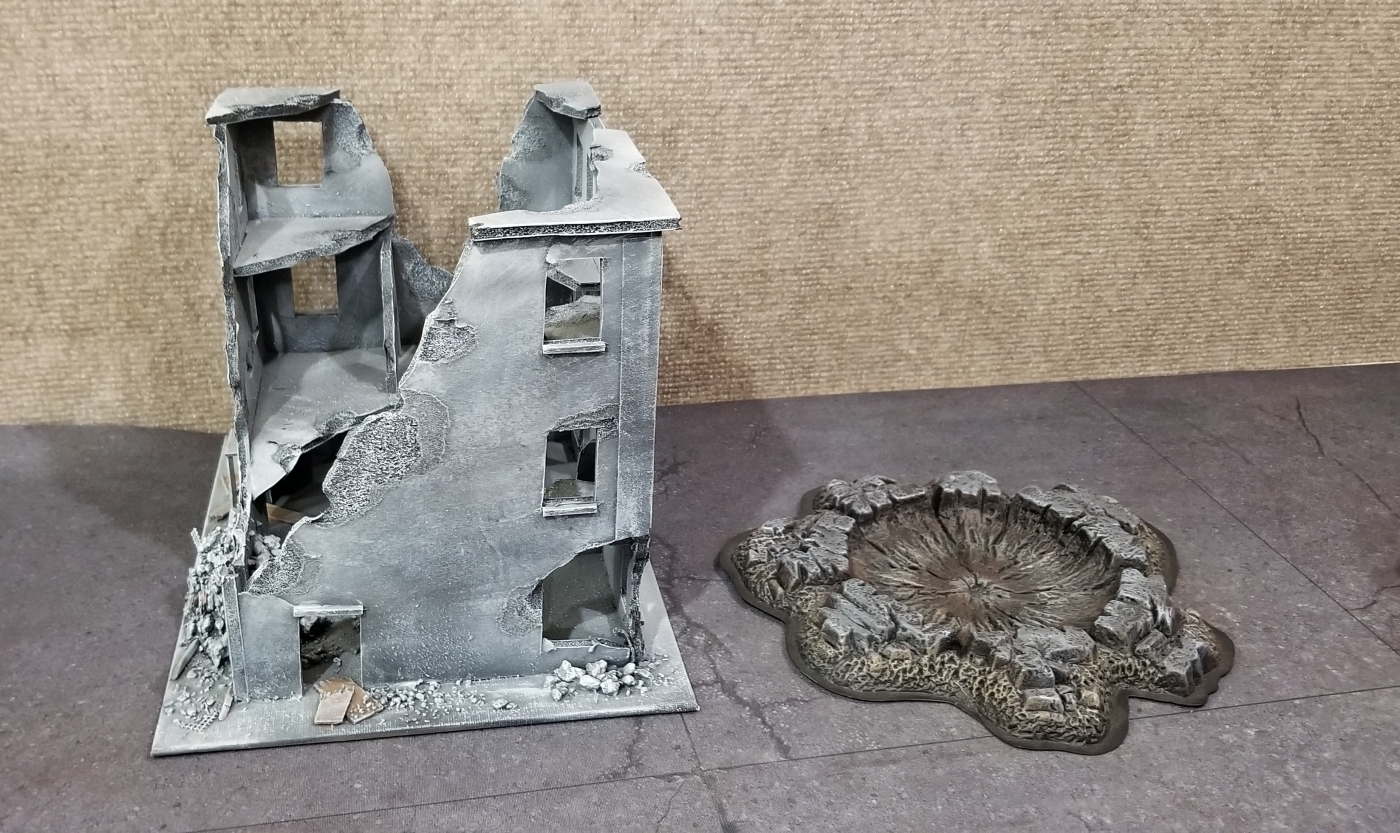
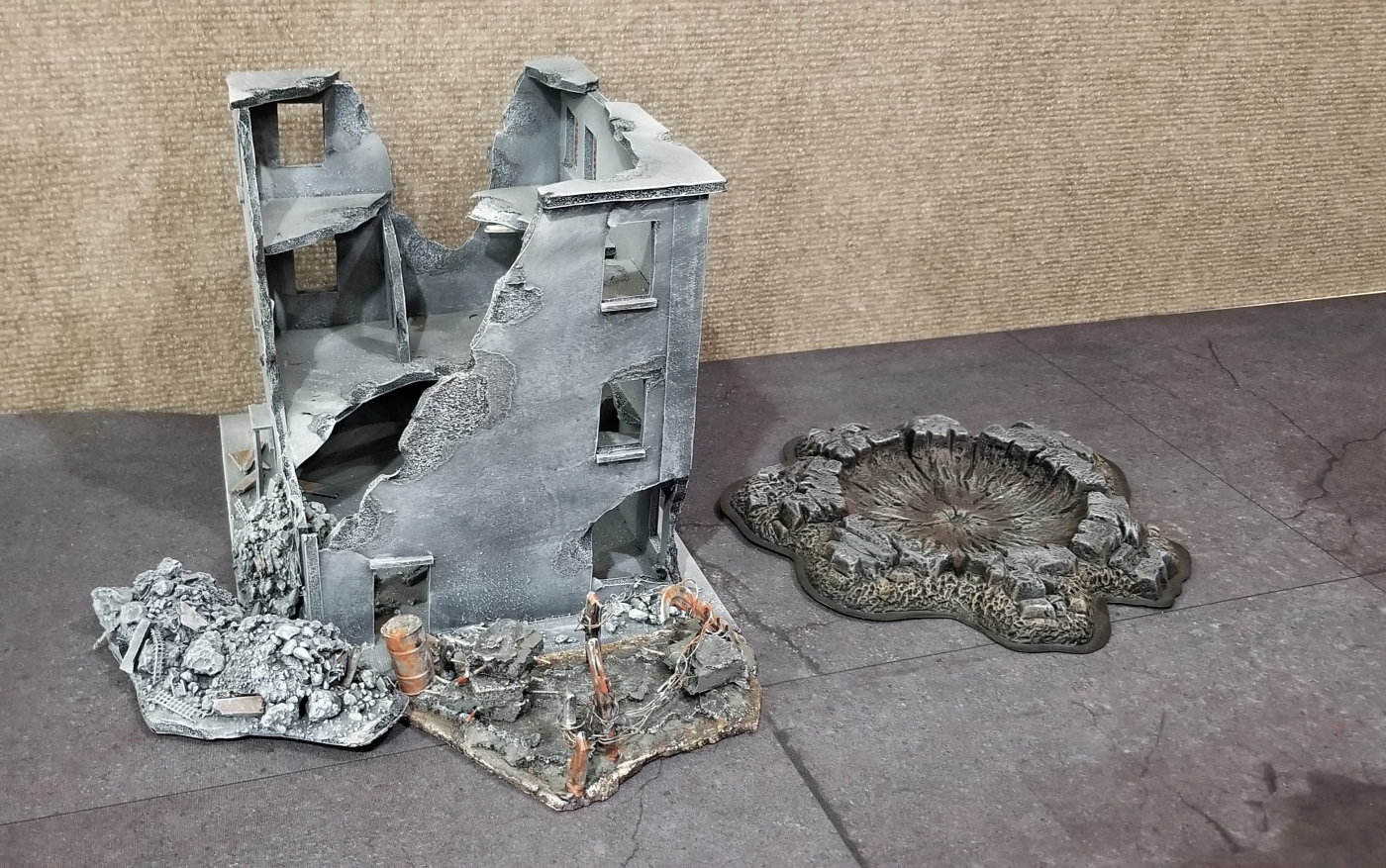
A good addition, but we can do better.
The typical board for 40k seems to be the ruined city, which gets really old quick. My personal favorite type of board is a half-city, half-natural board where it looks like the outskirts of a city or town. You get the color differences in gray buildings versus the pretty green of trees and grass, plus you get the difference in LOS blocking obstacles versus area terrain. It just makes for a nice pretty board.
Tying things together nicely.
It’s All In the Fine Print
Okay so you own a couple buildings and some trees, but you still feel like you’re missing something. You have a well-placed board that makes sense narratively, but you still have a weird feeling inside. Well this could be a couple things: it could just be gas. You might have to use the bathroom and you’ve been holding it to have more time to play with your friends, or you need your board to look more lived in. Adding a game mat underneath all of the terrain is the simplest way to add a huge boost in the look of your board with no effort. My personal preference is www.gamemat.eu for my mats, but there are many good companies out there. These mats add little details that really make a difference in not only determining where your buildings should be set, but also the tone of who lives there and what this place is like.
Adding those little details.
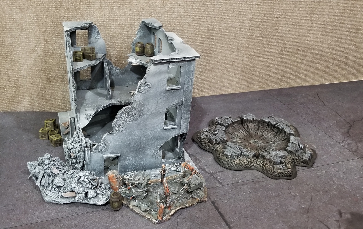
But that’s not all, there is one really important final touch to make to your boards to put them on the next level. Small details are key. As you can see in my pictures, every layer of detail on your board really makes a big difference. Adding small touches that illustrate how people live here is a big deal. Stacks of boxes outside of a building, rubble around a destroyed building, and objective markers that tell a story are all key to making your board lived in.
That One Weird Trick
There is a weird principle at work here, kind of like how men and women are so hopelessly attracted to me. If you just take a building and put it on the mat, that works okay. But those two things (building and mat) are obviously one thing sitting on top of the other. Often times their paint schemes don’t gel and if you’re being picky, it hurts the illusion of a real battlefield. So using small things around the base of the building kind of merges the two or blurs the line between terrain and mat. You’ll notice that many battle reports use fine gravel to merge the two and it provides an awesome looking blend of terrain and mat.
Throw in a narrative objective and voila!
Anyway, maybe you guys aren’t as into your battlefield’s look as I am, but it really creates quite a spectacle on the tabletop. Obviously the pictures are a very basic example, but you have to admit it looks way better than the first pic.
Do you have any other suggestions for a cool looking board?
Hey friends! Want to become a Pimpcronian?
Come join my Dynasty on Patreon if you enjoy my work. I promise I will love you forever.
Special thanks to Casey L., Andy B., Colin M., Caleb Y., Claes, Brendan, and Mandy for joining yours truly on Patreon!
Or contact me at [email protected] for the latest rules if you don’t do the Facebooks.

