Board Game Geek Revamps Their Website

Notable repository of all things board game, BoardGameGeek has relaunched their website with a fresh new look. Come see for yourself.
Board Game Geek has looked the same way since before Menelaus gathered together the league of Achaeans and set sail to get his wife back from Paris, making a seminal moment Greek History the first known reference to Borat. Not until British Rock group the Who would there be another Borat reference that topped the charts so handily.
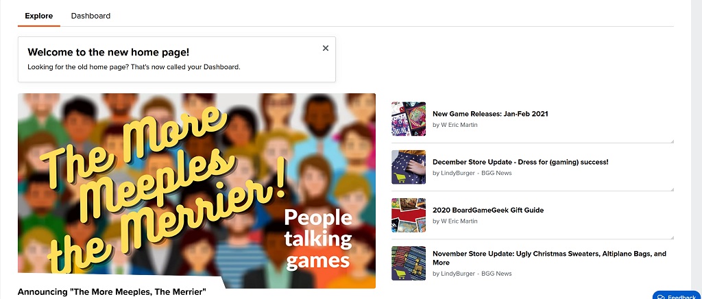
References to the greatest journalist of our age aside, the point is, Board Game Geek has been the same site since before the dawn of time. If you split open the Stone Table and Aslan came back from the dead, Board Game Geek would not be surprised because its site had been around when the magic was written. At least before today. Now Board Game Geek has revamped their site with a sleek new look that will usher in a bold new era in Board Game reviews, rankings, and community forums. The new site, shown below is a visual upgrade that brings it in line with pretty much every single other site out there.
Lots of bright visuals. High quality thumbnail images arranged in tiles. It could be a YouTube Channel or one of your favorite digital magazines/content sites.
They do at least let you get right to the point. What’s hot right now, what are people playing, and where can you find videos about the games all in one easy site–and laid out right at your fingertips. There’s a reason every website looks the same: it works.
It’s probably only a matter of time before tiled images arranged in pleasing patterns, some of which are articles, some of which are videos, is the order of the day here at BoLS. One day the algorithms will rule us all.
If you wanna be cynical you could say that algorithms are programming humans to appreciate certain things, caring only about what gets users clicking around like rats seeking a skinner-box-esque high in an effort to drive online ad revenues at an unsustainable rate that will one day come crashing down, but as long as you never look down, like a certain Coyote you’ll never know.
But until then, it looks pretty good and it works fast, which is all we really want out of a website.
What do you think of the new website? Check it out for yourself!


