Warhammer 40K: Howling Griffons McFarlane Intercessor Part 3: Freehand & Battle Damage
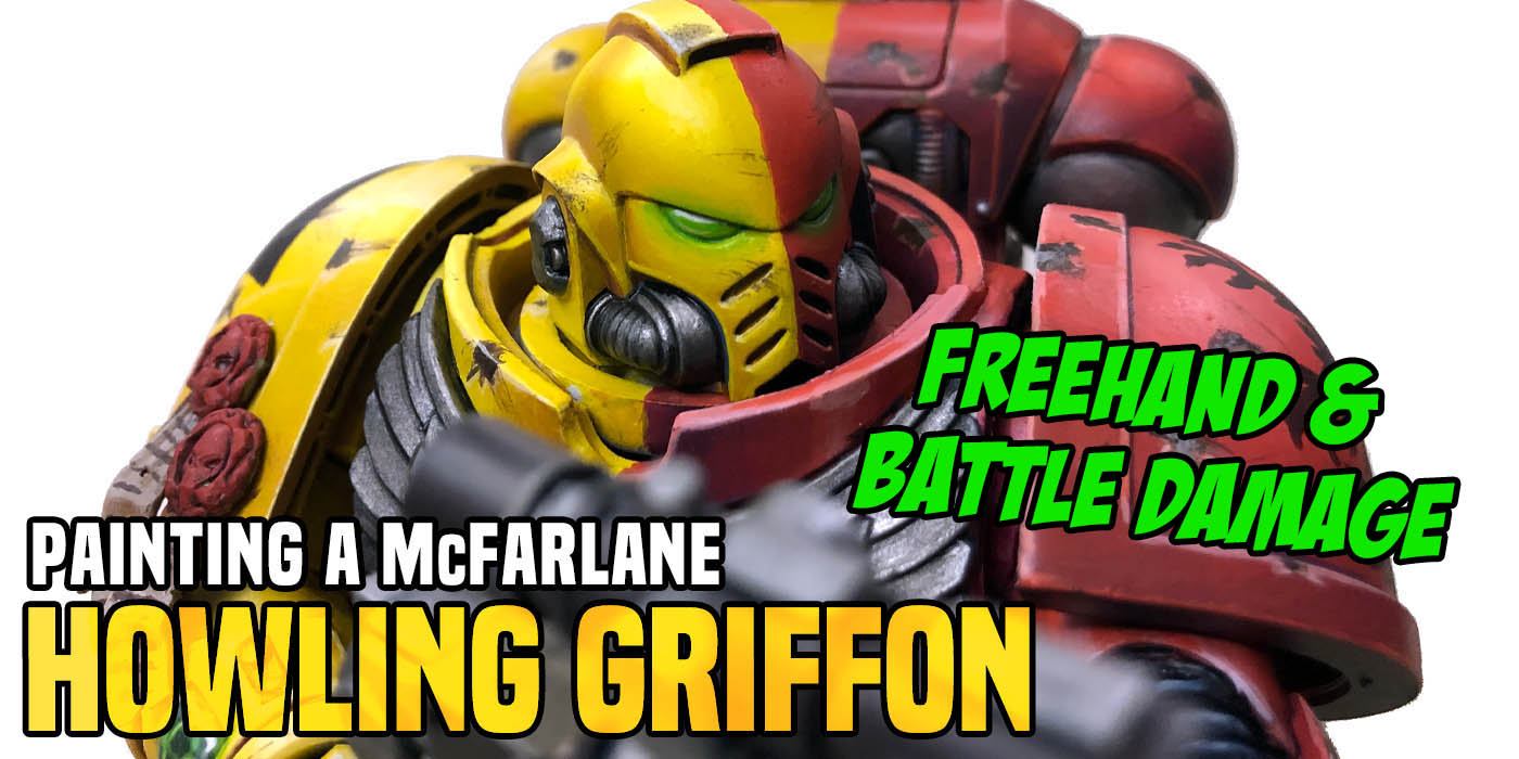

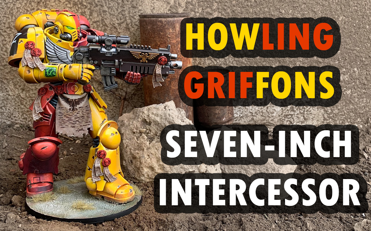
Time to work out all the final details and get this over-sized Astartes Howling Griffon battle-ready.
Catchup with the project here with:
Shoulderpads
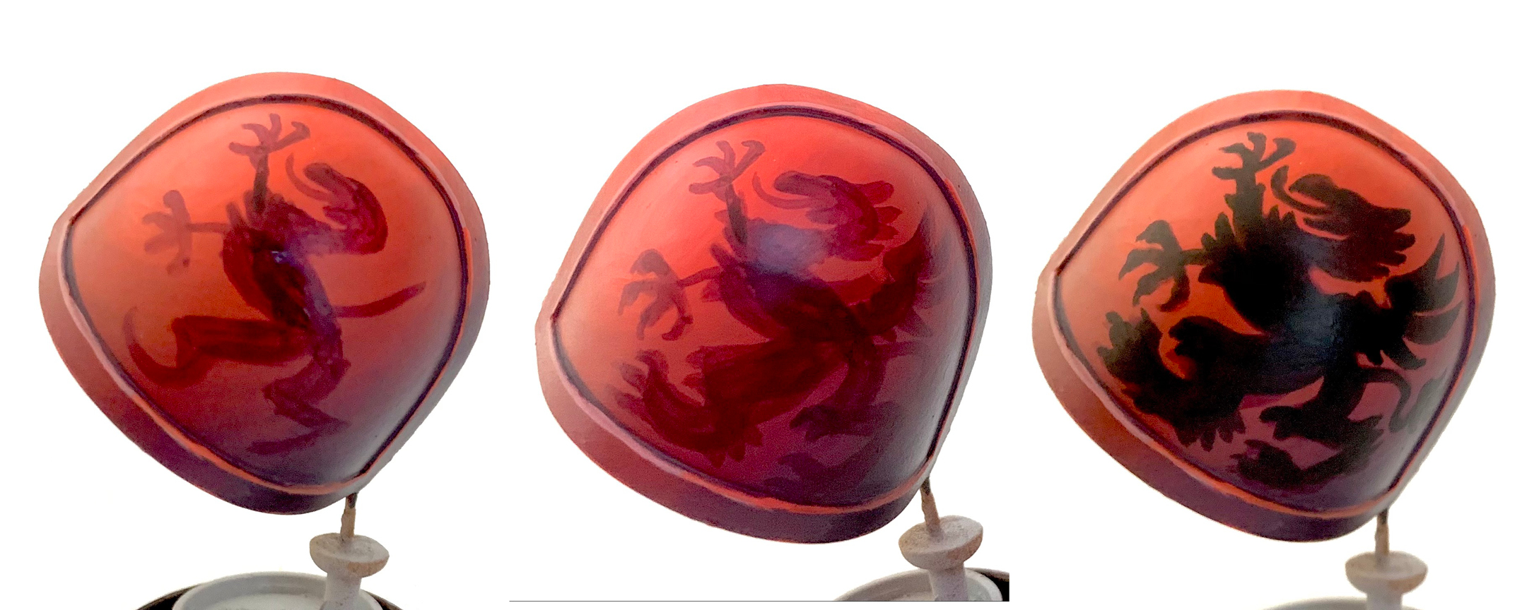
The chapter shoulderpad is as good a place as any to start. Last article I spent a long time blending the red on these shoulderpads, so I don’t want to screw it up. I start with a “sketch” in a slightly darker red. Any mistakes I make will be easier to clean up than with a pure black. I start with the inner portion and build it out from there. Once I’m satisfied with the design the black goes on top. You can see some of the red coming through underneath but it did cover up easier than the black would have.
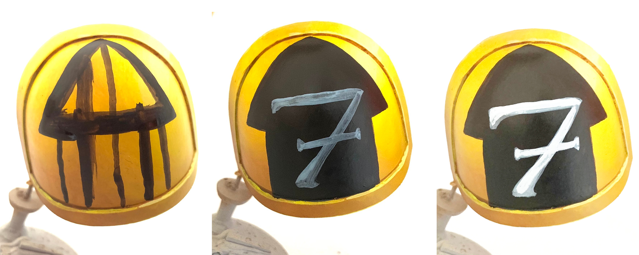
I was less careful with the arrow shape on the other shoulder pad since it is a much simpler shape. First I drew a line down the center, then added the other lines to complete the shape. The stem was too narrow at first, hence the two sets of lines. It’s always best to start a little smaller. Making the shape bigger is easier than having to paint over it to make it smaller again – especially with yellow. For the seven I started with a base of Fenrisian Gray and painted the white over it.
Tabard
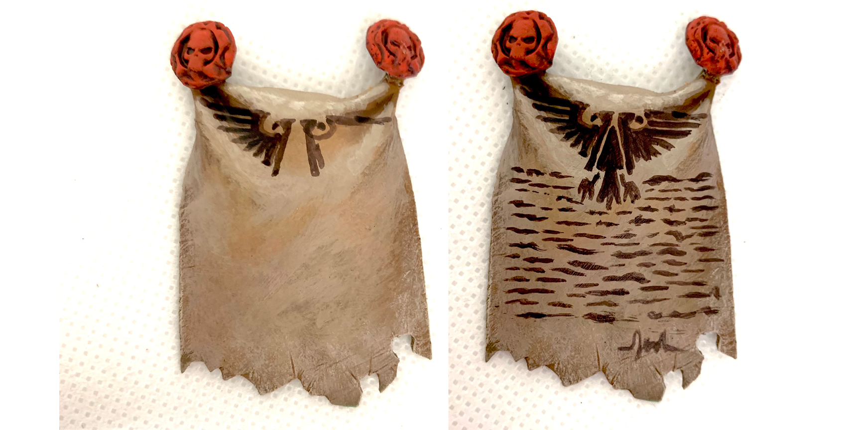
I was less careful with the tabard since it’s supposed to look like it was loosely scrawled with a brush.
Eyes
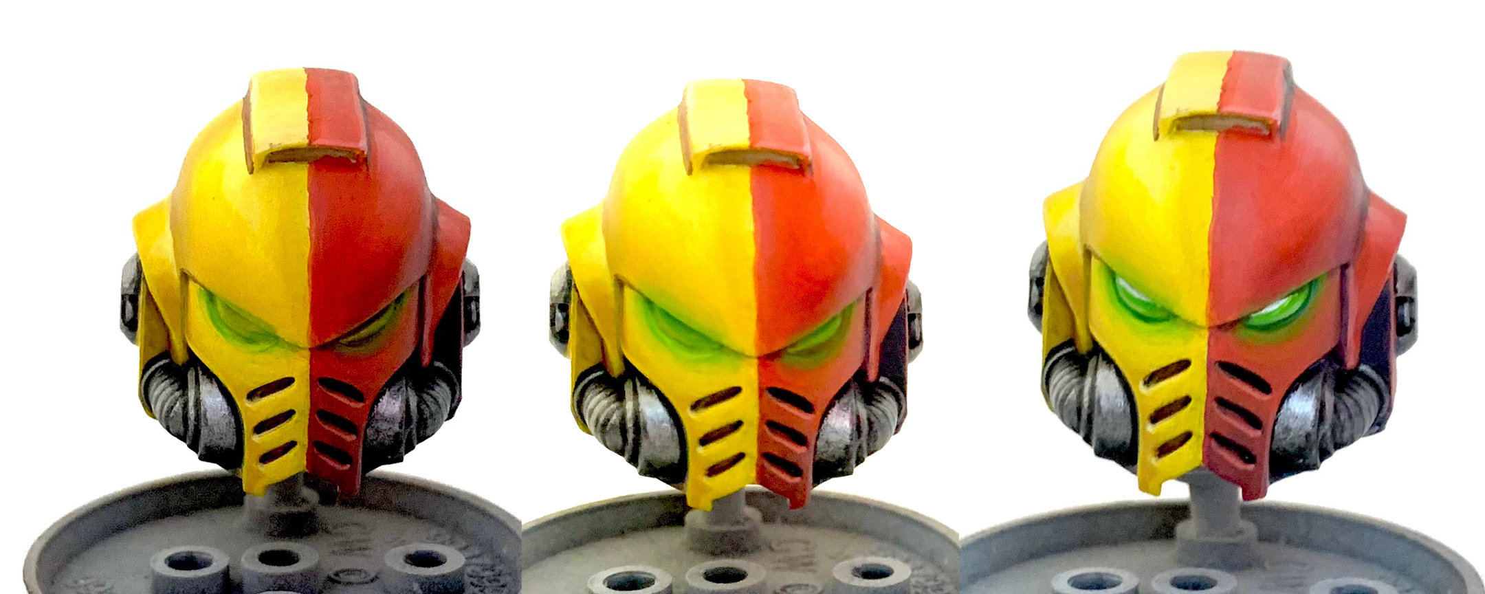
I made sure to give the eyes a nice glow with a gem texture for the lenses. Moot Green is blended out into the yellow and red. Warpstone Glow is blended in at the top of the lens before a white spot is painted on as a reflection.
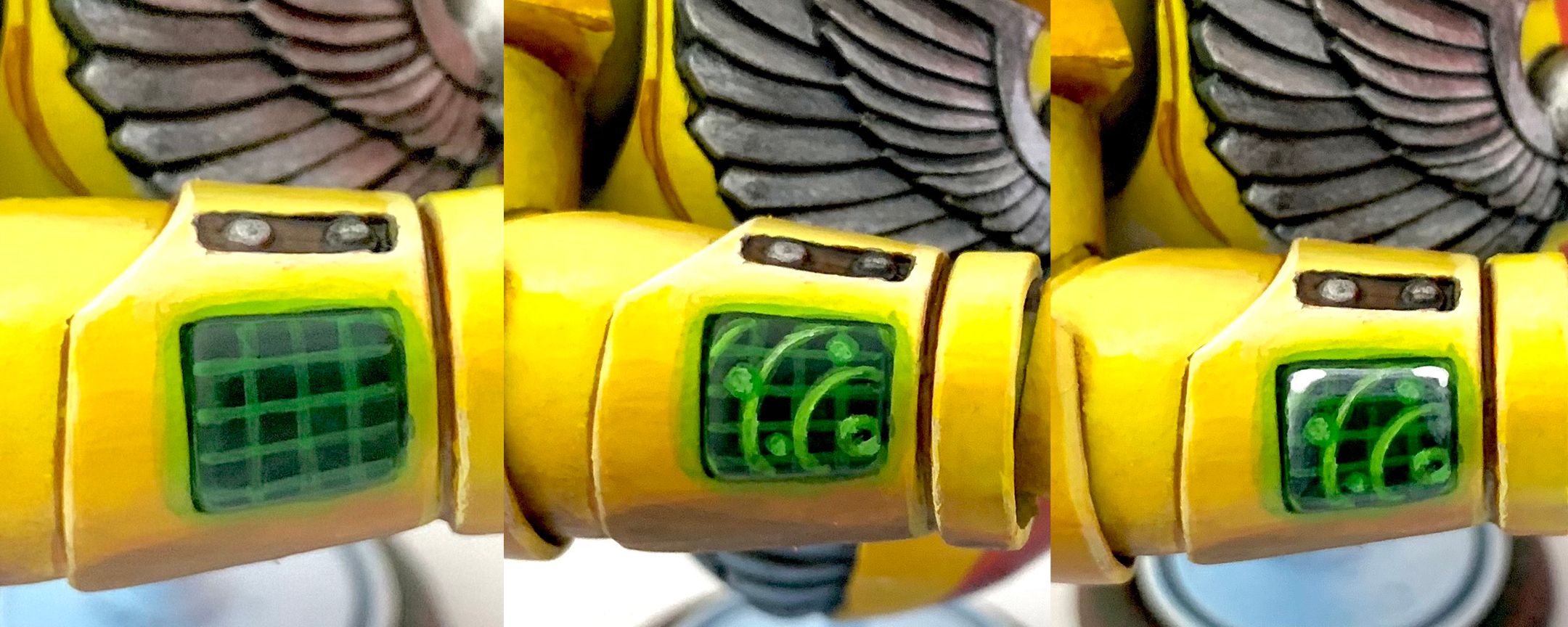
I had to do something cool with the screen on his arm. For the base of the rectangle, I blended a bit of Warpstone glow into Caliban Green into some black from bottom to top. The grid is a mix of Warpstone Glow and Moot Green. The same mix is used for the circles, but then another stroke of pure Moot Green goes over them. Then a final smaller stroke of Moot Green mixed with a little white goes over that to help with the glow illusion. In the final step I use a thin transparent glaze of Fenrrisian gray to add a little shine to the top of the “glass” screen. Then the top corners are defined a little more with pure white.
Battle Damage
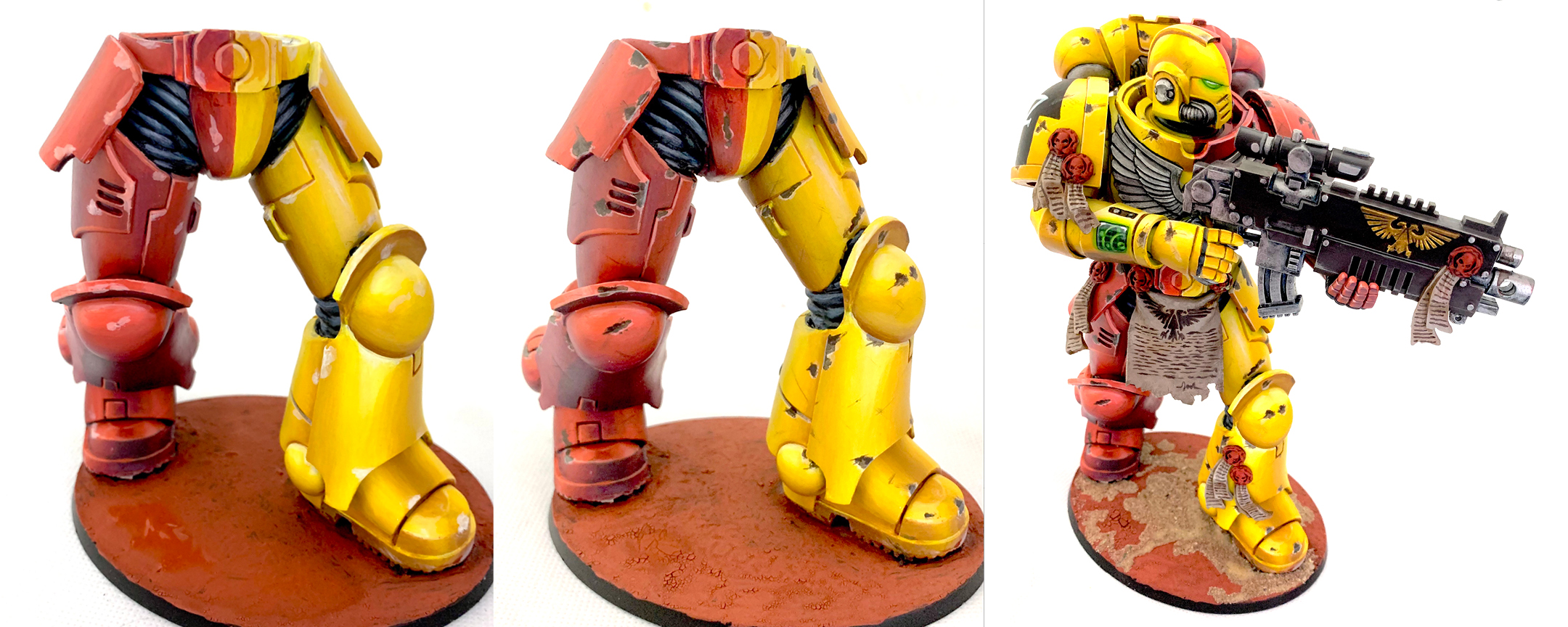
Finally the battle damage. This is one of those things that can be tricky to get just right. Too much just looks wrong and too little seems pointless. Start by painting little splotches with the brightest highlight used in the surrounding area. Maybe add a few streaks for good measure. Then go back over the splotches with a darker color (Skavenblight dinge in this case) leaving just a line of the original lighter color. This creates a highlight for all the “chipped edges.” Then at the very top of the new dark splotches, add a line of pure black, or just a somewhat darker color like maybe Rhinox hide or Dryad Bark. I also added some light streaks of Skavenblight dinge around the model for less extreme damage.
As you can see I was also working on the base at this point. I used Martian Ironearth to add some cracking to the base, but the cracks were so small I covered most of them with some sand before painting over the whole area with Skavenblight Dinge and Rhinox hide, splotched on in patches so the color wasnt too uniform. Then I drybrushed it with Screaming Skull and added some GF9 Grass tufts.
Now is as good a time as any to mention that the flexible rubbery material this guy is cast in does not bond well with super glue. It ended up being literally impossible to get him to stick to the base without several pins in the feet. He still wobbles just a little since there’s a very small gap between his feet and the base due to the uneven ground texture.
~ Hope you’re enjoying the article so far! If you want to see more of my work, find me on Instagram (#t00mini) for what I’m up to day to day. I also have a blog: [email protected], but I don’t post there as much as I used to.

