Star Wars: Stunning Concept Art of The Prequel Trilogy
We’re back with some more of the incredible concept art from the Star Wars saga. This time we’ll be looking at Prequel Trilogy.
The Star Wars Prequal Trilogy was known for sleek lines, futuristic architecture, and technology of a galaxy just before everything was thrown into chaos and war; and regardless of how you feel about the content of the movies, visually the Prequels were positively stunning. And the concept art shows years’ worth of art making it so.
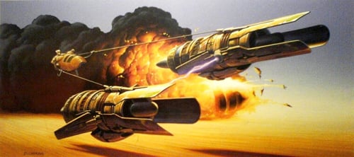
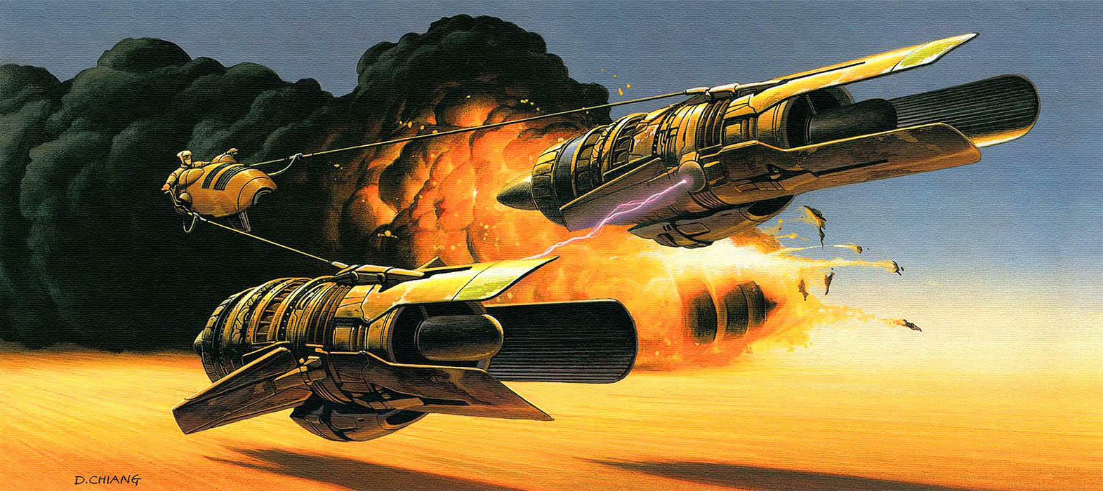
Now that’s what I call podracing! I know podracing wasn’t anybody’s favorite part of the series, but there is something very cool about seeing how close to the final product the concept art was. Something that I’ve noticed time and time again with the Prequel art is that they seemed to know exactly what they wanted the galaxy to look like at the beginning and went for it every time while the Original Trilogy had some wild and seemingly experimental art choices.
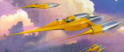
Similarly, this early design of the N-1 Starfighter is so similar to its final form that it’s still instantly recognizable, down the the exact color scheme.
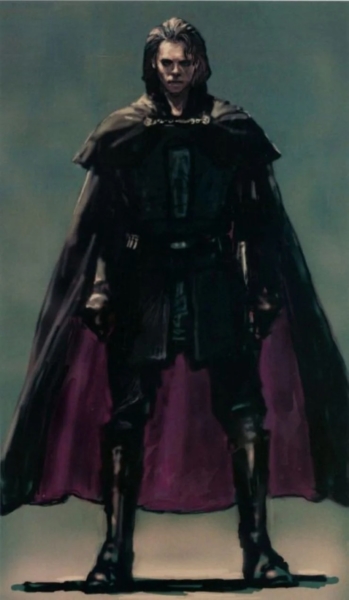
Even some of the concept art for the characters is almost exactly what we got on the screen. For example this early version of Anikan has some obvious differences but could be nobody but the future Sith Lord. Got it in one.
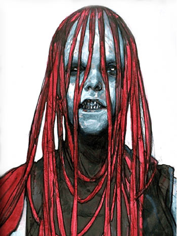
On the other hand, Darth Maul originally had a very different look from the Zabrak we all known and love. While the red and black skin and horns eventually became an iconic part of the character who the fandom seems to have collectively willed back into existence long after he should have been dead, this early look had long, hair and graying skin. Still not someone I’d want to be ambushed by, though.
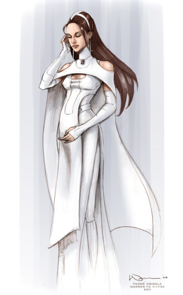
And of course Padme’s many many outfits had to be planned out, designed, and redesigned multiple times. What I enjoy the most about her specific concept art is how much it reminds me of fashion sketches, which makes perfect sense when you think about it. Fashion is one of Padme’s biggest tools for social cues and has more costume changes than I care to count.
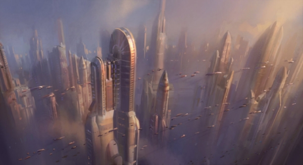
The vibrant settings and locations were a huge part of the Prequals with concept art that perfectly showed how huge and never-ending some of the views of Couruscant could seem. Even the mid air streets of ships were designed into the original.
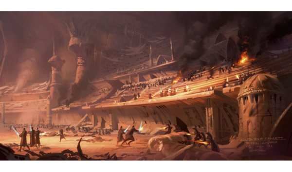
On the screen the Petranaki Arena Battle is so exciting and busy that this gorgeous art is almost boring in comparison. You can almost hear the buzz of the lightsabers, but not quite, but anyone can tell that this scene is tense and treacherous.
I have so much more Prequal art saved to my computer, but these were some of my favorites. What is your favorite piece of Prequal concept art? What art are you most surprised by? Which would you frame and hang on a wall? Let us know in the comments!
May The Force Be With You, Adventurers!

