Star Wars: Stunning Concept Art of The Sequel Trilogy

We’re back with some more of the incredible concept art from the Star Wars saga. This time we’re exploring the early designs of the sequel trilogy.
Love it or hate it the sequel trilogy sure is there. I won’t go as far as to say that every movie was great (or good), but the sequels had their moments and some visually stunning scenes brought to us by a team of incredibly skilled artists. Every film starts out as an idealized form of itself with big plans and gorgeous designs, and the last three movies in the Skywalker saga are no exception. Perhaps nothing exemplifies this better than the gorgeous concept art.
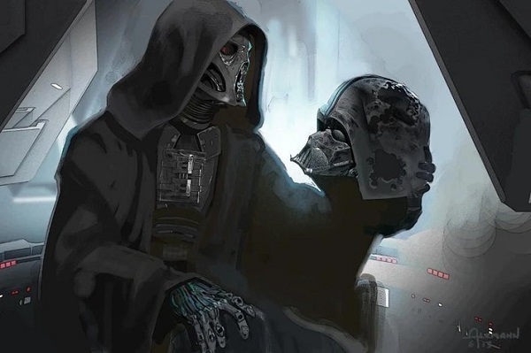
Kylo Ren
By and large Kylo Ren looks the same here as compared with the final version we saw on the big screen, but there’s something that lands just a little differently. Maybe it’s the helmet that looks a little more skeletal, or possibly it’s the combination of the trademark Skywalker robo hand and the messy and damaged looking chest armor. We’ll never know if this would have been a completely new version of Kylo or just a slightly different look, but we do know that his love for grandpa was always a big part of his character.
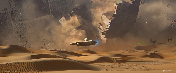
The Garbage Will Do
The triumphant return of the Millennium Falcon was one of the most fun scenes in The Force Awakens, from the almost unreasonable trick flying to the quips reminding us that the ship is basically the equivalent of that trashed sweatshirt we’ve had for too long and refuse to stop loving. This piece shows the chase to be as dynamic and exciting as it turned out in the final product, and Dusseault’s art style could easily be mistaken for a screen still at first glance.
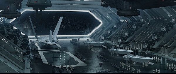
The First Order
I’ll never get over how The First Order was just the Galactic Empire with a slightly updated paint job. But I guess when you nail it with the design the first time, why make big changes? Clyne uses this piece to show the size and scope of the First Order’s power… and how little things have changed in the last couple of years.
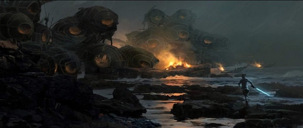
Rey
An in-training Rey runs towards the mysterious bonfire in this concept art from The Last Jedi. So much of tLJ art is full of gorgeous landscapes and bizarrely cool scenes from Canto Bight, and while this is one of the more divisive of the movies it’s hard to deny the work they put in to make it visually stunning.
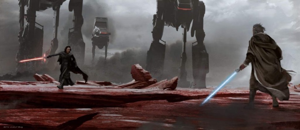
Kylo and Luke Face Off
Sometimes the final product is a hard departure from the early art, but others result in the original concepts looking like they could have been lifted from the movie itself. The showdown, the imposing First Order walkers, and the red salt are all so similar to the same scenes in The Last Jedi. Visually, the team nailed it.
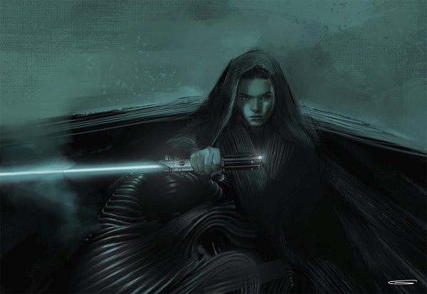
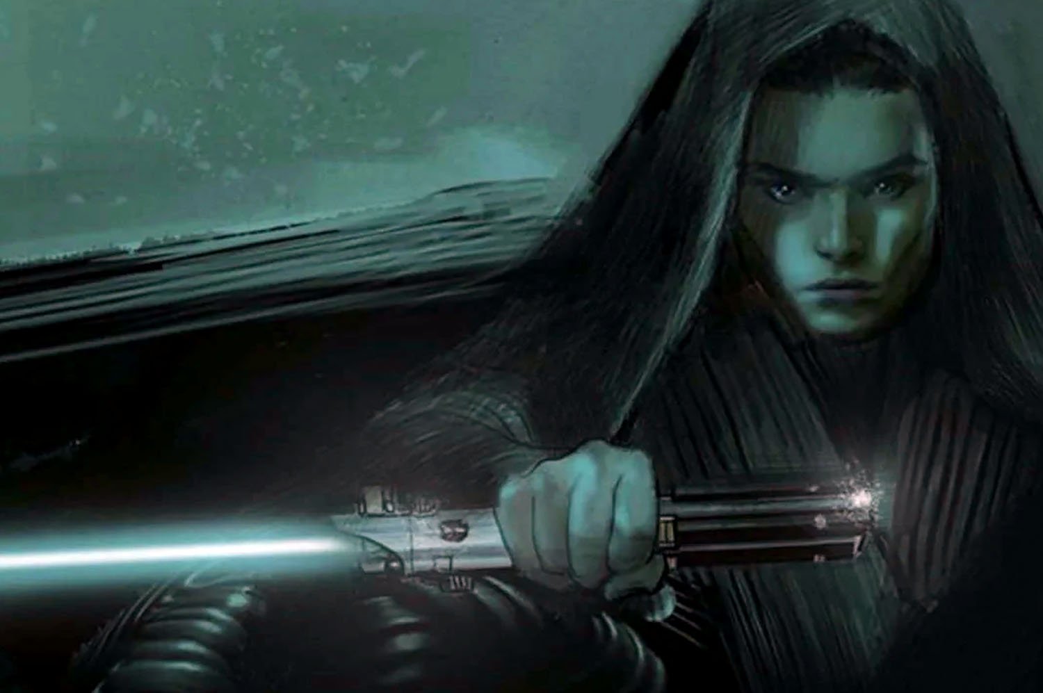
Dark Rey
There is so much to be said about this early art for Dark Rey in Rise of Skywalker. The color choices are dark and moody and the hood hides her face in shadow in a way that would be very on brand for a dark side leaning character. But my favorite detail is how the billow and texture of her cloak mimics the style of H.R. Giger for an effect that’s a little creepy and off-putting, but in a way that I can’t not love.
What’s your favorite piece of concept art from the sequel trilogy? Do you want to see the art from the lost version of episode nine that we’ve been teased with but will never get to see? Which trilogy’s early art is your favorite? Let us know in the comments!
May The Force Be With You, Adventurers!

