Warhammer: Why Be’lakor’s Glow-up Is A Reimagining Done Right
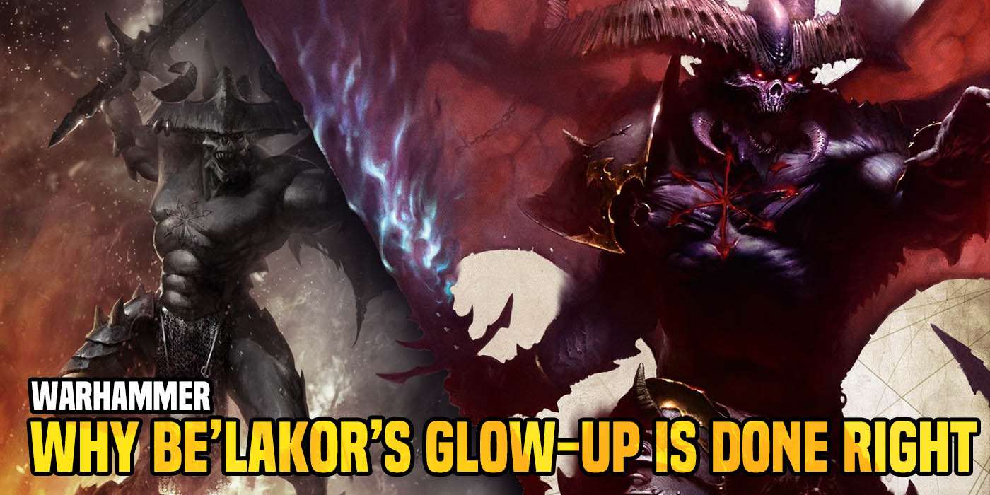

By now, you’ve probably seen the fantastic new model. But have you wondered why this “Glow-up” is a reimagining of a classic done right? Let’s chat.
Be’lakor, the First Daemon Prince, Master of Shadows is an iconic figure in the mythos of Warhammer. A Daemon Prince that crosses over in both 40k and Age of Sigmar (and Warhammer Fantasy before that), he’s been a key player in many of the events in the various game systems. That said, it never really felt like he got the respect he deserved for being the First Daemon Prince. If you know his back story then you probably know why he was relegated to being “second fiddle” to other players (like Abaddon or Archaon).
Until now.
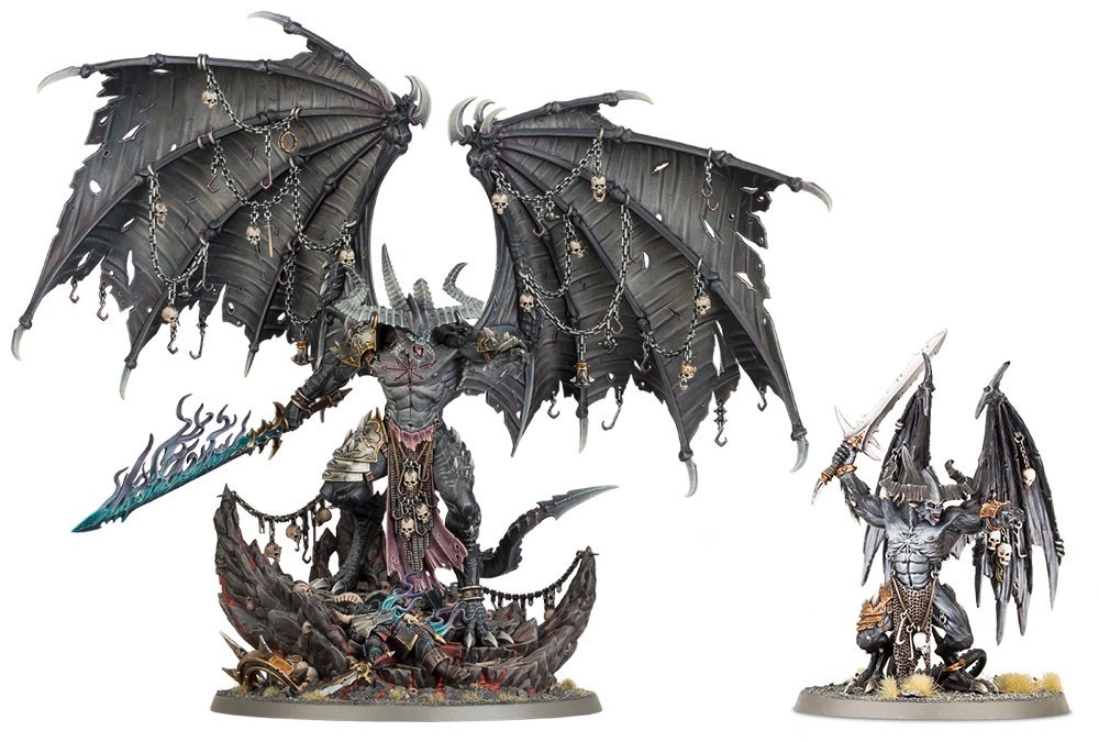
With Broken Realms: Be’lakor, he’s looking to make some titanic shifts and disrupt the status quo. It’s clear he doesn’t want to remain a bit player any more and it looks like GW is going to go with that considering he’s got a crazy new model! Today, we’re going to take a closer look at the model and see why this is reimagined Be’lakor his all the right notes.
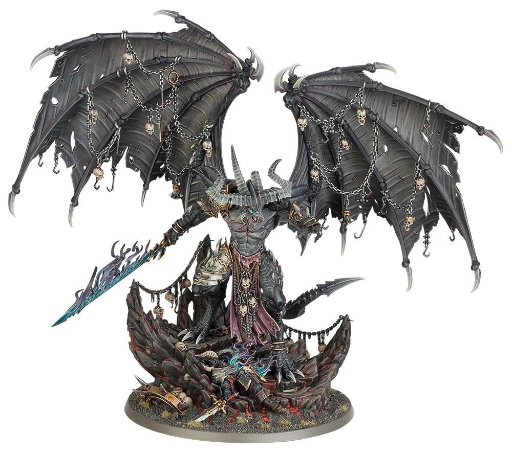
We’ve already seen the size comparison and not only is this model twice as tall, we’re also looking at a much wider model, too. That’s mostly thanks to the wings which are outstretched and MASSIVE. That adds some serious volume to the new Be’lakor. While the new size is impressive, it’s all those little details that really make this model shine.
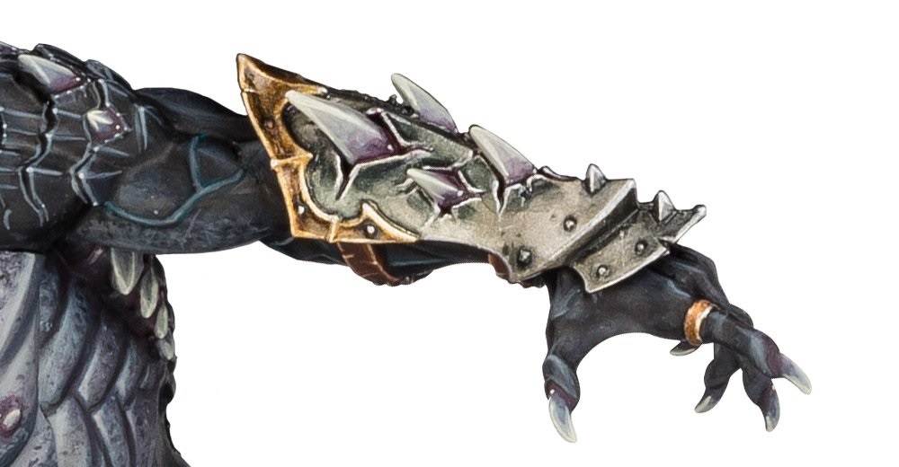
The model is going to have alternate pose options including arms and faces. This particular arm is a great look at one of the nods to the previous model. It’s got the forearm bracer like the old model, only this one has spikes protruding out. It similar to when a character in an anime “power’s up” and their clothes get shredded from the sheer size and power upgrade.
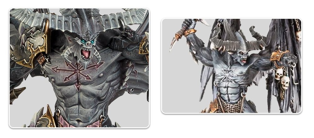
Here is another good look at the torso and head. You can clearly see the nods to the old model in the face and horns. It even has the same number of rings within the horns. And the facial horns look like the previous model “did that anime” thing and hulked out. It’s a bigger version of the same model in all the right ways. Looking at the chaos star on his chest, this is one more update that takes it to 11. The previous model had the star raised on top of his skin while the new model looks like it’s been carved into his chest. Now that’s some dedication to the cause.
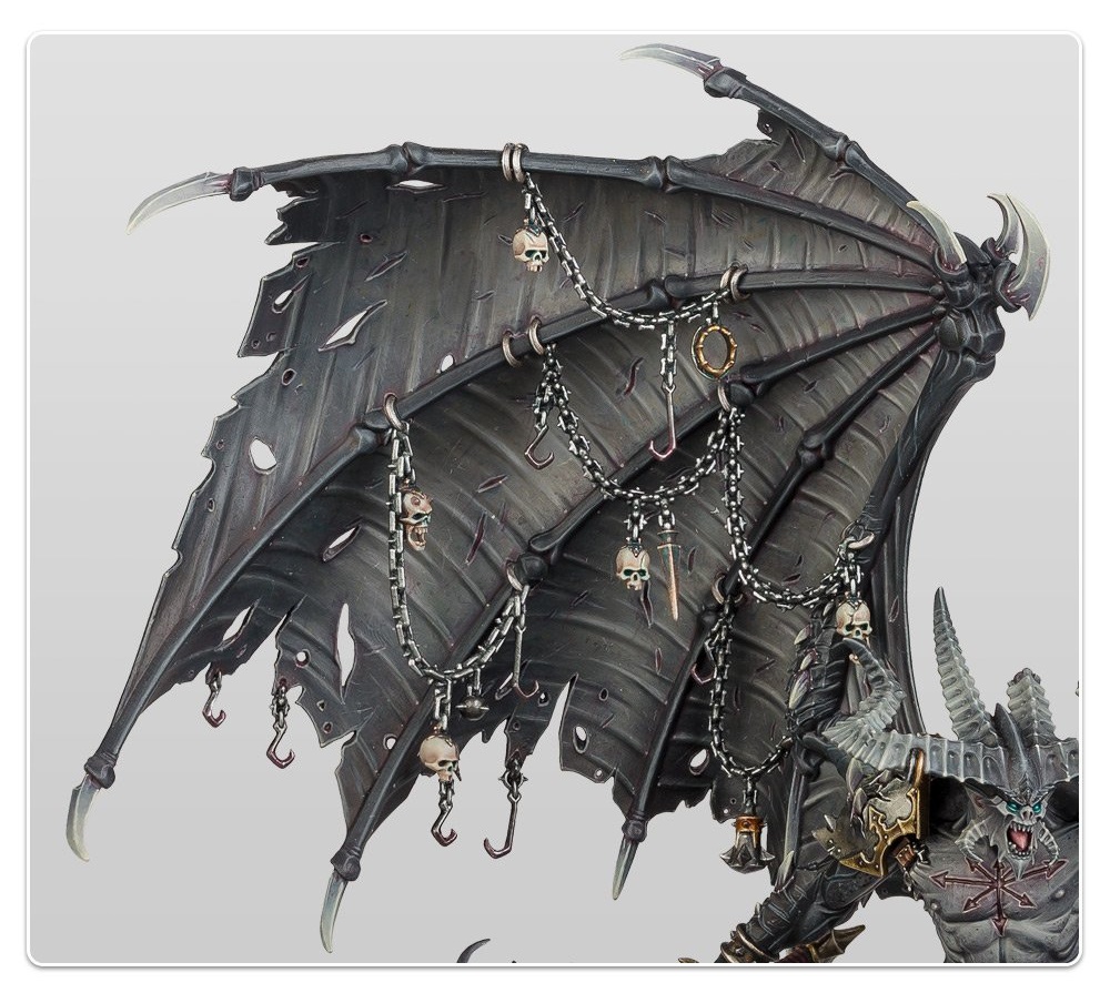
Another massive change and huge improvement are the wings. Here we get a closer look at one of them and it’s really impressive. The wings are what really make this model large and imposing. Part of me really wants to see if there is a way to build this model without the wings as a different conversion – but that’s another topic. The wings and chains here are another nod to the old model and because of the advances in technology (and swapping from metal/resin to plastic) GW is able to produce this much larger and much more open version. The chains are also going to literally hang from the wings, too – that’s another improvement over the old model.
Finally, let’s talk about the base, legs and tail. Starting with the tail, the previous model’s tail was pretty low-key. The new model’s tail looks a lot more imposing and daemonically enhanced. It could be a weapon in it’s own right. Leg-wise, again we see the nod to the old model with the armor plating on the same right quad – but the spikes protruding are another sign that it’s there mostly because it looks cool. No longer is his loin cloth just chains either, there’s now cloth there also and it adds some texture to the model (and looks stylish, too). The rest of the legs and feet are just as impressively updated as the rest of the model.
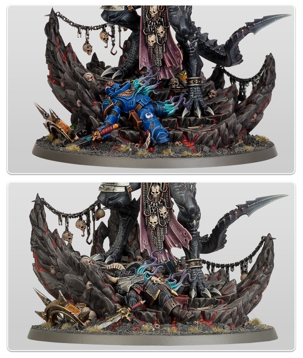
As for the base, this is where GW really did some impressive things. First up, you can either go with a Space Marine, a Chaos Warrior, or just leave them off the base. I appreciate that! If you wanted to dedicated your Be’lakor to a single system you can. But the base is sculpted in such a way that you don’t need to have the extra bit – that’s great! And how about the rest of the baseing? It’s like an impact crater and Be’lakor is the epicenter of the impact. Seriously, the more I think about it the more I think that he just went all Super Saiyan and hulked out.
That’s why this is just a great reimagining. It’s got all the elements of the previous model but upsized and upgraded. At the same time, as large and imposing as this model looks, it doesn’t look out of place or “cartoony” – there is some “over the top-ness” going on, but in a good way. I think the sculptor did a fantastic job not going *too* extreme while still taking this model to 11. I can’t wait to see what the community does with this one!
What do you like about the new Be’lakor model? Let us know in the comments!

