The Most Underrated ‘Star Wars’ Film – The Concept Art of ‘Rogue One’
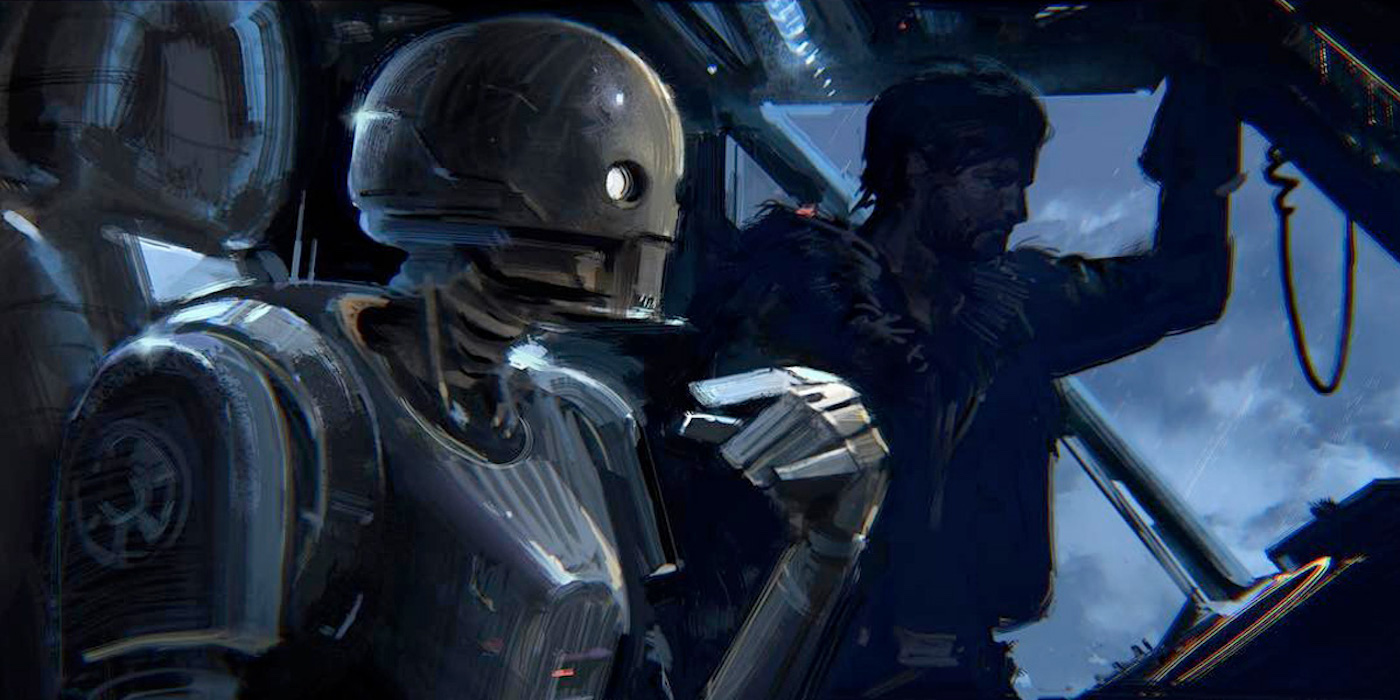
Rogue One is probably one of the best Star Wars movies in recent history. So it’s no surprise that its art is some of the most beautiful.
Andor comes out this week, and his return to the Star Wars scene has us thinking about Rogue One again. One of the best and most original Star Wars movies in a long time, it instantly became a favorite amongst fans. And recently it’s been back in IMAX as we inch closer to Andor‘s premier. Between new locations, favorite characters, and a story that knocked the wind out of all of our sails, it’s one of the more memorable stories to come out of the galaxy. Let’s take a look at where it all started and what the first visions for the movie were.
The Art Of Rogue One
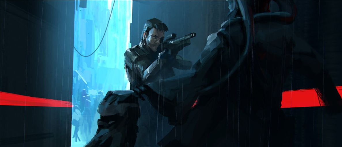
We meet Cassian Andor pretty early on, and it seems like from his inception he was always a hardened Rebel agent. Here he’s facing down a would-be assailant, probably to collect intelligence.
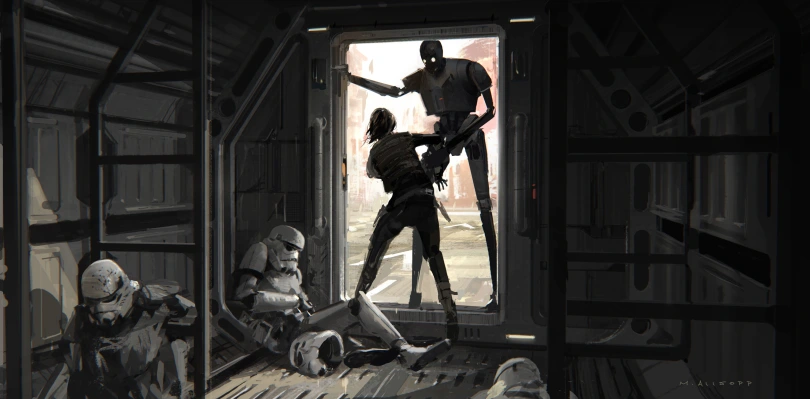
Speaking of introductions the first time Jyn and K-2S0 meet is an iconic piece of Star Wars history. This art really draws attention to how tall K2 is in comparison to… everyone. “Congratulations! You are being rescued. Please do not resist.”
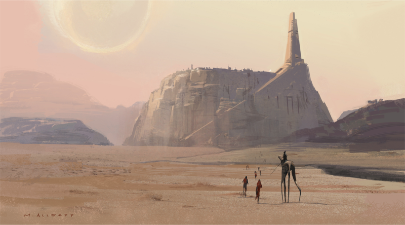
The concept art of Jedha City from far away is very similar to the couple of images we see next to imperial ships, but it’s hard to forget just what the city looks like. Unfortunately, I don’t remember seeing that tall creature in the final movie, so if it was there it didn’t make an impression. But the figures traveling toward Jedha City make it feel like a pilgrimage destination. Which likely wasn’t too far off.
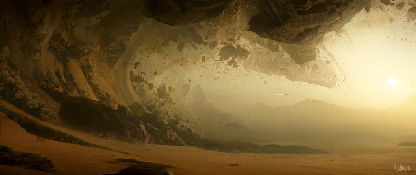
In comparison, the destruction of Jedha City looks terrifying in this Rogue One art. The debris is close to blocking out the sun, and the ship trying to outrun the destruction gives an indication of just how massive it all is. This isn’t the first time Star Wars fans witnessed the Empire’s destruction potential, but it’s just a preview for people in-universe.
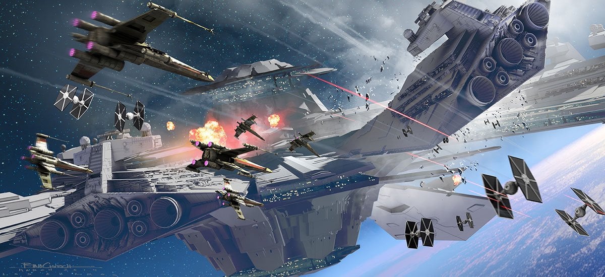
Most of the action in Rogue One took place on-planet as we followed the main characters, but there were a fair amount of space battles happening, too. This art captures the sheer chaos of everything. It’s a little hard to tell where ships are going or how many there even are, and that’s probably the point.
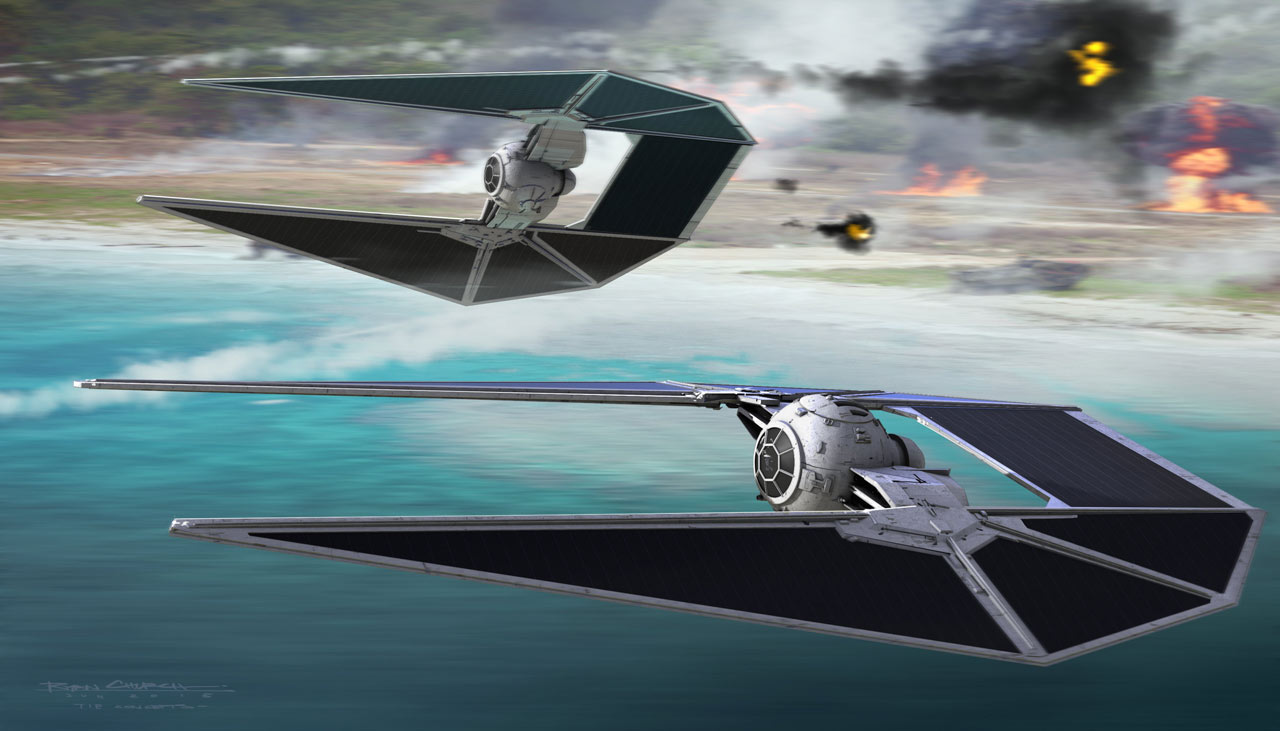
While down on Scarif, the other half of the battle is raging. This Rogue One art is a little less chaotic. But the background details are where this shines, I think. The ships in the foreground are beautiful. But the blurry background showing how fast they’re moving, and the explosions of the beach battle set the mood.
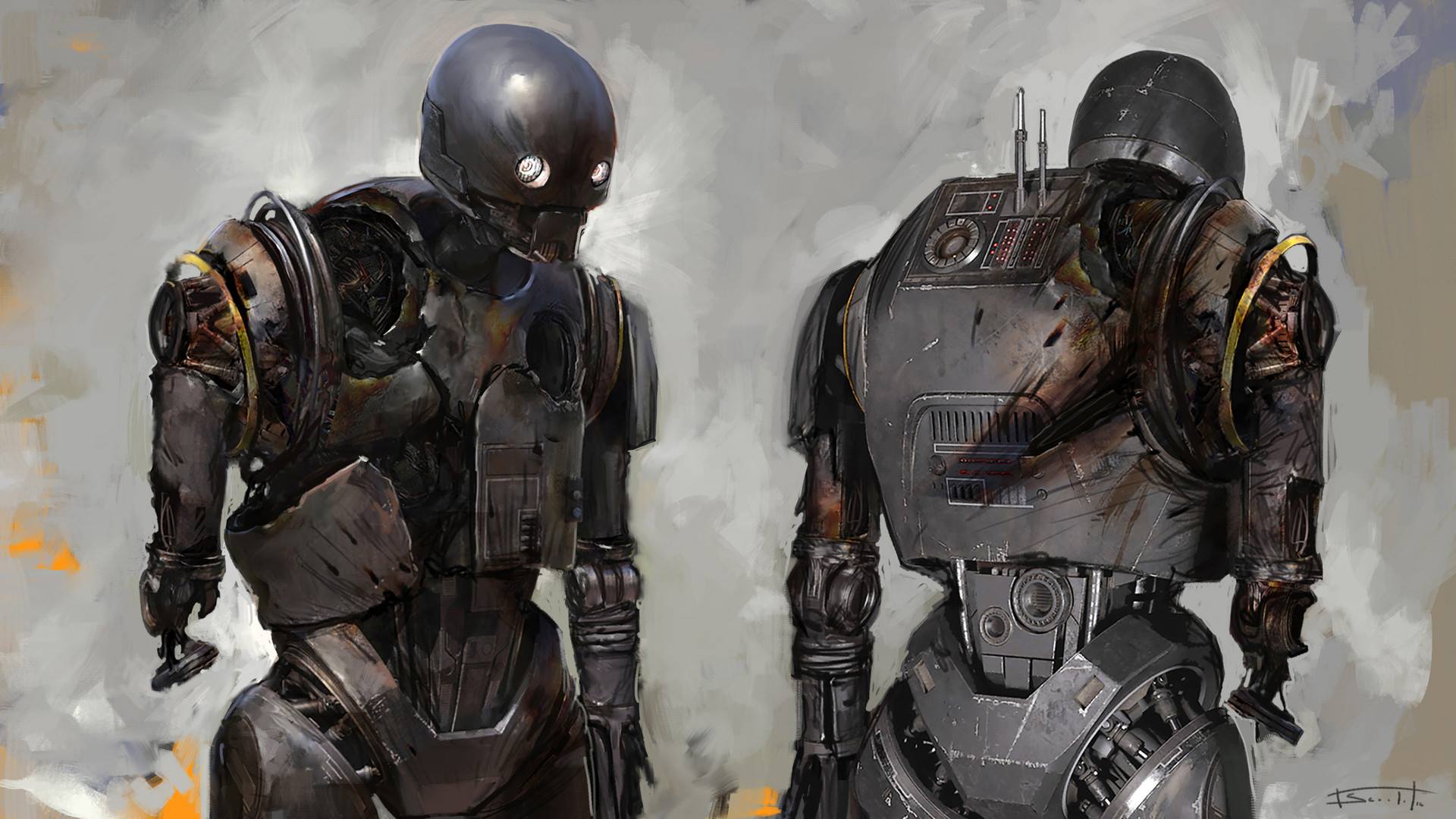
I didn’t grab a lot of character concept art, though Rogue One has some incredible art to choose from. But this piece of a badly damaged K-2S0 was impossible to overlook. The burn marks and torn-off arm all tell a very specific story of what K2 has been through. Luckily we don’t see his downfall in too much detail in the movie. But we could have.
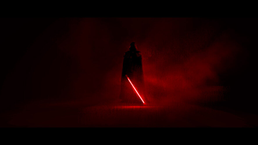
Darth Vader’s appearance at the end of Rogue One was incredible. Fans had a mixture of excitement and dread. In the end, it was a scene that was terrifying and very cool in equal measure. And this image of Vader illuminating the darkness with just his lightsaber was so striking and perfect. Sometimes the art that’s planned is also art on screen, and this was one of those times.
Andor will begin streaming on Disney+ on September 21st. The twelve-episode season will post new episodes weekly with a special three-parter release on the 21st.
Do you have a favorite piece of Rogue One art? Which movie do you think has the best concept art? Are there any scenes you’ve seen art for that didn’t make the final cut? Let us know in the comments!
May The Force Be With You, Adventurers!

