GW: Warhammer Gets A New Logo


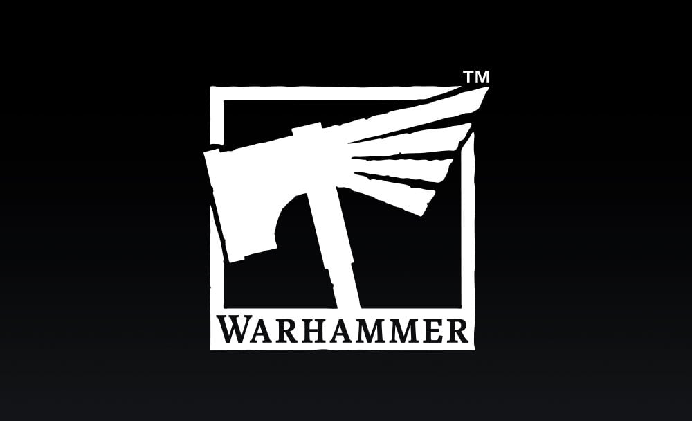
Games Workshop has unveiled a new logo for the Warhammer brand. It’s all about the Hammers and Eagles.
Warhammer means a lot of things to a lot of people. But it’s also become an umbrella term for the major game systems that Games Workshop owns and operates. It doesn’t matter if it’s Warhammer: 40,000 or Warhammer: Age of Sigmar – it’s all Warhammer…at least in terms of branding. Oh and Hammers. And Eagles.
Warhammer has been around for over 30 years, in various forms, but we’ve never had a single logo that unified the awesomeness of the entire Warhammer hobby – not just Warhammer 40,000 and Warhammer Age of Sigmar, but all that good stuff on the side – painting models, hanging out with your mates, amazing events, video games, T-shirts, the lot. Warhammer now means a lot more than models – it’s a way of life! So, we’ve made a logo designed to capture it all, featuring those two classic symbols of our worlds – hammers and eagles.
The New Logo
It’s a combination of the Imperial Aquila and a Sigmarite Warhammer – and I kind of like the new look. What’s I’m really curious about is what this means for the future.
Now, I seriously doubt they are going to merge the game systems anytime soon (or ever really). However, it is a way for them to consolidate their brand under one brand new symbol – for marketing that’s kind of a big deal. Plus it’s trademarked which, from a legal standpoint, will help them defend their IP in court. Branding is a powerful thing and this is a good move for them as a company.
What does this mean for the fans and players? Well, aside from a little confusion of “which Warhammer models should I bring tonight to game,” probably not much. If you’re already a fan this re-branding probably isn’t even targeted at you. They already have their hooks in you! This is probably targeted at the non-Warhammer fans and potential players out there. Age of Sigmar or 40k – it’s all “Warhammer” to them anyhow, so why not make a new logo and strengthen their brand?
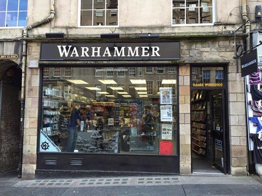
This new logo is also inline with their re-branding of the GW stores. A few years back, they started dropping the “Games Workshop” and started going with the plain “Warhammer” with white text on a black background. Now they have a Symbol they can associate with the stores, too.
It doesn’t matter if it’s playing on the tabletop, video games, wearing the T-shirts, painting the models, or hanging out with your friends pushing plastic around – it’s all Warhammer now. Just don’t forget the Hammers or Eagles.
What do you think of the new Brand Symbol? Let us know in the comments – It’s Warhammer Time!


